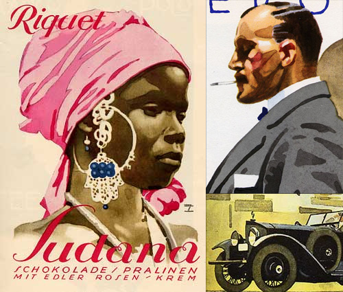
I’ve had some images from these articles in my ‘inspiration’ folder for about two years now, maybe even three. I’ve only just got around to looking closely at the lettering on them - it was the virtuoso watercolour technique that attracted me to them originally. The most interesting one for me is the Sudana chocolate poster… or is it packaging? The article doesn’t say. I think the best way to understand lettering is to redraw it using beziers - not a technique that works for everyone, but it works for me. I noticed right away that the letters are drawn with refinement and precision, and it was a very pleasant job to reproduce them with (almost) every point at extrema. The ‘S’ needed a couple of extra points along the main stroke, as if Holwein applied a little extra pressure at the midpoint to create a subtle bulge there. The swirly ‘a’s are a little more involved, and to draw them so they can be rendered reliably means a few extra points and outlines, and what with this being lettering they are of course different from each other. I doubt I’ll want to create a font out of these, but I’ll keep them handy for any lettering projects I have, that ‘R’ especially.