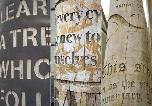
The Denver Egotist sent me a link to this rather nice piece of work, for Crawley Library in West Sussex. The new library is due to open in January 2009, so I might have to go up and have a look - I’ve not been to Crawley in years. There’s some more info on the Crawley Borough Council website, and some pictures on the Crawley Library Flickr set.
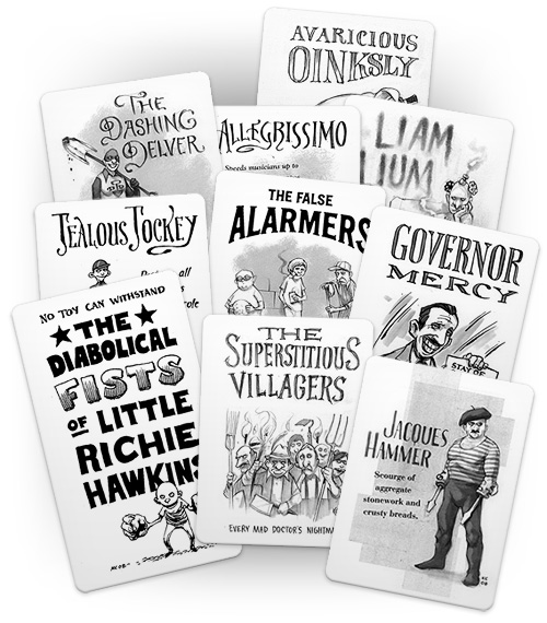
I’ve been enjoying The Superest for a while now (since it started I think) after following a link from Chris Glass (I think), and while every post on it is good, it’s the ones by Kevin Cornell that I look forward to the most. Apart from the fantastic illustration, there’s often gorgeous lettering to look at. His site, Bearskinrug, is a joy to visit as well.
I’ve nabbed some of his work from The Superest to illustrate the point - I put them on a cards for my own amusement, as the site reminds me of Top Trumps (and because I think you need to visit the site to see the full ones). Go and visit this, and his main site.
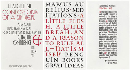
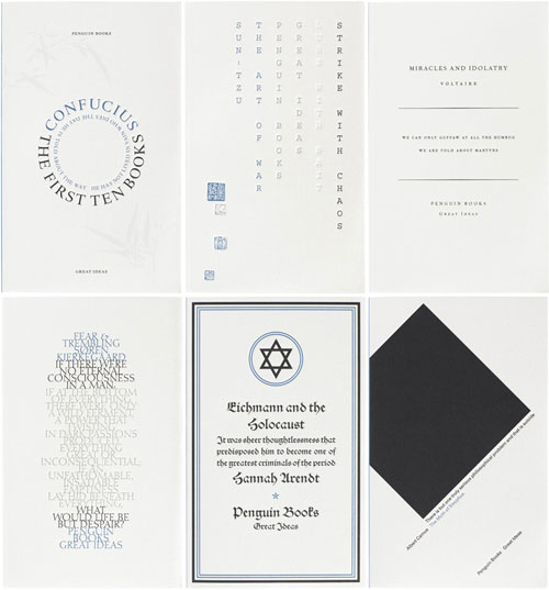
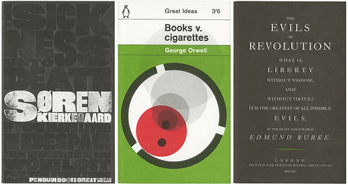
I’ve had these covers saved on my desktop for a while now, and I keep meaning to link to them. I saw the first set of Great Ideas books when visiting family last year, and was struck by the variety, creativity and humour of the cover designs. It turns out that there are two more sets, all done to the same standard. You can find the first set here, and the second set here. The third set seems only to be viewable on Flickr for now. I tried to find links to the boxed sets on Amazon but they appear to be unavailable - seems you can only buy the individual books. I like all the designs, but here are a few of my favourites:
These are from the first set. The ampersand on Confessions of a Sinner is quite special, the Meditations cover looks like it uses every ligature in Jupiter, and The Inner Life cover is just lovely - I’d like it as a large print.
English may not be Chinese, but when using monospace type, and with the right subject, you can get away with columnar type. There are some very nice typographic designs in the second set.
I have a couple of other favourites from the third set too, but these three are great.
I found a link to this preview of The Illustrated Ape magazine the other day. Such fantastic lettering! I don’t know whether I’ve been completely unobservant or my local bookshops are just crap, but I’ve never seen a paper copy of the magazine before. I’ll keep an eye out for it now though - I just love the lettering. I’ve cropped together some bits from the titles in the preview:
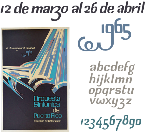
I was browsing through Bibliodyssey last night and found this poster in an article about Lorenzo Homar. I love the beautiful and lively lettering, especially the dramatic swash on the 9. I’ve (as usual) traced it with trusty beziers (I love bezier curves) and sketched out a very rough alphabet, which I might take a bit further at some point - redrawing the numbers from scratch, I think, as I’m not very happy with them.
To create a font based on this would be quite a project as the original lettering was clearly done by hand, though I’m sure with a deft application of Opentype rules you could create something that has much of the rhythm and charm of the original. However, I think I’ll create a stock of basic letterforms and apply variants and tweaks as I need them - I doubt I’ll be setting much body type in this. The lettering doesn’t look like it would suit a standard set of uppercase glyphs, but having ornamental lowercase forms in their place would work rather well - the swashed 9 shows what direction to take.
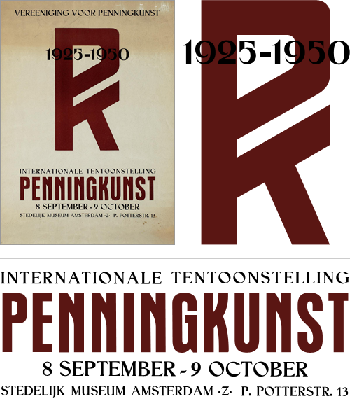
I rediscovered a set of saved images and links I had, labelled “150 Years of Dutch Advertising Art”. I’ve had the link sitting around for quite some time in the vast dusty archives of my home directory, and I can’t understand why I’ve not put it up here before. The site is an incredible collection of fascinating and inspiring images, from the baroque and painterly to the most sparse and graphic. Great stuff.
As usual, I’ve had to trace some of them with trusty beziers - I’ve just finished doing this one. I love the PK monogram and the composition of the two styles. Fun to trace too.
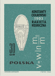
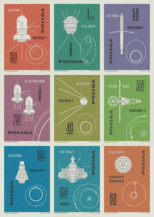
I saw pictures of these stamps on Ace Jet 170, and was absolutely fascinated by them. I love the illustrations of the orbits and paths taken by the space vehicles - the Łunnik 3 (Luna 3) one especially. As usual, I felt compelled to redraw them so as to understand them better, and they really are very well done - the orbits of Mars, Earth and Venus aren’t drawn perfectly circular, and the relative sizes of the planets are nicely visualised. The whole collection looks to have been a celebration of 60 years since the publication of Konstanty CioÅ‚kowski’s treatise on powered spaceflight “Изслѣдованiе мировыхъ пространствъ реактивными приборами” (The Exploration of Cosmic Space by Means of Reaction Devices), in 1903 - showing some of the results of the research his work started.
The first (or tenth?) stamp in the collection was devoted entirely to him, and the illustration is that of a design for a powered spacecraft from the cover of published versions of his paper - my redrawing of it is at right. The others show a variety of space missions, with the interesting date convention of having the month depicted with roman numerals. It’s not something I’d come across before, but it looks quite useful*. No longer would Americans and Europeans have any doubt over whether 01/03/08 is the 1st of March or the 3rd of January. Anyway, that’s another one of my must-do-something-with-this bookmarks cleared up, and it’s been quite a fun process in redrawing them. Here are the images I made based on the stamps. I’ve got them as vectors, so I’m thinking of getting them printed out A3 size.
This video I found while trawling through Computerlove - apparently it’s old and may well have been posted elsewhere, but when has that ever been a concern? I’ve never seen it before today, so I’m going to put it here. So there.
I like the shapes that form different letters depending on which way you look at them. I wonder if you could have a set of shapes that each show different characters (say, from three directions) with no repetition? It’d be tricky, especially if you restricted it all to one typeface… Even if not, I wouldn’t mind a couple of the ones in the video, just to play with, you know?
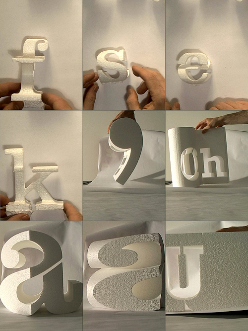
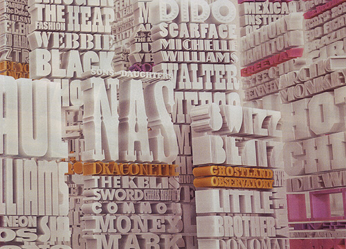
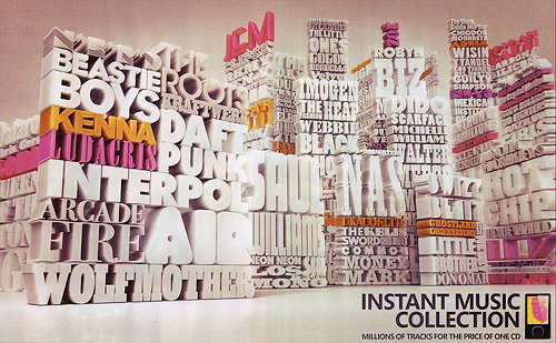
I spotted this in a recent copy of Wired Magazine. It’s an advert for (of all things) the Zune, making use of stacked, 3D-rendered type. Nowadays, such an effect is quite simple - just see some of the tutorials in PSDTUTS - but looks rather impressive. Massing the type together like this adds to the effect and makes for a pleasing composition. So I nabbed the pages out of the magazine and scanned them in*.
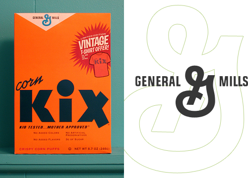
I’ve had this link on Hello Bauldoff hanging around for ages - the design of the box and the bold typography are fantastic, and the colours in the photo really appeal. One thing I noticed was the old-style General Mills logo which is far nicer than the version on their website, though they still use the crazy ‘G’ symbol. It’s the kind of thing that would drive me bonkers if I had to stare at it at breakfast every morning - is it a ‘G’? Is there an ‘M’ in there? Or is it some bonkers ampersand?
I know it’s the main point of the campaign they’re doing, but I’d remove the t-shirt promo flash, or massively simplify it - to me it looks like it’s trying too hard for that retro-Americana thang. The rest of the box carries that off perfectly, so it’s just not necessary.