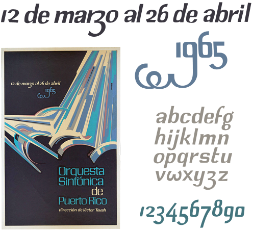
I was browsing through Bibliodyssey last night and found this poster in an article about Lorenzo Homar. I love the beautiful and lively lettering, especially the dramatic swash on the 9. I’ve (as usual) traced it with trusty beziers (I love bezier curves) and sketched out a very rough alphabet, which I might take a bit further at some point - redrawing the numbers from scratch, I think, as I’m not very happy with them.
To create a font based on this would be quite a project as the original lettering was clearly done by hand, though I’m sure with a deft application of Opentype rules you could create something that has much of the rhythm and charm of the original. However, I think I’ll create a stock of basic letterforms and apply variants and tweaks as I need them - I doubt I’ll be setting much body type in this. The lettering doesn’t look like it would suit a standard set of uppercase glyphs, but having ornamental lowercase forms in their place would work rather well - the swashed 9 shows what direction to take.