Schusev State Museum of Architecture

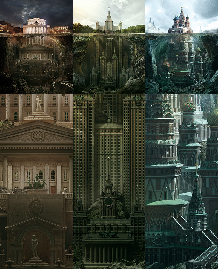
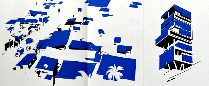
I could look at these illustrations all day. They’re for a press and outdoor campaign promoting the Schusev State Museum of Architecture. Compositionally they remind me of that iceberg image, which seems appropriate given the brief to show the history of architecture going much deeper than the buildings you see. The quality of the modelling and illustration is excellent and are well worth looking at more closely in the larger images. I think the sketch images included on Behance and Design You Trust are nice, but (somewhat unrealistically) I’d love to see all the discarded sketches and roughs they made along the way, I bet there are loads of good, interesting ideas that didn’t make it through. The extended buildings (The Bolshoi Theatre, Moscow State University¹ and St Basil’s Cathedral) look amazingly plausible, if a little reminiscent of something Nicolae Ceaușescu might have actually tried to build². The Moscow State University one is already a high-rise building so perhaps looks the most likely, if rather Gotham-esque. The St Basil’s one is just astounding.

Amazing. I rather like the red, green and blue theming of the images too.

As mentioned above, there’s a load of who-did-what information and bigger images on Behance and Design You Trust (where I first saw them), and a zoomable set of images on Carioca Studio’s site too.

Flying Cars

It must be the future already because, look, flying cars! It turns out that there’s been a whole series of these sculptures over the years at Goodwood Festival of Speed by Gerry Judah. I saw the photos of this year’s one on Dezeen and thought it was a nice concept rendering, but no, it’s real. What a thing!

I’ll have to go next year. Goodwood is almost literally round the corner from where I live.

Betteo 365

I’ve been enjoying Patricio Betteo’s 365 project for a few years now and somehow never linked to it here. The illustrations are (I think) added daily, though there’ve been a few months where it’s not been updated at all (sounds familiar, can’t think why). It’s a regular source of inspiration for me, with a mix of illustrative styles, with occasional photographs and typographic designs, and always in a square format — the variety and quality are quite brilliant. Patricio Betteo is extraordinarily talented, and if you look through his blog or DeviantART portfolio you’ll probably notice you’ve seen some of his work at some point even if you’ve not heard his name. Well worth a look.

Blued

I’m quite fond of illustrations made with restricted palettes (part of the appeal of mid-century printed ephemera, I think) so this project by Sameer Kulavoor (as Bombay Duck Designs) caught my eye when It’s Nice That featured it.

The illustrations highlight the use of basic blue tarpaulins in Indian cities by abstracting all the other elements and leaving just the shadows and the blue colour to define the scene. If in India the blue tarp is ubiquitous, as in Kulavoor’s words, “it makes for excellent sun-proofing, dust-proofing, pigeon-shit proofing, packaging, and temporary refugee camps.” they’re certainly familiar globally; I recall my father’s motorbikes being protected from the rain with them, a neighbour’s shed-rebuilding project shrouded in one (for years) and various festivals and outdoor markets seemingly constructed from them (and thickets of scaffolding poles). The book is available from Tadpole Store.

The First Six Books of The Elements of Euclid

A series of unsuccessful (and unrelated) searches led to the happy result of finding this book (and the site it’s on). The Public Domain Review is a fascinating collection of articles about (and a collection of) out-of-copyright texts, images and films, and somehow I’d never seen it before.

I’d seen a page from the book and thought it to be something quite modern, something produced by some later follower of De Stijl or Bauhaus (something the Public Domain Review also comments on), but it is in fact from 1847. Not something you’d associate with early Victorian publishing at all. It’s a remarkable book, and thinking back to when I first learned geometry I wondered if something like this would have helped. In all honesty (and of course entirely my opinion) I can’t say it would. The pages are a visual delight but they compel the learner not only to learn the concepts and mathematical language but a whole new graphical one too. From my memories of Euclid you need a good guiding commentary (or a good teacher, or both) rather than a new translation to help you make the necessary connections and learn the principles well.

The long-s characters and the ornamented capitals are a clue to the age of the book, but the diagrams appear very modern.

The Chicago Neighbourhoods

Kelly from Design Crush linked to this last week, a project by designer and Chicagoan Steve Shanabruch to create a logo for each of the Chicago neighbourhoods. Some, he says, are based on personal experience, and others on research. He’s created a lovely set of graphics so far, all of them remind me of old movie title cards (or end cards, like these), some look like they could actually be names of movies set in the neighbourhood.

There’s something particularly compelling about design projects like these, they trigger a sort of completist tendency in me, an appreciation of the collection as object. I like sets of things, and interpretations (and reinterpretations) of things particularly so. Thinking of this, I was reminded of the Branding 10,000 Lakes project by Nicole Meyer, to design an identity for each of the lakes in Minnesota (which is indeed known as The Land of 10,000 Lakes). There are some lovely ones in the collection. Some recent ones here:

Buzludzha Monument

Jason Kottke linked to this incredible photoset by Timothy Allen of the Buzludzha Monument in Bulgaria. It was opened in 1981 to celebrate the beginnings of organised socialism in the country 90 years earlier, and it is everything you’d expect from a thumping great monument to communism. From some angles it looks like a World War Ⅱ defence post, from above it resembles part of an Olympic venue, complete with oversized torch for the ceremonial flame, and to many people it’s as if a flying saucer landed on the hillside. A concrete flying saucer. To anyone who’s ever seen a Bond movie, well, that’s clearly a SPECTRE hangout, right there. Taking a closer look, the outside is decorated with a glorious relief of socialist slogans set in gigantic concrete Cyrillic lettering, a lot of which seems to be missing now.

Pictures from the Timothy Allen article, © him.

Inside there were mosaics celebrating the usual themes and noteworthy characters of international socialism, and in the ceiling above the debating chamber, a geometric hammer and sickle, surrounded with the call for the proletariat of the world to unite. Again, a lot of the interior has been stripped out by trophy hunters, vandals, or simply ruined by the weather. Needless to say, the monument isn’t being maintained by the Bulgarian government, and in 2011 they ‘gifted’ the entire structure to the Bulgarian Socialist Party, who hope to restore it someday.

In researching this article, I found a couple of other articles and photo collections on the monument, one by Arch Daily, and the other here on Kuriositas.

Lettered Department Store Logos

This is something I’ve had open in a browser tab for months, and I’m sure it’s officially ‘old’ in internet parlance, but I’m still drawing inspiration from the images. Christian Annyas has isolated (and traced?) these old department store logos and made quite a collection of them. He makes the point that very few stores today use similar lettered styles to these, and that they go for a logo style that “won’t offend” — I wonder though, if all these logos were created with a similar sentiment in mind? After all, brands in a sector do tend to cluster, so as fashions change, they all change together.