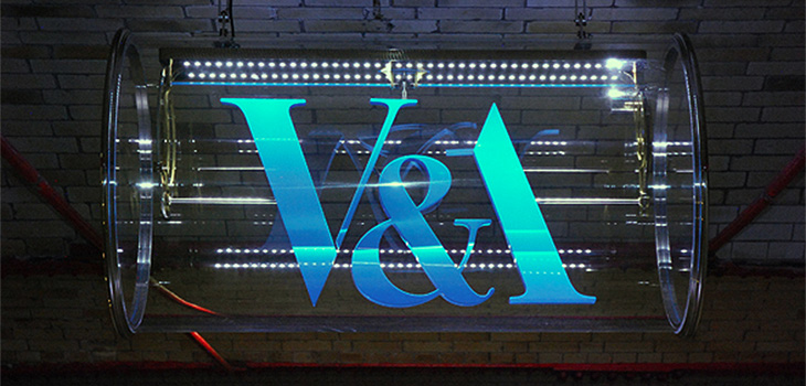
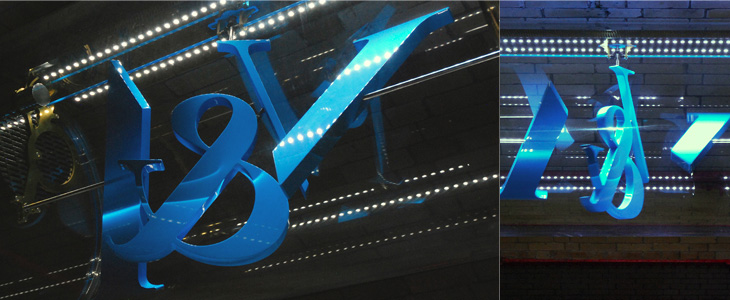
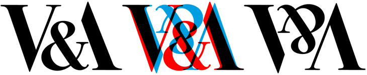
This new sign for the V&A is wonderful. The museum commissioned Troika to make a sign for the tunnel connecting the museum and South Kensington tube station, and it’s bloody gorgeous. It’s a kinetic sculpture, rotating parts of the museum’s logo (in itself a wonderful thing, by Alan Fletcher in 1989) so that it reads at first from one side, and then from the other. I did wonder at first whether the V and A on Fletcher’s original logo were actually rotationally symmetric, and no, of course they aren’t, but for a sculpture like this the alteration to make them work like that isn’t at all noticeable. Go and watch the video (or of course, visit the museum) to see it in action. It’s so simple and yet so clever, whoever came up with the idea must have been quite pleased with themselves, and justifiably so.
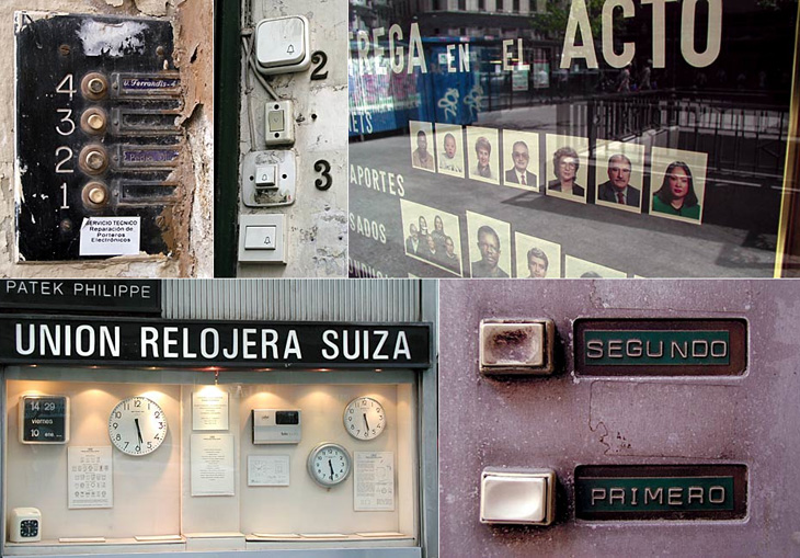
Me Design Magazine highlighted this fascinating project, While Stocks Last by designer Leandro Lattes; a massive collection of photos of Madrid, across two books, documenting the incidental details of the city; shop signs, intercom buzzers, bars, cafés and the like. I’m normally pretty wary of ‘found type’ collections as they tend to lack any kind of context, analysis or insight — or indeed any sense that they are curated, but what makes this different is the restriction to the one city, and the intent to document things that are likely to disappear without record. There’s very much the power of the collection going on with projects like this; individually the objects and scenes may have some interest, but all together like this they draw you in — the similarities and differences become compelling and before you know it you’ve lost an hour or two. Go and take a look.
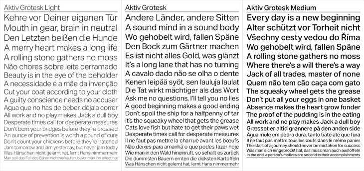
A few months ago I went to BrightType 2010 at Brighton University — two talks, one by Richard Rutter and another by Bruno Maag — which I meant to write up at the time but sadly never got around to. One thing that stuck with me was Bruno Maag’s 5 minute rant against Helvetica where he compared it unfavourably to Univers and decried its overuse and the unthinking adoration given to it. Apparently Maag likes to include a bit of a rant like this in all his talks, but it was new to me and quite refreshing. Basically, Bruno Maag detests Helvetica, and has designed a new face, Aktiv Grotesk, to kill it off.
The new face is designed both to correct the apparent flaws in Helvetica and as a new, warmer, friendlier Univers. I guess I’d need to spend some time with it to know how it feels in use, but first impressions are pretty good. Univers is one of my all time favourites and Aktiv Grotesk has much of the same feel, though I’m not sure it really feels friendlier. I always thought Univers had a lot of character and was pretty friendly already, so I’m surprised Maag described it as ‘cold’. I guess it depends on your associations. Comparing Univers*, Helvetica, Helvetica Neue, Aktiv Grotesk and Akzidenz Grotesk is pretty interesting. You can immediately see that while there’s a connection, Aktiv Grotesk is is definitely an entirely new face — the counters are more open, possibly due to the squaring off Maag mentions; the strokes are sophisticated and refined, more like a display face; and the whole thing has a beautifully even colour:
* Admittedly my version of Univers is pretty crap, not that I’ve found much better available online.
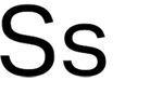
There are a few oddities in it though. In particular, that ‘s’ is just plain odd. In context, above, it fits in mostly OK, but it appears to lean backwards. It feels unstable. Both the Helveticas and Univers have S’s that come to a satisfactory finish at both ends, and Akzidenz Grotesk has that chunky flare at the ends of the stroke to balance it out, but Aktiv Grotesk just tails off a bit. It feels, dare I say it, a bit like Arial.
This statement surprised me a bit:
“Being a Swiss typographer, it’s always been Univers. Even in my apprenticeship we didn’t have Helvetica in the printshop. Then I went to Basel school of design and of course in Weingart’s workshop it was Univers, never Helvetica. Then I come to England and there’s all these designers using Helvetica! The Macintosh had just come out and Helvetica was on every single machine. Everyone was so fascinated with it … I never understood that.”Bruno Maag in Creative Review
Really? When I was growing up I remember that when there were sans serif faces they were either Univers or Folio. My uncle was a typesetter and designer and I remember the books of Lorem Ipsum set in Univers he used to chop up and paste into layout comps. It was never Helvetica. But then, these were the cold, damp provinces, so perhaps things were different in that London, you know, where they had computers and all that clever stuff. Maybe.
So for what it’s worth, I think Aktiv Grotesk is a real winner of a face (that ‘s’ notwithstanding) and will be pretty nice to play with and use professionally, but I doubt it’ll unseat Helvetica as the sans designers turn to. As a high quality font and with its Swiss typographic credentials, it does stand a chance of eclipsing Univers though, which would be a shame.
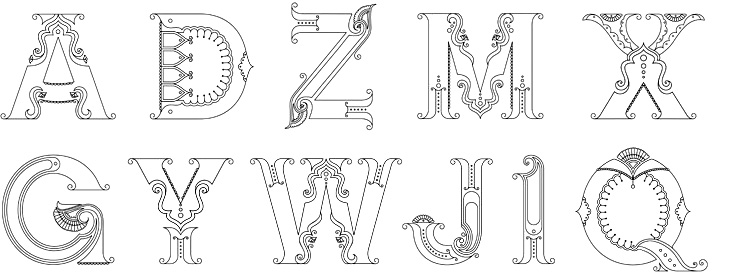
Beth Shirrell has produced this attractive all-caps ornamental alphabet, inspired by Indian (and specifically Hindi) decorative culture. It’s nicely produced and has some fascinating little details, but I wish there were some higher resolution examples to look at. Putting up low resolution images for something as detailed as this feels frustrating, though I understand why it’s done. Anyway, a few characters below — see the rest on her site.
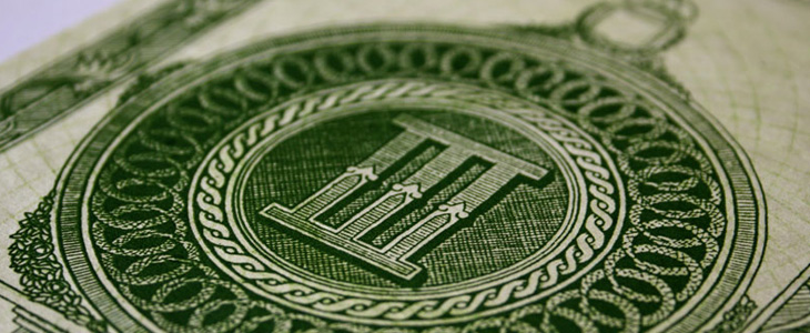
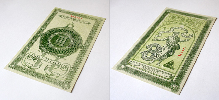
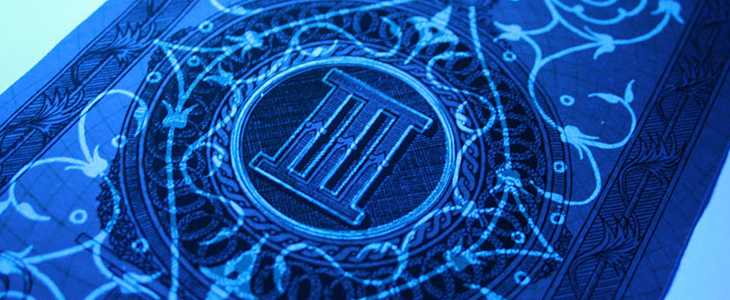
Xavi García is a student at Central St. Martins, and recently produced this banknote-inspired piece, which I find quite beautiful. It’s entirely hand-drawn and has an impressive array of security features: watermarks, UV-responsive inks and see-through images — the attention to detail here is absolutely perfect. There’s a few images here, but go and look at Xavi’s site for more. Interestingly, he’s also a student of Kenn Munk, who I wrote about before here.
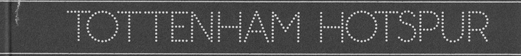
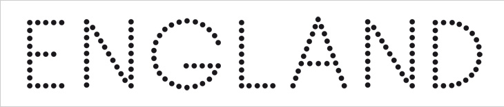
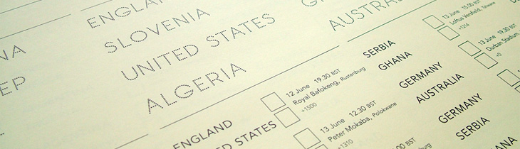
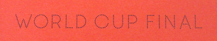
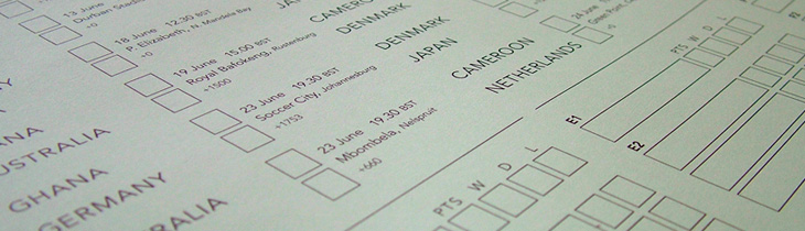
I wasn’t expecting to have anything to write about that was football-related, even during such a big event as the World Cup, but wonders never cease. When Benjamin Prescott mailed me about a personal project to create and sell limited edition World Cup wall charts he’d designed I had a big of trouble thinking what it was for — I’m so out of touch with such things. I mean, yes, I’ve a theoretical knowledge of the offside rule (something that’s talked about as if it’s one of the Great Mysteries of the Ancients) and yes, I played it at school, but the whole yelling-at-the-tv, wearing team colours and flying the flag kind of thing always passed me by. Still, I know enough people who like it all (so I can ask), and as it turned out I was just re-reading the email when I noticed I was sat right next to one of the wall charts, and a lovely thing it is too! What really interested me in it was the recreation of the typeface from Subbuteo scoreboard references — I like lettering and illustrations made from dots anyway so this was a nice find, and it works well with the Avenir used on the rest of the chart too. The wallcharts are limited edition, so I hope I’m not too late in writing about them and you can still get one if you want one.
An original Subbuteo reference and a sample of Prescott’s redrawing.
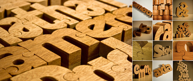
These wooden name puzzles by John Christenson are great. Grain Edit posted about them recently and I kept the link — one part of me really wants one of my own name, but the sensible part of me warns that I’ve got more than enough stuff and I’m supposed to be minimising clutter, but still, they are very nice. Seeing the photo of a number of them together makes me wonder whether a poem or short piece of prose would be a good subject, then it’d go on the wall and it’d be art and it wouldn’t be clutter at all, oh no. Rationalisations, rationalisations…
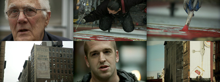
Up There is one of those things that’s been linked to like crazy across Twitter and most of the sites I read, but I’d not got around to watching it. I find that with a lot of online video, I mark it to watch later when I’ve a bit of time to devote to it and then, well, don’t get around to it. So, if you’re like me and haven’t seen this yet, I do recommend watching it. It’s only 12 minutes, very well composed and edited and really gives you an insight into the work of people who hand paint signs and adverts on the sides of buildings. It’s a craft that (not surprisingly) is dying out, but one that can be kept alive by commissions from a few enlightened companies and agencies. The film was sponsored by Stella Artois who, as JJ from Graphicology points out, are producing more narrative-based advertising lately. Kudos to them for this, I’ve a lot more respect for Stella Artois the company now. Less said about the lager.
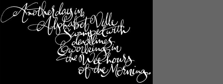
Another link to the ever-inspiring The Art of Hand Lettering, this script is beautiful. I love the composition and the flow of the letterforms, the even colour across the lettering takes my breath away, and it was all done by hand, late at night. I guess that’s the sign of an expert, no? Lovely. Go and take a look at more of his work.
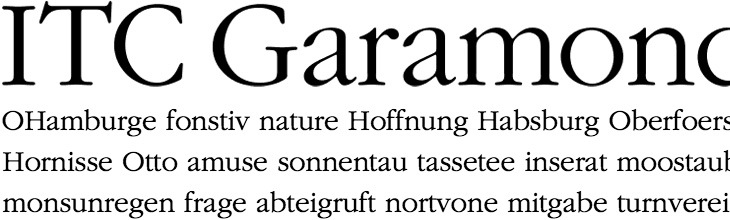
Michael Bierut hates ITC Garamond. I wouldn’t normally link to something like this, but unusually for Design Observer there are a couple of actual laugh-out-loud moments in the article, including this gem:
The most distinctive element of the typeface is its enormous lower-case x-height. In theory this improves its legibilty, but only in the same way that dog poop’s creamy consistency in theory should make it more edible.Michael Bierut
Go and have a read of the whole thing. It’s good to see an actual taste-based critique on something for a change. I’m a big supporter of backing up your statements with facts or reasoned arguments, but from time to time we’re all entitled to a bit of plain old raw opinion. And if you’d like to make up your own mind (why wouldn’t you?), here’s a sample of ITC Garamond Light: