A few months ago I went to BrightType 2010 at Brighton University — two talks, one by Richard Rutter and another by Bruno Maag — which I meant to write up at the time but sadly never got around to. One thing that stuck with me was Bruno Maag’s 5 minute rant against Helvetica where he compared it unfavourably to Univers and decried its overuse and the unthinking adoration given to it. Apparently Maag likes to include a bit of a rant like this in all his talks, but it was new to me and quite refreshing. Basically, Bruno Maag detests Helvetica, and has designed a new face, Aktiv Grotesk, to kill it off.

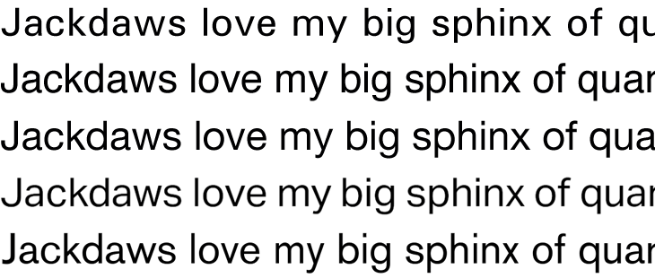
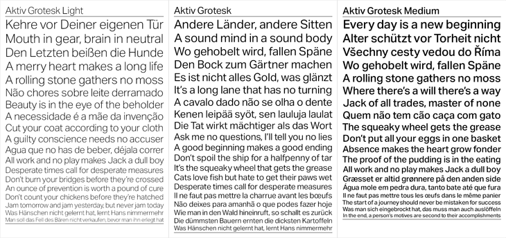
The new face is designed both to correct the apparent flaws in Helvetica and as a new, warmer, friendlier Univers. I guess I’d need to spend some time with it to know how it feels in use, but first impressions are pretty good. Univers is one of my all time favourites and Aktiv Grotesk has much of the same feel, though I’m not sure it really feels friendlier. I always thought Univers had a lot of character and was pretty friendly already, so I’m surprised Maag described it as ‘cold’. I guess it depends on your associations. Comparing Univers*, Helvetica, Helvetica Neue, Aktiv Grotesk and Akzidenz Grotesk is pretty interesting. You can immediately see that while there’s a connection, Aktiv Grotesk is is definitely an entirely new face — the counters are more open, possibly due to the squaring off Maag mentions; the strokes are sophisticated and refined, more like a display face; and the whole thing has a beautifully even colour:
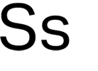
There are a few oddities in it though. In particular, that ‘s’ is just plain odd. In context, above, it fits in mostly OK, but it appears to lean backwards. It feels unstable. Both the Helveticas and Univers have S’s that come to a satisfactory finish at both ends, and Akzidenz Grotesk has that chunky flare at the ends of the stroke to balance it out, but Aktiv Grotesk just tails off a bit. It feels, dare I say it, a bit like Arial.

This statement surprised me a bit:
“Being a Swiss typographer, it’s always been Univers. Even in my apprenticeship we didn’t have Helvetica in the printshop. Then I went to Basel school of design and of course in Weingart’s workshop it was Univers, never Helvetica. Then I come to England and there’s all these designers using Helvetica! The Macintosh had just come out and Helvetica was on every single machine. Everyone was so fascinated with it … I never understood that.”Bruno Maag in Creative Review
Really? When I was growing up I remember that when there were sans serif faces they were either Univers or Folio. My uncle was a typesetter and designer and I remember the books of Lorem Ipsum set in Univers he used to chop up and paste into layout comps. It was never Helvetica. But then, these were the cold, damp provinces, so perhaps things were different in that London, you know, where they had computers and all that clever stuff. Maybe.
So for what it’s worth, I think Aktiv Grotesk is a real winner of a face (that ‘s’ notwithstanding) and will be pretty nice to play with and use professionally, but I doubt it’ll unseat Helvetica as the sans designers turn to. As a high quality font and with its Swiss typographic credentials, it does stand a chance of eclipsing Univers though, which would be a shame.