Connections

Funny how coincidences arise. I found both Mario Feese’s Air Lines and Chris Harrison’s Internet Maps at about the same time and was struck by how recognisable the continents are, and, as I’m fond of maps I thought I’d compare the two images. On the Air Lines map, most of the continents are rendered as a ghostly but fairly accurate outlines, with South America rendered as a beautiful abstraction, right to its tip. The Internet Map is obviously somewhat different, with almost all the connections between cities in rich countries; Africa barely exists and the tip of South America is shown with a single faint line, whereas North America and Europe are smothered in a riot of lines. I overlaid the two maps onto each other and I noticed an interesting thing about the Internet Map, which I describe below.

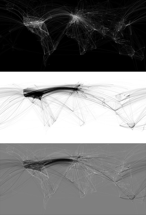
So, to align the maps I needed to use various groups of cities that appeared in both maps; using the southern hemisphere to get the horizontal scale right - there are sharp points for cities in South America, southern Africa and Australia, and in the northern hemisphere I used San Francisco, LA and Tokyo to get the vertical scale. Thankfully, both maps are using the same projection.

Everything pretty much lines up nicely, except there’s that node in the Gulf of Guinea which I originally thought might be some satellite uplink affair at Sao Tomé, maybe a huge data haven I’d never heard about. However, after lining up a map of Africa with both maps it turns out to be nowhere near any land at all. In fact, when I was trying to mark the point on Google Maps, I realise this big data interchange point (the biggest in Africa!) is at 0.0°N, 0.0°W, which is a suspiciously default sounding location. Maybe in the data that Chris Harrison used there are a few unknowns, with their locations set to null, and these connections should be shown elsewhere? If they were removed, Africa would be even more ghostly.

Infographics

Two of my favourite animations of all time are the advert H5 did for Areva, and their Royksopp video. I can watch them over and over again; they’re so good. So I went to the H5 website recently to see if there was anything else they’d done like that, and found the video for Alex Gopher. I’m sure I’ve seen it before somewhere, but it was a long time ago and I hadn’t made the connection it was done by H5 too. It’s available to view on YouTube, but you can see it on H5‘s (all flash) website by clicking ‘films’, then ‘clips’, then ‘alex gopher’.

Anyway, I like things like this, where the label is the thing itself, and it reminds me of the National Geographic trailers for Seconds from Disaster that I linked to before. I’m thinking it would be amusing to remake Powers of Ten in this style - zooming into the word ‘galaxy’ to see it made up of widely spaced words like ‘star’ and ‘nebula’, and so on, down to the sub-atomic level, with everything its own label.

Screen captures from ‘The Child’

Screens from the Areva advert, the Royksopp video, and this rather good public information film by Japan’s Ministry of Agriculture, Fisheries and Food.

Talking of labels becoming the object itself, there was a short film, I think on the Sci-Fi channel, about a post-apocalyptic future where the apparently normal, happy, consumerist lifestyle everyone leads is in fact an illusion. There are many layers of unpleasant illusions underneath the ‘nice’ one to stop people trying to break free and see the real world. I particularly remember the ‘real world’ in the film as being made up of cardboard boxes labelled with the name of the object it was supposed to be, and a big barcode (the name set in Helvetica, natch), with one scene showing a load of cardboard boxes labelled as ‘Black Leather Briefcase’ going through some device (gotta love sci-fi) and emerging fully-clad in the illusion of black leather briefcases. I’m sure the film is nowhere near as good or as profound as I remember it, but does anyone know what it was?

Portsmouth By Its Slang

Found this on the CR Blog: “Do you speak Pompey?” - a map of Portsmouth with the streets relabelled with examples of apparently local slang. I wouldn’t say very much of this slang is unique to Portsmouth - I hear much of the same phrases and accents in Brighton, and around Sussex and Surrey too - but the map is pretty interesting nonetheless. As CR Blog points out, it’s similar in execution to the NB Studio map of London. It’d be interesting to do a map of a larger region (or country!) showing accents in a similar fashion. It’d be of aesthetic interest more than scientific, but I’d be tempted to buy one.

The Unfinished Swan

A beautiful name, and a beautiful concept for a game. The idea feels rather illustrative - finding your way across a blank white world with a load of black ink to delineate edges and discover hidden objects, it’s like creating the world of a graphic novel on the fly. To add to the effect, the game seems to have some reversed areas too, and the white paint on black really reminds me of Sin City.

Our Friend The Atom

Found on ffffound a little while ago, this beautiful book cover. It reminds me of some books I used to have from the same era - I had a National Geographic book about all the massive engineering works being done in America in the early/mid 20th Century, from straightening and deepening the Mississippi to the building of the Hoover Dam. It was a bronze-coloured hardback with a big cross-section of the dam in white, and a plan of a canal cut across a loop of a river, in black, both embossed into the surface. I wish I still had it. Still, I’d only trace it as a vector like Our Friend The Atom, here:

Studies in Pen Art

Drawn linked to this fantastic PDF, “Studies in Pen Art”, a scan of a 1914 pamphlet by William Dennis. It has loads of examples of penmanship and advice on techniques and equipment which is pretty much all relevant today - although not perhaps the emphasis on speed; even a commercial letterer today wouldn’t have to produce work as quickly - producing this kind of lettering by hand would be a project in itself these days and so more time would be devoted to it. Still, we all have deadlines and knowing how to work quickly is never a bad idea. The PDF is available for download from the Drawn page - worth a look.

Inspirational Posters

Fazai38 posted a couple of articles showing some examples of inspirational posters. I’ve a few favourites but at the same time (and coincidentally) Computerlove posted about Negro Nouveau’s new typefaces with a graphic that was happily similar to the Deerhoof poster. I rather enjoy the similarity of the basic motif, and the different effect each of the two implementations give.

I like the little bubbling flask motif on the “We Are Scientists” one, and of course I’m going to like the one that resembles guilloches.

Ridiculous Design Rules

I came across this site the other day - Ridiculous Design Rules. I’m not quite sure what the basic premise of the site is - whether it’s to collect ridiculous rules together and collectively point and laugh at them by giving them stars, or to collect rules together and rate them as ridiculously good or relevant. It’s very odd. I thought of the ridiculous design rules I’ve encountered before but they tend to be about the audience, or users, for example the truly ridiculous and unproven (and unprovable) “99.9% of people set their browser to the correct language” to the too-many-caveats-to-say-one-way-or-another, “text on screen is unreadable compared to print”.

Whatever you think of the rules or how they’re presented, the site does have some beautiful illustrations by Niels Shoe Meulman - only four for now, but hopefully a lot more soon. I’m particularly taken with the cat picture, it’s a nice Latin script variety of the kind of illustrative Arabic writing I’ve posted about before. Very nice indeed. You can see them larger on the site, or on this Flickr set.