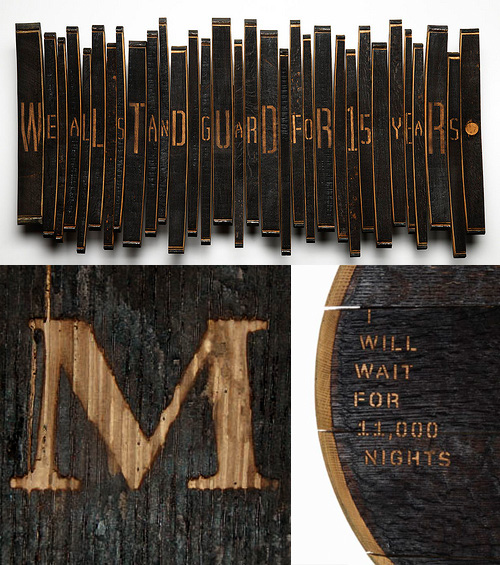
I’ve been following this series of articles by Johnson Banks about their Art from Barrels project for Glenfiddich. The aim of the project was to get across the length of time it takes to make a barrel of Glenfiddich Single Malt, and the end results are pretty interesting. I haven’t got all that much to say about it, especially as the articles explain it all pretty well, other than to say I’ve discovered I like sandblasted letters in charred wood:
Hallmark has some very nice trailers for its programmes, usually with great typography, and always with perfect grading. They’re very fond of them too, so you tend to see them several times throughout a programme - something that can easily drive you nuts if you’re not quick with the mute button. Still, they look nice.
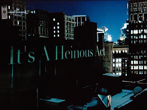
This particular one, for Law and Order, uses the nice technique of placing text set in Didot into various scenes in New York. The point of view changes as the text builds up and enhances the 3D in-world effect, and as it does, dribbles of grime (blood?) trickle down from the words. It’s all very nice, but what, I say what is this I see?
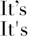
The proper Didot apostrophe, and the improper one.
A prime*, used as an apostrophe? A heinous crime, if ever there was one! Someone call the cops! Thing is, you’d have to deliberately turn off “smart quotes” in After Effects to get that symbol to show, and not the correct one (at right). So why?
Perhaps, and here’s a thought, perhaps they did it like that to echo the dribbles in the animation? That would make it an artistic decision, and not an ignorant mistake. I do hope that’s what it is, as the rest of the sequence is rather pleasant:
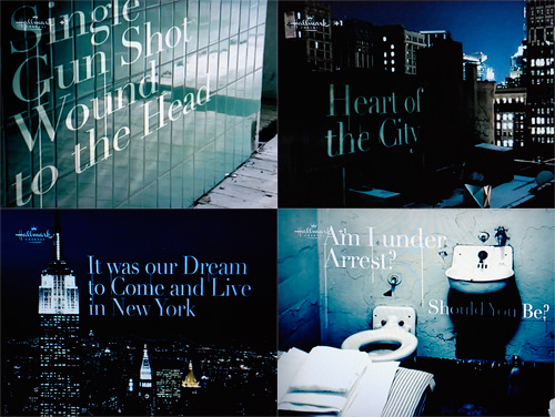
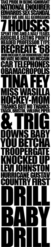
Well it’s finally here. The actual day of the US election. I don’t really want to write about it, it’s been on TV, in the press, online, everywhere, for two years and I can’t wait for it to be over - I’m sure it’s got more coverage on British TV than any of our own elections ever has. It’s been at such a level of saturation that I, as someone who lives outside the US, a British citizen, someone who hasn’t been actively following the election, can look at this (rather nice - snippet at right) bit of typography and recognise pretty much all the stories it represents*. However, there are some compensations; there’s been a big focus on graphic design this time around, though seemingly only on the Obama side of things - to the extent that thatShepard Fairey poster is the subject of much parody.
The Obama campaign branding is of such incredibly high quality and consistency I’m hoping there’ll be a book about it - they must have had to use so many suppliers over the campaign, if not for artwork then printing, set building, copywriting and typesetting. To ensure a consistent quality and tone for such a long time over such a wide distribution is quite an achievement.
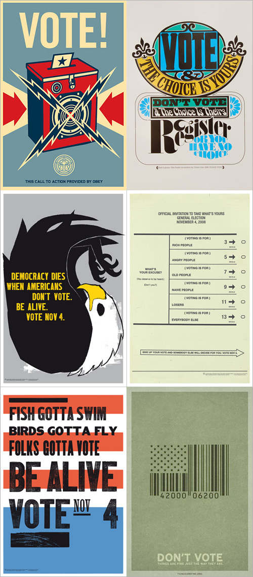
Anyway, now that the day is finally here, and with the full knowledge from my site stats that about 40% of my readership is from the US, I urge those of you from that country to get out and vote. The biggest threat to democracy is people thinking that the election is already won - it isn’t. So vote. I hear the turnout may be record breaking - let’s hope it is, and it inspires lazy British voters to get out there when it’s our turn. And to make this post a bit more related to type, some lovely posters to get you in the mood:
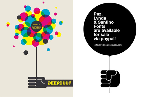
Fazai38 posted a couple of articles showing some examples of inspirational posters. I’ve a few favourites but at the same time (and coincidentally) Computerlove posted about Negro Nouveau’s new typefaces with a graphic that was happily similar to the Deerhoof poster. I rather enjoy the similarity of the basic motif, and the different effect each of the two implementations give.
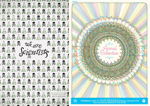
I like the little bubbling flask motif on the “We Are Scientists” one, and of course I’m going to like the one that resembles guilloches.
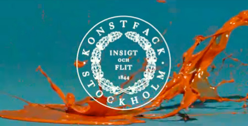
After some casual browsing the other day, I found this film promoting applications to Stockholm’s University College of Arts, Crafts and Design. It’s just nice! I love the orange paint against the blue, and it’s lovely when it hits other objects rebounding from the floor.
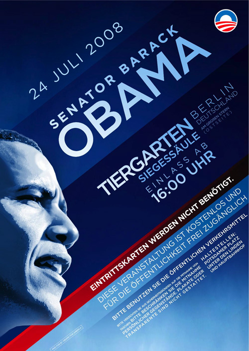
There’s been loads written about the high quality and consistency of Barack Obama’s campaign branding and design. I don’t disagree with any of it, but I’ve not really seen anything that really grabs my eye, that makes me look closer and see how it was done. Maybe I’m being cynical because it’s advertising for a political campaign, but they’re perhaps too knowing, too carefully designed, sometimes perhaps too derivative, to be commented on individually as pieces of design work. That is in itself quite remarkable, of course, and collectively they’re interesting as an example of brand power, but at the end of the campaign it’ll be interesting to look at all of it together, as a single body of work, and I fully expect there to be a book published to allow us to do just that. I’ll probably buy it, too.
So, having said all that, I just came across this scan of a flyer promoting Obama’s speech at the Tiergarten in Berlin last week, and it’s a bit more special. It’s got a very nice grid, which to some, invites some comparison to the work of the Bauhaus, though I can’t be the only one to realise that diagonal grids are unique to the Bauhaus. Indeed, they’re quite often used in political, commercial and (dare I say it) theatrical advertising. Still, the flyer below is an excellent example of a diagonal grid, well applied:
I just read this fascinating article on GT!Blog, presenting a theory of why Japan never made the iPod. The basic premise is due to the increased memory and processing requirements of representing Japanese text on screen adequately, Japanese manufacturers tended to develop appliances, rather than general purpose computers. So Japan (and by extension, east Asia in general) became leaders in electronic gadgetry such as games consoles, fax machines, watches, stereos and the like, with the trend reaching its (possible) apotheosis with the mobile phone - not one of which devices required a general purpose personal computer as the connecting hub. Each device did its thing, and was specialised for that - if anything became close to a general purpose device, it was the mobile phone itself, though it was, and is, quite limited in what it can do and what people want it to do.
Now, as the article points out, modern computers can handle Japanese (and Chinese, Korean, etc.) and the computer-as-hub idea is gaining popularity in east Asia, but it’s fascinating how the typographic requirements of a language have apparently altered the entire economy (and culture!) of not just a country or region, but the whole world.
Using the characters from the GT!Blog article, you can see how an 8×8 grid is inadequate for representing Kanji.
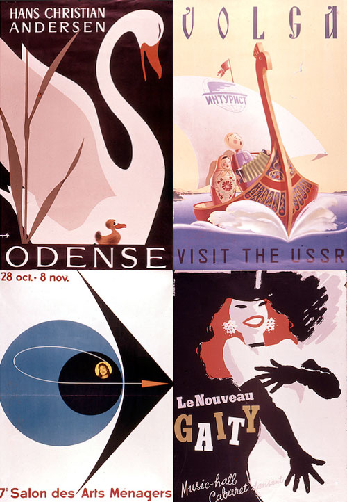
There are many collections of vintage posters on Flickr, most of them full of the mundane, rather than the classic. What makes an old poster a ‘classic’ anyway? Does it have to have inspired a whole style of advertising, or be an exemplar of a particular style, be well-executed or just be by someone famous? I guess it doesn’t really matter, it seems it just has to be old and have survived to be scanned in and shoved online. It’s nice though when you find some good examples in these collections. I particularly like some of the (depressingly low-resolution) scans on this collection, especially the lettering on the Volga one, which I nearly missed thanks to Flickr’s brutal it-must-be-square thumbnail cropping.
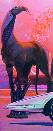
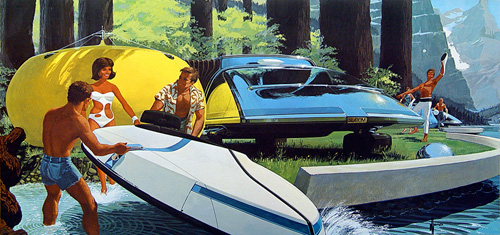
Farm animal, curiosity or pet? Check out the big cat in this one.
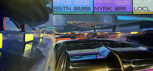
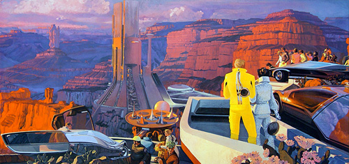
In the future, we will all have very low, flat cars, road signs will be hard to read, we will have genetically modified pets and will build large industrial entertainment complexes in areas of astounding natural beauty. That’s the future according to these amazing 1960s illustrations from United States Steel International, by Syd Mead*. Naturally, the implication is that we will be using lots and lots of steel, and will continue to use it to make sleek, shiny cars.
It’s strange how these pictures remind me of a book I had at primary school (I was about 7) which showed two possible futures. One was positively pastoral, with blue skies, happy people cycling along clean white paths through a garden city. The other showed what would happen if we didn’t reduce our energy dependency (apparently), and showed gigantic skyscrapers looming against brown, smoggy skies, with traffic jams and people wearing gas masks. They were both illustrated in an almost identical style to these retro futurist ones, and showed almost the same subjects - they could have been taken directly from this series.
The nonist is continuing with his series of Graphis annuals and has posted a set of scans from the 1957/58 edition. Go and take a look! If you’re in the UK, you might notice something rather familiar, something that reminds you of an advert much more recent than the late 50s. Now, I’m wary of assigning nefarious motives to people about this kind of thing, but it’s quite interesting to compare and contrast the two: