
I just found this great collection of mostly French and Dutch promotional materials for the Citroën 2CV. I love the typography of the 2CV bit on a lot of the examples especially.
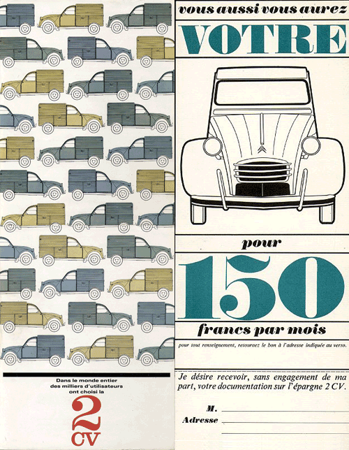
I just found this great collection of mostly French and Dutch promotional materials for the Citroën 2CV. I love the typography of the 2CV bit on a lot of the examples especially.
A few weeks ago, I spent a good hour trying to find some background info on the rebrand of Dubai International Airport, without success. I just went back to the Brand New post on it and there it is, a link, courtesy of Ty Wilkins.
While the airport logos have patterns similar to the tesselations characteristic of islamic art, the main logo pattern is rather reminiscent of a compass rosette, perhaps to imply that Dubai is at the centre of things? I generally agree with the Brand New post (and many of the comments) in that the positioning of the type on the individual airport logos seems clumsy and distracting. Having the type endpoint line up with the apex of the implied sphere is a straightforward solution, and yes, it’s not all that bad, but it’s not all that good either.
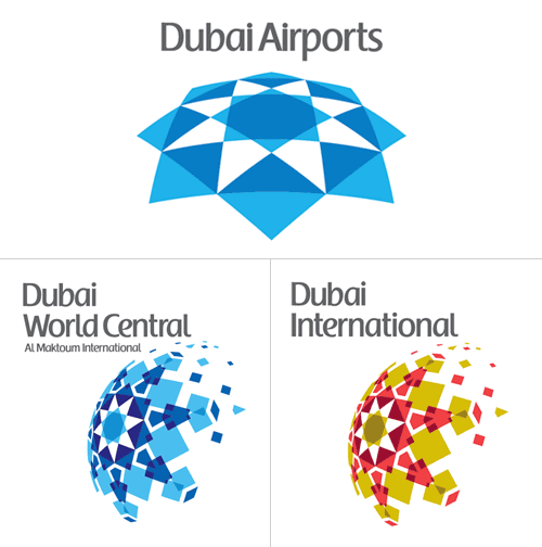
There’s something oddly old-fashioned about the choice of typeface and colour too, like something from the late 1980s. I’d prefer to see either the word “Dubai” or the airport identifier in a different weight, or black (instead of grey), or something - anything to give the type some life. I’m not sure about the face - it does look a bit like the Emirates logo, and I’m interested to see that there’s no arabic version of it too. Changing the positioning of the type, as below, focuses attention on that centre of the centre-of-things pattern and would look even better in arabic right-to-left lettering - in my everso humble opinion, naturally:
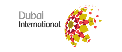
Mind, when we get some wider applications of the logo to brochures, signage, wayfinding and the like, it could appear quite different, with the odd type integrated and comfortable with the patterned globe.
…
Oh, and I have to point out the odd language on the logolounge article,
Dubai Airports tapped Cato Purnell Partners in 2007 to develop an identity system that would not only unite the organization’s holdings, but also mark Dubai as an international air hub.
Tapped? How do you tap an agency? I have horrific visions of plumber-surgeons installing chromeware directly into living flesh, a media agency relationship direct from the mind of Guillermo del Toro! Of course, this would hardly be the only linguistic horror inflicted on the language by the media industry, I say over and over again, the word creative is not a noun, no, not even when applied to a person, and especially not when referring to artwork. Rant over.
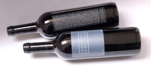
I just came across this site, The Dieline, which claims to be “The Web’s Leading Packaging Design Blog”. There are some very nice things on there indeed, including these wine labels. I must admit to being rather heavily influenced by the labels on wine - if I like the label, generally I think I’ll like the wine, and oddly enough it’s been quite successful in the past. Is that so wrong? After all, I’m not alone (same site, another nice wine label). So, having said that, I think I would definitely like to try this:
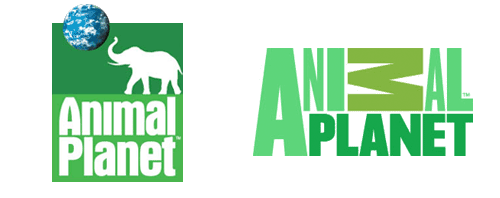
I just saw the new Animal Planet logo here, then after a search, here (of course). My first impressions weren’t too great, immediately I was wondering why the M was on its side - it looks like a reversed sigma, a kind of mathematical AniΣal Planet, if you will - and the mixed of weights and stretched type just seemed confusing and messy. However, after looking at some of the applications on the website (there aren’t many yet, though look at the videos on the home page, and here) I’ve changed my mind. Despite the obvious typographic objections (stretched type - ow!) I actually like it. I still think the sideways M isn’t too great, but overall the logo has a strong identity and fits with the aim of moving the channel from exclusively family friendly fare. They wanted to make the channel more grown up, and I think they’ve done it, simultaneously cutting the apron strings to the main Discovery brand by losing the spinning globe. I often like global ‘over-brands’ like Discovery had but it requires a consistently high standard of application and I think the old Animal Planet logo shows that that wasn’t the case. The new logo has a big advantage in that as it lacks imagery, it has a much wider range of applications for combining it with photography and video - a big strong typographic logo is much easier to apply to transitions, fades and tints than something with an image of an elephant on it, by far. The old one had some nice applications, but I look forward to far more from the new one.

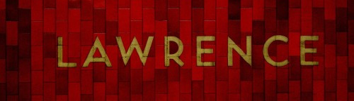
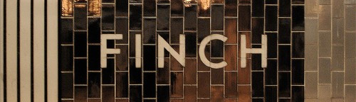
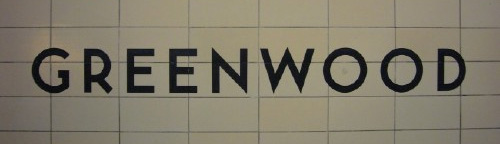
I’ve had this page open in my browser for weeks now, demanding that I say something about it. Joe Clark writes a comprehensive critique of the state of typography on the Toronto subway system, from great beginnings to the chaos of today. From the introduction:
You might not expect something typographically unique to come out of Toronto, a B-tier city that stands in the shadow of A-tier cities even in the minds of some residents. But the margins are where originality can thrive, and the typography of the Toronto subway is a prime example. It is also an example of subverting, ignoring, and actively destroying a special typographic heritage - quite an achievement considering that the type involved is almost a foot high and permanently sandblasted into subway walls.
The article goes on to describe the poor state of information design for signage across the subway system, provides comparisons with New York’s system and shows us what can happen to type when people really don’t care (check out the letterspacing on Leslie, about halfway through the article). It makes you appreciate, even more, just how good London Underground’s type system really is.
The appalling thing is that the original type in Toronto’s system was really rather good, I love the R especially - it is, dare I say it, cute. See some more examples from the article below, then set aside half an hour or so and go and read the article.
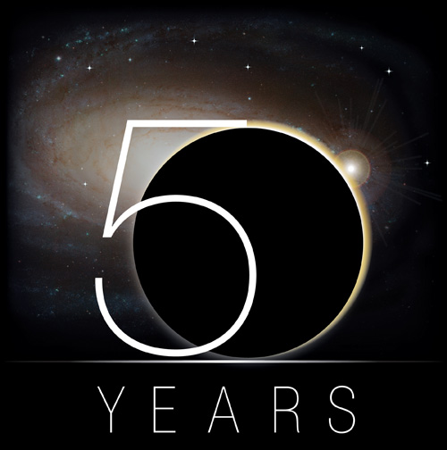
I have mixed opinions of this. Even if it is a blindingly obvious thing to use a planet to make the zero, it is NASA and if anyone can use a planet in a logo they surely can, and I think it’s quite nice with the 5. I just wish they’d left it at that, but no. They had to go and stick a big fat lens flare on it. It’s not even a real one even though one thing NASA has, is access to plenty of lens flares. Oh, and I hate the vignetting.
Jeremy Pettis has produced a wonderful series of typographic illustrations, representing 26 animals - one for each letter of the alphabet. For each, custom lettering is designed to convey the appearance or behavioural characteristics of the animal. They’re all very clever, and some require a bit of contemplation to ‘get it’. My favourite is the (perhaps) rather obvious, but beautiful Zebra one, though the Kangaroo one has an ‘ar’ ligature that’s just perfect:


He’s put the background sketches and roughs on Flickr, which is a great use of the site and for once, a use of the site that I actually can get behind. Flickr’s soviet, rigid, artless presentation is actually ideal as a kind of digital scrapbook for roughs.
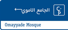
I’ve had this link stored for a little while now, waiting for me to explore further and write about it. I was initially taken by the use of arabic script to form directional signs (at right) and downloaded the beautifully designed and illustrated thesis by Luigi Farrauto. It’s well worth a look, even if you don’t read Italian. There’s a Q&A in English too:
Which are the main differences between the typography of arabic countries using arabic script and the one of non arabic country using arabic script?
I find that there is more typographic freedom within the Arab world that outside of it. There is a perception, or maybe that’s just how I see it, that Westerners are more focused on fully calligraphic styles for Arabic typefaces, and so they are unaware that we need other typefaces to suit our daily life. Calligraphic styles are great but you can’t set a dictionary in 5 pts size with that.
That’s what I noticed about the sign in the first place - clean, sans-serif (as it were) arabic type. OK, anyone who watched a news broadcast in 2003 would most likely have seen motorway signs written in arabic, but the films crews were hardly focusing on the finer details of the typography.

How has been faced the problem of vertical ligatures in typography?
Opentype provides us with GSUB (glyph substitution) lookups that can exchange a string of characters by a pre-designed ligature. That means that there is a large number of ligatures to be designed, and I’m not a fan of that. In my Naskh style typeface, I kept only horizontal stacking and so I have no ligatures except the Lam-Alef. I find that simpler to read and clearer.
This is also interesting. There are fonts that have been designed with loads of ligatures, but I guess sometimes, less is more.


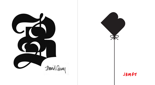
This is interesting, the Bunch design agency got a whole bunch (geddit?) of designers and illustrators they admired to ‘respond’ to their identity. As a result they got a whole load of variations on their logo which they’re now using as part of their identity. Very clever indeed, as commissioning all that work conventionally would be very expensive indeed.
A few of the results are shown on the CR blog page, but I picked my two favourites here. The blackletter style one is very interesting, as the negative spaces aren’t simply a reversed image of the implied continuation of the stroke, but an additional shape on the outer edge of that stroke. Very nice.
I came across a site this morning offering a 9Mb RAR file offering fonts for free download. It’s quite a list:
Agency Bold, Alternate Gothic No. Two, Arial Rounded Bold and Bell Gothic Black, Avenir (Book, Medium, Heavy), Avernus, Base 9 Regular SC, Catull (the Google font), Digital Sans Medium, FF Cocon Bold, FF DIN Medium, FF Dot Matrix Two Regular, FF Meta Bold and Book, Frankfurter Medium or Bryant Bold Alt, Frutiger Black, Frutiger Bold, Handel Gothic Bold, Helvetica (complete set), Hoefler Text, Interstate Black, Interstate Regular, ITC Bauhaus Medium, ITC Officina Bold, ITC Ronda, Klavika, Lisboa Sans, Myriad Pro (complete set), Neo Sans Medium, Pixel Fonts, Proxima Nova, Syntax Bold, Trade Gothic Bold, VAG Round (Round, Rounded BT, Rounded Lt-Normal, VAGRundschriftD)
From the language used on the site, I’m not sure that the person involved actually knows that fonts are licensed software products, that you have to pay for with actual money:
By the way i would like to share 9mb file contained with web 2.0 font type files archived in *.rar format in order to fulfill some of my loyal reader request.
Whether he does or not, ignorance is no defence, so I did my civic duty and shopped him to ITC, FontFont and Linotype. I’ll be interested to see what happens (if anything). The thing I notice on the three companies’ sites is that there is only a general contact email, but nothing specifically to report piracy of their products. Very strange. David suggested a good way to encourage reporting of piracy would be to give the first person to report an instance of theft a bounty of those fonts being used illegally.