Dynamic Type

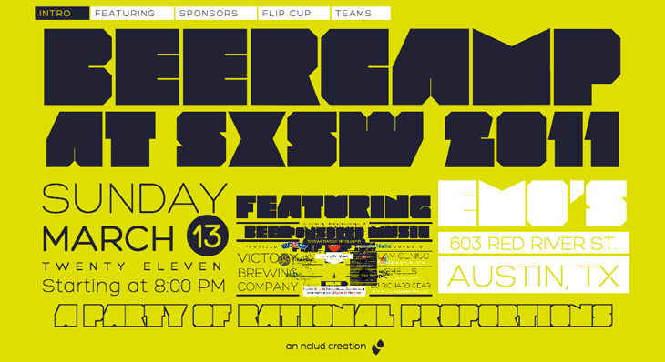
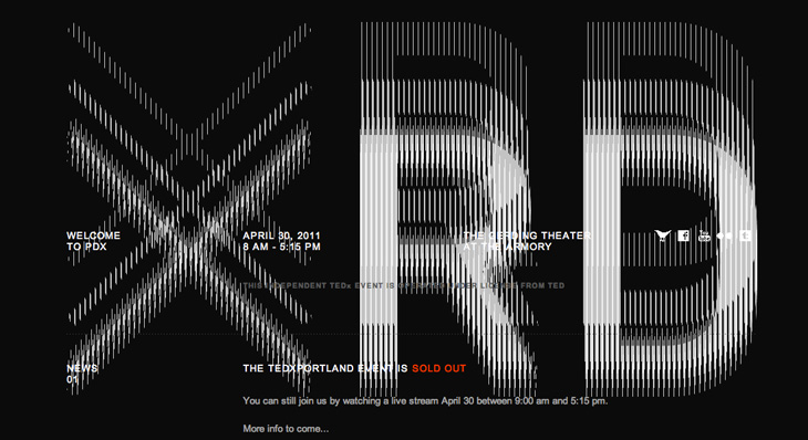
These two sites each transform the common, straightforward act of scrolling into amusing visual effects. The Beercamp one uses a page-within-a-page idea, with a smart little in-joke right at the lowest level, instantly recognisable to anyone who’s seen that film. The zooming effect works really rather well and seems perfect for a small site like this. The TEDx Portland site is interesting in that the broken-CRT visual effect actually interferes with the text somewhat — you have to scroll more than you might do normally before the text (ahem) ‘below the fold’ is readable. That might be irritating, but it’s well done enough that it leaves you with more of a, “oh, that’s fun” feeling instead. Well, it does for me. Your mileage may vary.

Beercamp
TEDxPortland

Chemical Color Corporation

I wanted to trace this for the fun conceit of the C being used as a retort stand. It’s an interesting way of dealing with the open space created inside the Ch pair — I don’t think it quite works, the horizontal bar is a bit clumsy and the positioning of the retort glass itself could be more balanced, but it is all rather fun. I’ve traced it as best I can, not having any higher resolution example than what you see below, so yes, the script is quite clunky. At a certain point you realise you’re creating rather than copying. Who knows, maybe the original was even more wonky? I’d love to see a high-res example of it though. Originally seen here on CO₂Comics, via Drawn.

Maps Made of Words

I like the idea of typographic maps, from the fairly abstract ones by ORK to the impressively detailed linocuts by Andrew Webber, so it’s nice to see another approach, especially when there are some clever little touches. These posters from Axis Maps show maps of Chicago and Boston made entirely from type, using a technique that is fairly straightforward and which could risk producing a rather dull result, but Axis have created textures and used typographic colour to create an interesting set of images. The overall effect is pleasing, and I think if there was a New York or London version I’d be tempted to get one. A couple of details showing some of the effects I like — using a heavy stroke on type to create the dark line of a river and the overlapping curved text to create the waves on Lake Michigan:

An obvious solution perhaps, but it works rather nicely.

One little niggle though. As much as I like and admire Museo, I don’t think it works as a titling face on these maps, not at this size, and not in this context anyway.

The Royal Opera House

Definitely catching up with old news with this one; I’ve had this Brand New article on the new Royal Opera House identity by Someone bookmarked for a while. If you’ve not seen it already, the new identity centres on a fantastic new cut of the royal crest by Christopher Wormell and is supported by new type and image guidelines. The new typeface is Gotham Light, which is lovely and works wonderfully with the new brand, but I can’t help but feel a little sad to see the Caslon-esque old wordmark go. Still, if it had to go, it had to go, and given how Covent Garden looks and feels nowadays Gotham is a good choice — it’s a fresh clean and light companion to the dense complexity of the crest, and works perfectly with the more modern layouts and imagery they’re using, but was Gill really just too much of a cliché?

The new crest and logo

The new crest itself is wonderful. The old one had a certain old-time charm to it, but next to the new one it looks distinctly shabby. Like Armin Vit, I’m especially impressed that they produced two versions for use on light and dark backgrounds, rather than simply inverting the image. The work is so well done that it’s hard to work out what’s actually different between the two images — they’re not just outlined or trimmed, the thickness, detail and density of each image is different, but designed to give the impression they’re the same. Clever and skillful work by a true master of engraving:

Ampersand Print

Well with a title like “Ampersand Print” this post could refer to any number of things, but this time it’s this rather pleasant letterpress print by Colorcubic. It’s a limited edition of 250, but as I type they have some in stock — I just bought one in fact. The image is a recreation of Herb Lubalin’s ampersand made of Inksie’s four icons and what with the tiny symbols tracing the thin lines it reminds me of fractal patterns. However, unlike most fractals this looks good and it’ll go great on my wall.

Colosseo

This is a very belated post, but one I’ve been meaning to do for a while. Cameron Moll’s Colosseo Type poster is a joy to behold. The level of detail in it is astounding, using type to create textures, patterns and outlines to illustrate the Colosseum. The piece is letterpress, and took over 250 hours to create; it’s set in Goudy Trajan and Bembo Pro, and interestingly, some glyphs recreated using tracing and redrawing:

Additionally, glyphs have been recreated based on the work of master Italian calligrapher M. Giovambattista Palatino, as featured in Libro di M. Giovambattista Palatino Cittadino Romano, published in Rome around 1550 AD.Cameron Moll

Belated or not, it turns out now is a good time to post this as Moll is having a sale of not just this, but the Salt Lake Temple poster and the EPS of the traced glyphs from the Palatino book (one of which is up at the top right). So yes, 25% off, and you get a free glyphs poster with one of the larger posters. Excuse the sales-y tone, but I think these posters are worth every penny; they’re lovely on screen, but as physical objects they’re quite beautiful.

While Stocks Last

Me Design Magazine highlighted this fascinating project, While Stocks Last by designer Leandro Lattes; a massive collection of photos of Madrid, across two books, documenting the incidental details of the city; shop signs, intercom buzzers, bars, cafés and the like. I’m normally pretty wary of ‘found type’ collections as they tend to lack any kind of context, analysis or insight — or indeed any sense that they are curated, but what makes this different is the restriction to the one city, and the intent to document things that are likely to disappear without record. There’s very much the power of the collection going on with projects like this; individually the objects and scenes may have some interest, but all together like this they draw you in — the similarities and differences become compelling and before you know it you’ve lost an hour or two. Go and take a look.

The Financial Services Authority

It looks like the UK’s Financial Services Authority, theoretically responsible for making sure financial institutions (like banks) stick to the law, don’t do stupid things and don’t rip people off, is to be shut down, or merged into the Bank of England, presumably because it didn’t do enough of those things well enough and often enough. This will make everything OK again, we are led to assume. Such is life. I guess this is the beginning of the end for the FSA logo though, which is a bit of a shame. The lettering is crushingly dull, but the scroll-and-circle device is lovely — a real I wish I’d done that kind of thing. It’s drawn to resemble a continuous scroll such as you’d find on a certificate or banknote, but is just cleverly constructed to look like that. It’s just so beautifully and simply done it’d be a shame for it to disappear altogether.

Deconstructing the FSA logo, slightly.

Handmade Money

Xavi García is a student at Central St. Martins, and recently produced this banknote-inspired piece, which I find quite beautiful. It’s entirely hand-drawn and has an impressive array of security features: watermarks, UV-responsive inks and see-through images — the attention to detail here is absolutely perfect. There’s a few images here, but go and look at Xavi’s site for more. Interestingly, he’s also a student of Kenn Munk, who I wrote about before here.