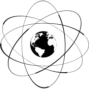
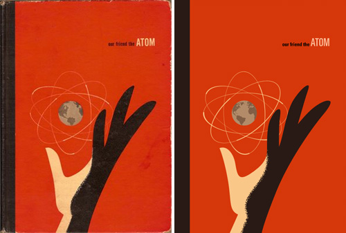
Found on ffffound a little while ago, this beautiful book cover. It reminds me of some books I used to have from the same era - I had a National Geographic book about all the massive engineering works being done in America in the early/mid 20th Century, from straightening and deepening the Mississippi to the building of the Hoover Dam. It was a bronze-coloured hardback with a big cross-section of the dam in white, and a plan of a canal cut across a loop of a river, in black, both embossed into the surface. I wish I still had it. Still, I’d only trace it as a vector like Our Friend The Atom, here:
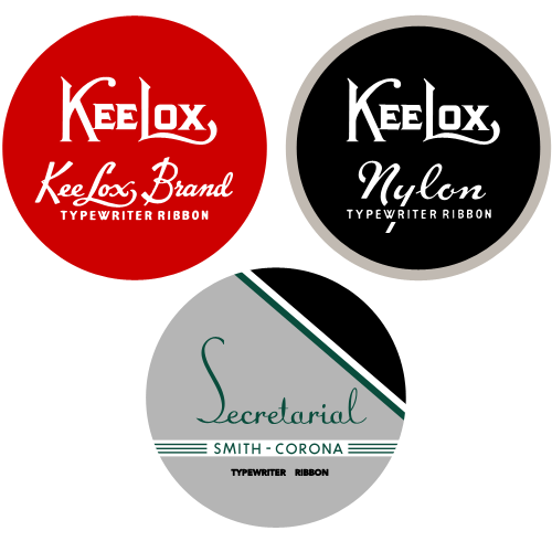
I came across this typewriter ribbon collection on Uppercase a little while ago, and there are some beautiful examples of typography and graphic design in there. They remind me of old tobacco tins, and oddly, of sewing consumables like cotton thread and needle tins. Go and have a look if you’ve not already (the collection is getting famous). Of course I’ve redrawn some of them…
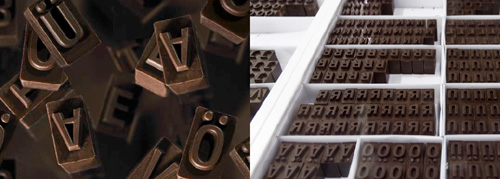
When I saw this chocolate type I had a thought that it would be fun to try and print using it. Just use warmed rice paper and off you go. OK, the type wouldn’t last very long, but each piece would be unique, and edible. Oddly, and just out of interest, it claims the letters are set in “FF FagoMo Bold”, but unless there’s another foundry out there prefixing their font names with FF, I can’t find it on FontFont’s site.
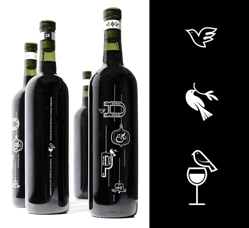
I saw this nice wine bottle design on The Dieline, and had to draw the little bird illustrations on them for myself. Just, because, you know. The bottle designs were done by the design director of Zeus Jones, Brad Surcey, and there’s more good stuff on the agency’s site.
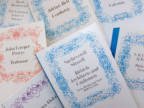
Looking back through CR Blog, I followed a link to this article about the Faber Finds service by the developers and designers, PostSpectacular. The whole thing is incredibly fascinating and quite exciting - taking its cue from the growth in low-volume self publishing services, the service goes further down the mass-customisation route so that each book is printed only when it’s ordered and with a unique, automatically-generated cover design. The cover designs are the most interesting bit, and while the Post Spectacular article doesn’t say whether Faber actually do generate a new one for each and every book (there are a couple of comments about that), the technology is definitely there to do it.
I actually did mean the latter too, every physical printed copy unique, leaving the era of mass production behind - the software was built for this exact context. Though having said this, I really can’t tell if Faber are following fully through with this plan.Karsten Schmidt
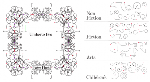
The patterns are based on sketches by Marian Bantjes, with four different types depending on the subject category of the book. The books are assembled on the fly as a web service using Processing, PHP and Java, and apparently while each cover takes only a second to generate, another automatic process weeds out ‘off brand’ ones. I’m often surprised by the almost casual way some really quite remarkable ideas and advances in artificial intelligence are used today - I’ve some knowledge of the subject from many years ago and such things as automatically detecting off brand designs would have been the stuff of futurists and science fiction back then. The description makes it sound simple and straightforward, which perhaps indicates how far things have developed.
Finding appropriate values to these design parameters required a phase of constant experimentation and conversations with Faber’s design team - these collaboratively agreed boundary values then became the encoded art direction within the software.
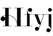
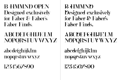
The typeface used for the covers, B HMMND, was designed specifically for the project by Michael C. Place, and while I can appreciate individual letterforms (some at left that I find rather beautiful) and see that they work well with the Bantjes’ patterns (and the Faber logo), they just don’t read very well all together. Some of the titles end up with extraordinarily uneven colour, with great dark patches of ink at one end of a word while the other end is a sketchy ghost of hair-thin lines. Maybe that ‘kookiness’ was the intention but I find it disappointing - the covers are far less appealing as a result; they just look messy and badly typeset. To my mind this typeface would be very successful as-is when manually typeset, or needs a whole bunch of alternates and Opentype rules to allow for a more readable result when set automatically.
I love the idea and how this service has been implemented (the cover titles aside); we definitely need to see more of this kind of thing so that we can get new copies of any out of print book in future. I know that there’ve been old books I’ve wanted to buy only to find that they’re out of print and that second, third and fourth hand copies are incredibly rare - sometimes impossible to find at all. I didn’t want a special first edition or something to squirrel away in an atmosphere-controlled book collection, I just wanted to read the book. For law-abiding, copyright-respecting people like me what options are there? Perhaps one day the whole idea of ‘out of print’ will fade away to be replaced by the very longest of Long Tail economics. I hope so.
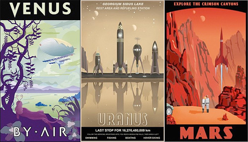
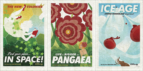
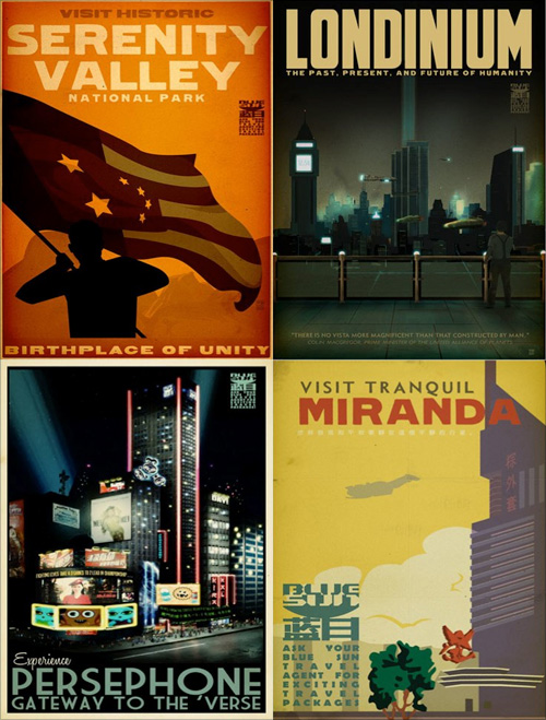
Again, some other things that have been doing the rounds but got stuck in my pile of ‘things to look at’. These travel posters by Steve Thomas, Amy Martin and Adam Levermore-Rich promote travel to exotic eras and destinations, such as the Crimson Canyons of Mars, Tranquil Miranda, or the Winter Wonderland of the Ice Age.
I like the ones for destinations in the solar system by Steve Thomas. Aside from their obvious fantasy, I find them a little poignant though. They evoke the ideas of the early 20th Century when we were going to colonise space pretty soon and it was going to be amazing. Except we didn’t, and space is pretty expensive and we’re only just starting to get space tourism, and even that barely above our atmosphere. Still, perhaps looking at these posters we can live in hope! Well, not for Uranus, what with it not having a solid surface and all, oh, and Venus needing some hefty terraforming… but Mars is about right! Oh, except it’s brown, not red. Ho hum:
Then the Amy Martin ones, which are simply beautiful. The colours are lovely, and these are the ones that to me more closely resemble travel posters:
Lastly, the ones that are from the universe of Firefly and Serenity. I have to admit I’ve not watched either so I can’t really comment other than to say they’re rather attractive. You can buy them here though.
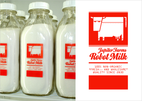
Found via Blue Tea, and via the visits to 826LA I made for the Robot Milk post.
I love robots, I love invented brands, and I love well-made artifacts, so this set of bottles really got my attention. Trouble is, there’s very little I can find out about it. I know it’s something to do with 826LA, it might be a student project, the bottles themselves might be for sale (though not from their online store) and that I would like one. Or two. Or three.
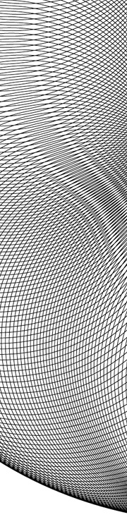
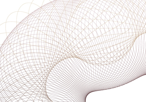
Banknote patterns fascinate me. I can get lost for hours in all the details, seeing how the patterns fit together, how the lettering works, the tiny security ‘flaws’ - they’re amazing. Central to banknote designs are Guilloche patterns, which can be created mechanically with a geometric lathe, or more likely these days, mathematically. The mathematical process attracted me immediately as I don’t have a geometric lathe and nor do I have anywhere to put one. I do, however, have a computer, and at the point I first started playing with the designs (mid-2004) Illustrator and Photoshop had gained the ability to be scripted. So off I went, using the hypotrochoid equations on Mathworld to create rather rough and ready patterns - scripting at this point didn’t have a very usable set of functions for creating beziers, so I had to use crummy line segments. The process took ages and served just to prove to me that I could do it, but the results were too poor to go much further.
Then, a couple of years later I discovered Grapher on the Mac. Aha! Now here was a program that could create the patterns I was after and export to EPS. Well, kind of. It could create the patterns, most of the time, and export to EPS, though not always. I got a couple of patterns out of it and had a look round for other options. Again, not much - not much that I could afford, that is.
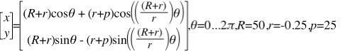
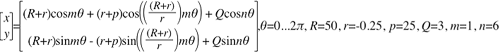
The basic hypertrochoid equation. This makes a nice rosette.
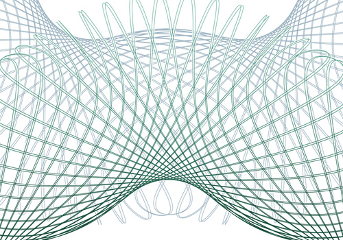
Then we get to now. I give Grapher another go, and at last, I can create and export patterns:
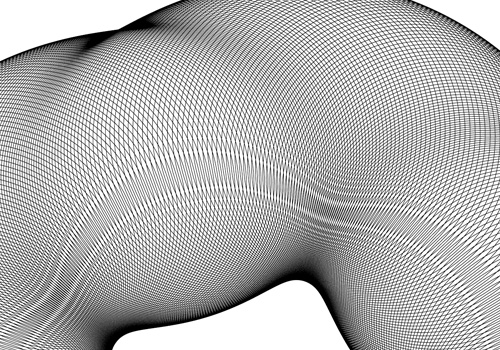
There are still some extremely frustrating limitations though. First of these is the resolution of drawing the graph. I’m sure for most graphs the default resolution is fine, but when creating these patterns you need tiny increments. Tiny tiny ones. If the line is going from one side of the graph to the other and back again a thousand times in a couple of radians, you don’t want the graph program to start dropping line segments, or corners, or anything really. Grapher does allow you to increase the resolution, but it’s not sticky - change anything in the equation and it pops right back to the default. Every. Single. Time. The same thing seems to happen with the line thickness too - I wanted all the designs to be at 0.1, but it kept changing it back to 1.0. Frustrating! There are a couple of other UI things I’d change, like having an option to keep axes at 1:1 ratio to each other, even when you resize the window.
Another, deeply irritating frustration with the whole process is to do with Illustrator. Try and open an exported EPS in it, and you get “An unknown error occurred”. Photoshop can accept the EPSs as placed objects, and InkScape can (eventually) open them, so Grapher seems to be outputting valid EPS files. I suspect that the number of lines in the graph is causing the premier vector editing app in the industry to fall over. Oh dear.
Still, after all this, I can still get the patterns made, and get them into an image editing program, which is quite something. Now I just need to find the magic numbers to create just the right patterns I want.
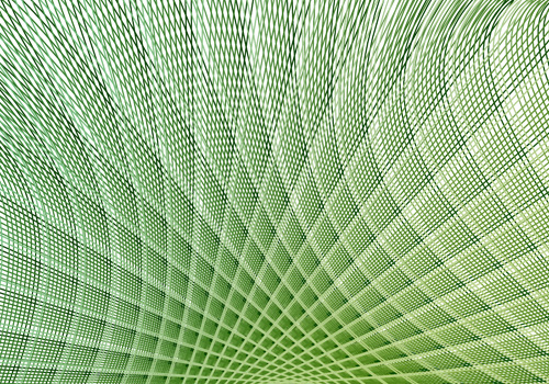
This beast creates the pattern above. The 'm' is not strictly necessary for this one, but varying it is good for experimentation.
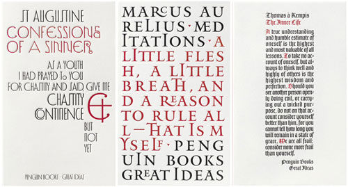
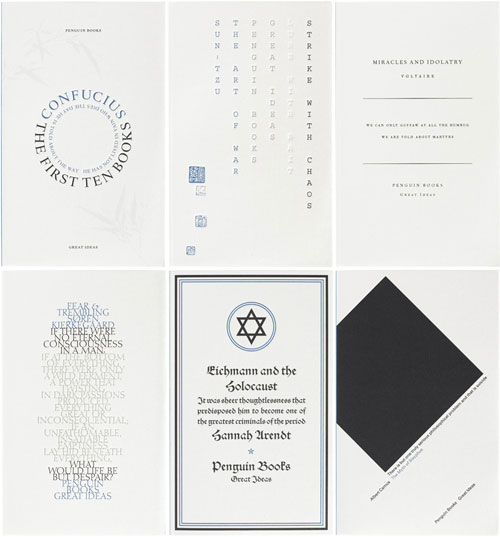
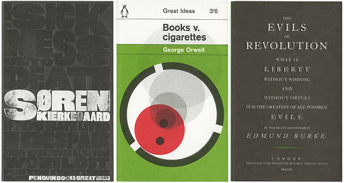
I’ve had these covers saved on my desktop for a while now, and I keep meaning to link to them. I saw the first set of Great Ideas books when visiting family last year, and was struck by the variety, creativity and humour of the cover designs. It turns out that there are two more sets, all done to the same standard. You can find the first set here, and the second set here. The third set seems only to be viewable on Flickr for now. I tried to find links to the boxed sets on Amazon but they appear to be unavailable - seems you can only buy the individual books. I like all the designs, but here are a few of my favourites:
These are from the first set. The ampersand on Confessions of a Sinner is quite special, the Meditations cover looks like it uses every ligature in Jupiter, and The Inner Life cover is just lovely - I’d like it as a large print.
English may not be Chinese, but when using monospace type, and with the right subject, you can get away with columnar type. There are some very nice typographic designs in the second set.
I have a couple of other favourites from the third set too, but these three are great.
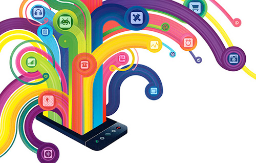
John Gruber (Daring Fireball) linked to this interesting article on Android, which is worth a read, but stop a moment and admire the illustration by Christian Montenegro. It’s quite something - the flat slab of technology and this glorious fountain of swirling colour coming out of the sharp-edged screen - if only real phones were nearly as exciting, with 3D display technology like that and everything. I’d go for an interface that launched out of the phone like that.