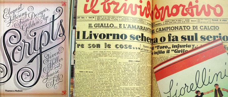
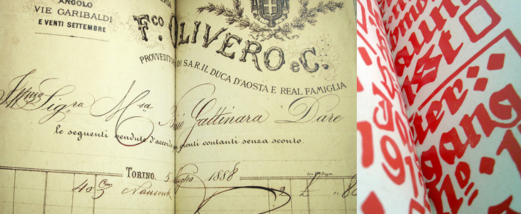
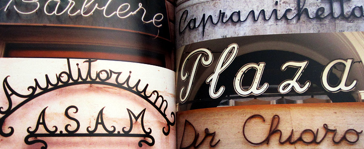
I’ve been sent a book by Thames & Hudson that I think is worth putting on here. The (slightly contentious) title is Scripts: Elegant Lettering from Design’s Golden Age*, and shows the collection by the authors, Steven Heller and Louise Fili, of handbills, flyers, posters, photos of signs, type samples, you name it, as long as it’s got script lettering or type on it. I’ve linked to a few big online collections of ephemera before, but never seen one in book form before. The photos are clear and detailed, and while I regret some (all) of the arty cropping, it’s a pretty good resource if you want to research scripts. The collection is broken down by country of origin (rather than by era or style, say) so there are chapters for French, British, German, Italian and American scripts. Thankfully, each chapter has at the end a listing of the origins of each of the pictured pieces, which provides some much needed context; however, I think I’d prefer to have had each image captioned, even if that might have reduced the impact of some of the spreads. A personal preference, I think; your mileage may vary. It’s definitely a book to enjoy browsing through, which is what I’ve been doing, funnily enough.
Interestingly, the book design is by Jessica Hische — I immediately thought of her lettering when I saw the cover, above left.
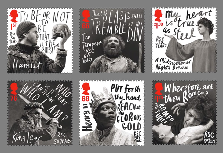
Creative Review highlighted this new issue of stamps from the Royal Mail by Hat-Trick, celebrating the 50 year anniversary of the Royal Shakespeare Company. The stamps feature images of David Tennant as Hamlet, Anthony Sher as Prospero, Chuk Iwuji as Henry VI, Paul Schofield as King Lear, Sara Kestleman as Titania, Ian McKellen and Francesca Annis as Romeo and Juliet accompanied by a line from a play rendered in gorgeous expressive lettering. I know that lettering has been applied to portraits for centuries, but these have a particularly graphic novel feel about them — the expressiveness, the iconic phrases used, the packing of text into white space, these are all ideas best known (to me at least) from the world of comics. Makes a lovely change from your usual setting of Shakespeare for stuff like this in an antique revival type — and is perfect for a company like the RSC. Get them from Royal Mail here.
What would Das Kapital, The Iliad or Faust look like if they were printed on a single page? What about Macbeth? This set of four posters by All The World’s A Page can show you exactly that. Oddly, they’re simultaneously both compelling and repellent — the concept, the flow of text, the exposed structure (especially in Macbeth) and the beautifully consistent and even colour give you a sense of wow, look at that, while the sheer scale of them, the obvious difficulty in reading them feels intimidating, even slightly upsetting. Not too upsetting, I might add; I bought two as soon as I saw them. I can’t wait for them to actually print Ulysses too…
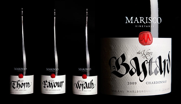
These wine labels, featured on The Dieline, by Marisco Vinyards are beautiful. They’re from “The King’s Series”, a range of wines produced to celebrate the family’s heritage — they’re descended from the tyrannical Marisco family who, during the 12th Century, owned and operated from Lundy Island, just off the coast of Devon. It turns out the family were periodically in and out of (but mostly out of) favour with the monarchy, inspiring the names of the wines, from The King’s Favour to The King’s Wrath. The labels were designed by Hook’s Christopher David Thompson and the beautiful, historically-appropriate calligraphy was done by Peter Gilderdale. I love the finishing on the labels — the textures are reminiscent of lacework and embroidered fabrics, and the strong varnish and deboss on the calligraphy makes it look like bright fresh ink. It’s all really rather lovely.
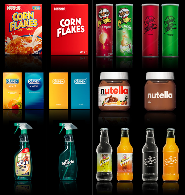
A few people tweeted links to this brilliant collection of packaging redesigns by Antrepo — they’re done as an exercise to illustrate the idea of reducing the design of the labelling to its simplest form, while also showing an intermediary step of a ‘partially simplified’ design. It’s interesting the effect it has on the different products. Some gain a sense of being a premium, high-value product, while others start to resemble economy, basic versions. The Pringles packs look pretty basic; with the full-colour printing gone, the basic nature of the cardboard tube stands out, and with the simple black printing it looks like a supermarket own-brand or something bulk-bought by caterers. On the other end of the scale you have Nutella and the Schweppes drinks — both of them look like the kind of ‘artisanal’ packaging you’d see featured on the Dieline or similar targeted at people who want the same old stuff but to feel a bit special about buying it. And having said that, the Corn Flakes one is just great. It’s absolutely perfect — if I ate cereal then packaging like that would definitely have shelf appeal with that beautifully simple and stark lettering, and how. It reminds me a little of the General Mills Kix packaging, which I also like a lot.
Visit Antrepo’s site for more info and links to the full set.
Of course, packaging for most fast moving consumer goods is brightly coloured and covered in imagery for a reason — it’s to draw the eye and make its purpose, contents or intended use immediately obvious to the shopper. Without going into some kind of pop-psychology analysis of consumer habits, it’s interesting to think what the manufacturers are intending with each package. The simplified Mr Muscle one looks great, but on the original you can easily tell it’s for windows and tiles even without reading any of the words. Similarly for the Durex boxes, I’d hazard a guess and say the orange box contains flavoured ones — the word ‘select’ hardly makes that clear — again, the original packaging wins out.
The food ones all have some kind of serving suggestion (albeit a ridiculous one in the case of the Corn Flakes, I mean, that’s quite a tempest going in the bowl) designed to put the image of the food in your mind, a simple association that makes you more likely to buy it. The only one I think where that doesn’t happen is with the Schweppes bottles. The type is pretty small on the simplified one, but it’s a hell of a lot more legible than the original. Given that you’re likely to see bottles like these in a fridge behind a bar, you’re going to be hard-pressed to read the label and form an idea in your mind that maybe you’d want mandarin as the mixer in your drink, as opposed to orange juice, say. You’re going to look and see confusing labels all done up with sparkles and images of bubbles, and not know if it’s soda and plain old OJ in them or something more special. You’d just end up asking for something generic, and end up (in a lot of British pubs at least) with some rank pre-mix out of a tap on the bar. I could mention at this point that Red Bull might be considered drinkable by some, and therefore a food. It’s not, but it is easily recognisable in a behind-the-bar fridge, which tells you something about British pubs and the drinking culture they encourage, but that’s an entirely different rant.
So yes, beautifully simple packaging is a wonderful idea, but I doubt we’ll see many big manufacturers opting for it, sadly.
The last time I posted about a set of maps made of words I was a bit hesitant about it. The map itself was attractive, and I liked a lot of things about it (I wouldn’t have posted it otherwise) but I did wonder how much of it was automatically generated, and how much of it was done by hand.
Not that there’s any problem with generating things automatically, as it takes just as much (if not more, sometimes) craft and creative energy to design, program and build something to do that, but sometimes with the computer generated stuff there’s a question of, “How much of this did you do?” Is it a plugin or script you downloaded? Should we be crediting someone else with the creativity and diligence to program the thing, and you with the idea to use it like this? Does it actually matter? It’s not like effort is ever any measure of quality, but of course we naturally associate a premium with something made in a way that doesn’t scale (through difficulty, moods, inspiration, randomness and so on), so that it becomes a unique object, or at least a rare one — this is the premium of the handmade, the crafted object. So this is what I was wondering about when I saw these maps by Seagull’s Hut, not made of type but hand-lettered, and then printed as limited editions:
It’s not like you can buy the original artwork, but it is in itself is unique, and the prints from it can only be copies of it; you can’t make new originals, which is something you can’t say for anything algorithmically produced. Well, unless you create AIs and they become conscious and develop an artistic sensibility that is. I’ve raised that issue before and had quite the flood of crazy comments from the internet’s vibrant and vocal apocalyptic tendency, including the gloriously and perhaps unwittingly eloquent, “humans will be instinct”.
So yes, don’t get me wrong, I do like the maps from Seagull’s Hut. Shame I can’t link to them directly, but go and take a look at their store. I don’t think I’ll be posting about any more maps made from lettering or type though. The inspiration has become a meme, and is ever more dulled by the transformation.
I love architecture. I love buildings — the art, the engineering, the design, the culture and history of them, and how they form en masse actually places that people recognise and form emotional attachments to; the design of cities, their growth, evolution and (perhaps sadly) eventual decline are all utterly fascinating to me. So I sometimes write about architectural stuff here, as it has a kinship in my mind with the design of type and lettering. I should warn you, this post is a bit of a rant, and because of the subject matter is a tad more political than normal. So, with that out of the way, we can proceed.
I follow a fair few architecture-related sites, one of which (and the most regularly and rewardingly updated) is Arch Daily. It’s basically a pretty damn fine site if you’re into architecture, featuring thousands of projects, new and old, innovative and traditional, and so on. One important thing I’ve noticed is that most of the larger projects being planned and built have a lot in common with each other, with innovation and traditional technique alike apparently reserved for the smaller projects. I’d actually go further and say these large projects are not merely similar but all subscribe to the same blank, unrelenting anonymity — an utterly uninspiring (if glittering and crystalline) mediocrity. Look at the renders below (from this article on New Chengdu City Center on Arch Daily), they could be anywhere in the world:
We’re not talking about adherence to some new International Style here — these buildings subscribe to no ethos, no design principle, no philosophy. They are the safe, neutral buildings guaranteed to be approved by conservative planning departments wanting the skyline of New York, Chicago or Hong Kong at any cost, ignoring the culture, history and sense of place of the city they’re supposedly ‘improving’, and with little to no apparent understanding of the conditions that gave those cities their skylines. Oh sure, they’ll package up some significant buildings, a monument here, a couple of streets there, and they’ll be prettied up and photographed for the ‘culture’ section of tourist brochures, and meanwhile vast swathes of the city will disappear under motorways (labelled ‘boulevards’), office blocks (sorry, ‘towers’) and shopping malls (or ‘pedestrian-friendly traditional streets’) and dreary dormitory estates (‘upscale residential developments’). Then they stick some thin screed of greenwashing over the top and invoke the holy acronym of LEED and declare themselves satisfied.
At this point I probably sound like some arch-traditionalist, railing against the depredations of the modern world and all it brings, but that’s not my intention, or my point. My problem with these developments is that they’re being sold to rapidly-expanding cities around the world and aren’t being designed with the long-term life of those cities in mind. Cities like Chengdu have ancient histories and in some cases still have some of their original structure and urban fabric intact — architecture firms, planners, and most importantly, citizens need to recognise what’s valuable about the best and even the worst areas of their cities and think long and hard before approving any large-scale improvements. If this sounds like western cultural imperialism, the jumped-up western opinionist telling people desperate for an improvement to their lives that they should keep their barrios, their slums, their favelas and their cramped hutongs then perhaps it is. But then, I’m not the only one to say it and this isn’t to say those slum areas should stay slums, that they can’t improve or change on smaller, community-level scales. There doesn’t have to be an overarching project to demolish and replace them with some glittering arcology, instead, a longer-term effort to support the communities within them and prevent their control by gangs, just like what’s happening in the favelas of Rio de Janeiro, including the infamous City of God itself:
For decades the favelas have been a deadly battleground, where thousands died in the turf wars of rival gangsters and drug lords. But two years ago - in anticipation of the football World Cup in 2014 and the 2016 Summer Olympics, the government launched a new initiative. Since then the Police Pacifying Units (UPP), have moved into 12 favelas, freeing 150,000 people from the control of the gangs and bringing a new calm to embattled neighbourhoods.
While the Chengdu development appears to be built at the edge of the metropolitan area, giving perhaps the possibility of the city’s core remaining intact, there are a whole new set of problems as the city expands into wild areas and farmland. Earlier this year Václav Havel explained some of the problems this kind of expansion can cause, citing his experience of the changes to Prague in recent years:
What was until recently clearly recognisable as the city is now losing its boundaries and with them its identity. It has become a huge overgrown ring of something I can’t find a word for. It is not a city as I understand the term, nor suburbs, let alone a village. Apart from anything else it lacks streets or squares. There is just a random scattering of enormous single-storey warehouses, supermarkets, hypermarkets, car and furniture marts, petrol stations, eateries, gigantic car parks, isolated high-rise blocks to be let as offices, depots of every kind, and collections of family homes that are admittedly close together but are otherwise desperately remote.Václav Havel at Forum 2000, October 2010
You can see the effect of this round many British cities; instead of a boundary, the place tails off with business parks, warehouses, big-box stores, and strange areas of empty land, prevented from becoming wild, not used for agriculture, not built on, just waiting. There is nothing about these hinterlands that gives you any clue to where you are, not just which city, but which region and (road signs aside) even which country. Governments bang on about growth, endless growth, but very few people seem to ask what kind of growth it is we want. The kind of growth that turns our cities into this kind of anonymous emulsion of steel, glass and concrete doesn’t seem to be the growth anyone would choose, but the consequences of any individual action that bring it about are so far removed that effectively our choices are abstracted to boardrooms and cabinet offices, where we have little say. When faced with the Anywhere City, should you just shrug and accept it?
It’s so good to see Drawn (sort of) back again, I’d sorely missed its regular supply of illustrations and tutorials and feared it would never come back. But no, thankfully it’s back (as a Tumblr blog) with a beautiful new logo lettered by Chris Gardner. The grammar wonk in me is glad they’ve dropped the exclamation mark from their name too — makes referring to it a little easier, no?
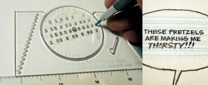
So yes, the Ames Lettering Guide — Drawn linked to a nice tutorial on using one by Dustin Harbin, which brought back some memories of school for me. I remember we were shown how to use one and set some exercises, but since then the hand lettering I’ve done hasn’t had quite the constraints (or the volume) to need anything more than a ruler and a bit of patience, so I’d completely forgotten the thing existed. I’m sure there’s one back at my parents’ in a box somewhere. Maybe I’ll dig it out, because now it seems like a useful thing to have around.
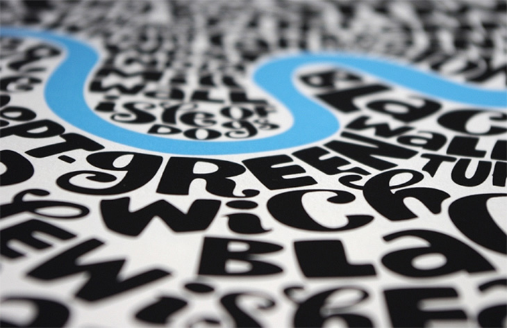
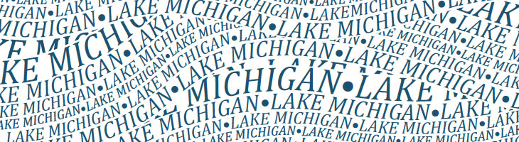
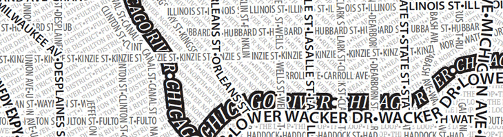
I like the idea of typographic maps, from the fairly abstract ones by ORK to the impressively detailed linocuts by Andrew Webber, so it’s nice to see another approach, especially when there are some clever little touches. These posters from Axis Maps show maps of Chicago and Boston made entirely from type, using a technique that is fairly straightforward and which could risk producing a rather dull result, but Axis have created textures and used typographic colour to create an interesting set of images. The overall effect is pleasing, and I think if there was a New York or London version I’d be tempted to get one. A couple of details showing some of the effects I like — using a heavy stroke on type to create the dark line of a river and the overlapping curved text to create the waves on Lake Michigan:
An obvious solution perhaps, but it works rather nicely.
One little niggle though. As much as I like and admire Museo, I don’t think it works as a titling face on these maps, not at this size, and not in this context anyway.