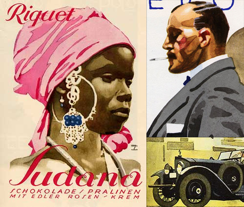
Ludwig Hohlwein

I’ve had some images from these articles in my ‘inspiration’ folder for about two years now, maybe even three. I’ve only just got around to looking closely at the lettering on them - it was the virtuoso watercolour technique that attracted me to them originally. The most interesting one for me is the Sudana chocolate poster… or is it packaging? The article doesn’t say. I think the best way to understand lettering is to redraw it using beziers - not a technique that works for everyone, but it works for me. I noticed right away that the letters are drawn with refinement and precision, and it was a very pleasant job to reproduce them with (almost) every point at extrema. The ‘S’ needed a couple of extra points along the main stroke, as if Holwein applied a little extra pressure at the midpoint to create a subtle bulge there. The swirly ‘a’s are a little more involved, and to draw them so they can be rendered reliably means a few extra points and outlines, and what with this being lettering they are of course different from each other. I doubt I’ll want to create a font out of these, but I’ll keep them handy for any lettering projects I have, that ‘R’ especially.

The Lure of the Collection

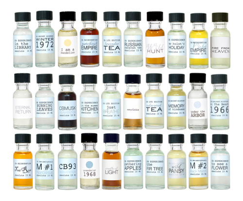
I remember as a kid finding a load of little glass bottles buried among some building waste in the garden. I’m not sure where they came from or what they were for, but I know one still had a bit of cork stuck in its top, and each one had a different shape embossed into the front. I was fascinated with them, and what they could have been for - clearly nothing environmentally persistent, nothing toxic anyway. I washed them out and kept them for a while, eventually losing track of them in the whole growing-up thing. So, when I came across this collection of perfumes (via Non 2) I had quite a nostalgic moment. It’s an oft-remarked phenomenon that things that are individually uninteresting or unremarkable gain a special significance and appeal when collected together. A scan of a coffee stain on paper is nothing special, but scan a whole load of coffee stains in and upload them to Flickr, hey presto! It’s interesting!

The Nature of the Beast

Jeremy Pettis has produced a wonderful series of typographic illustrations, representing 26 animals - one for each letter of the alphabet. For each, custom lettering is designed to convey the appearance or behavioural characteristics of the animal. They’re all very clever, and some require a bit of contemplation to ‘get it’. My favourite is the (perhaps) rather obvious, but beautiful Zebra one, though the Kangaroo one has an ‘ar’ ligature that’s just perfect:

He’s put the background sketches and roughs on Flickr, which is a great use of the site and for once, a use of the site that I actually can get behind. Flickr’s soviet, rigid, artless presentation is actually ideal as a kind of digital scrapbook for roughs.

The Other Ministry

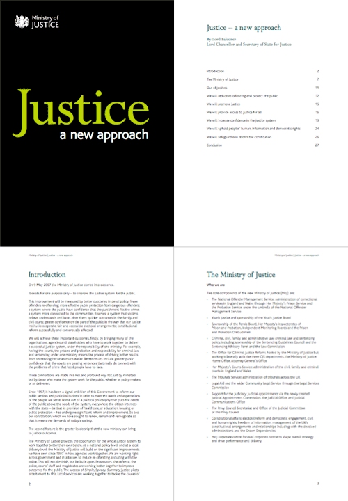
Digging around in my files this afternoon, I found this PDF. I’ve had it since early June 2007 after being sent it by David, who noted that they’d developed a branding remarkably similar to the far more important Ministry of Type, something I still find amusing. Hey, I was here first - just. The combination of white, black and chartreuse must be quite the current fashion for ministries - though I notice that the website carries the oh-so-accessible-but-dull Standard Public Sector branding. Shame that, as the branding of the PDF is rather pleasant.

I was trying to identify the typefaces used. It’s unlikely to be a custom job since the time between the announcement of the MoJ and the publication of this document was only a couple of months. I doubt they’d have been able to create a whole new typeface in that time. Also, the branding was included in the costs of “capital, hardware, accessibility, branding, templates, desktop” - £700,000 in all, and after the costs of IT that doesn’t leave much. So yes, I think it’s a modified version of Bliss - the y is not quite exactly the same, so perhaps some tweaking was done (if I’m right). As for the serif, that’s Perpetua. Quite a nice combination really.

The logo and some sample pages:

Manhole Art

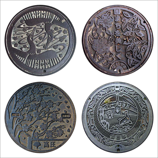
I’ve had this page of manhole covers open in the browser for the past few days, one of those things in the should-look-at-more-closely category. I’ve had a better look now, and I was reminded of seeing Japanese manhole covers, and they come in a much greater variety of designs (and colours!), so I was wondering why manhole covers are often so dull. I watched a How it’s Made on manhole covers the other day, and there’s no real reason why a city, region or département (say) shouldn’t have its own design.

This site has a good collection of images of Japanese manhole covers, four of which I’ve cut out below.

The Nonist

I used to read the Nonist ages ago, and then it went ‘on sabbatical’ for ages. I’ve only just noticed that it’s back (despite posting a link to it recently - I thought it was an old post).

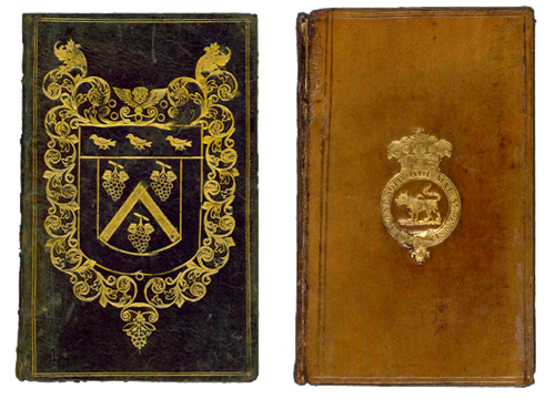
Anyway, this post brought me to a great selection of interesting bindings from the British Library. Worth a look through the site as there are lots of inspirational links and posts.