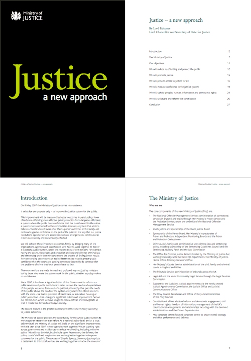
Digging around in my files this afternoon, I found this PDF. I’ve had it since early June 2007 after being sent it by David, who noted that they’d developed a branding remarkably similar to the far more important Ministry of Type, something I still find amusing. Hey, I was here first - just. The combination of white, black and chartreuse must be quite the current fashion for ministries - though I notice that the website carries the oh-so-accessible-but-dull Standard Public Sector branding. Shame that, as the branding of the PDF is rather pleasant.
I was trying to identify the typefaces used. It’s unlikely to be a custom job since the time between the announcement of the MoJ and the publication of this document was only a couple of months. I doubt they’d have been able to create a whole new typeface in that time. Also, the branding was included in the costs of “capital, hardware, accessibility, branding, templates, desktop” - £700,000 in all, and after the costs of IT that doesn’t leave much. So yes, I think it’s a modified version of Bliss - the y is not quite exactly the same, so perhaps some tweaking was done (if I’m right). As for the serif, that’s Perpetua. Quite a nice combination really.
The logo and some sample pages:


