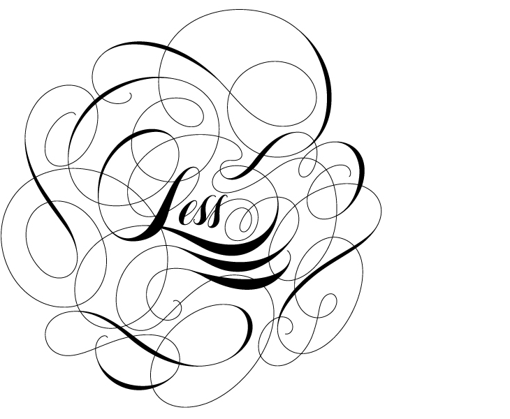
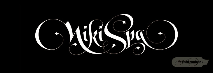
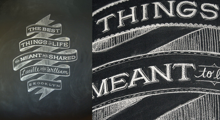
Lettercult has posted an incredible collection of custom lettering projects by hundreds of lettering artists, all completed in 2010. There are so many projects that they’ve split the post across two days, and there are 33 (quite long) pages in each post. I’ve not had a chance to go through all of them yet, but the variety and the quality is remarkable — so much to look at! I’ve posted a few favourites below, one by David Croy, another by Jordan Jelev of The Fontmaker, and I’d be surprised if you’ve not seen her work already (but very worthwhile admiring again), a piece by Dana Tanamachi.
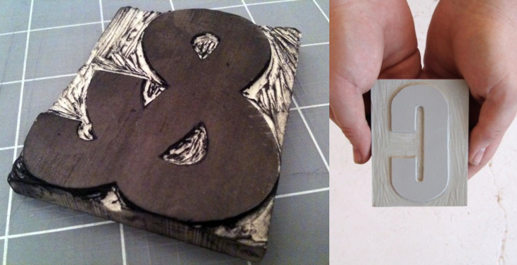
Brooklyn-based designer Aymie Spitzer is carving a linocut letter every day throughout March, and blogging about the process (and the results) on a project site. It’s a nice idea (I like these A Thing A Day/Week/Month things anyway), with aims best put by Aymie herself:
This project is purely an experiment of learning how to carve letter forms. It’s about developing my hand skills, technique through repetition, focus, and dedication. Most importantly, this is about having loads of fun because using my hands to create is what I live for.
What’s more, she’s basing her letters on Champion Gothic by Hoefler & Frere-Jones, because of its beautiful ampersand. Nice.
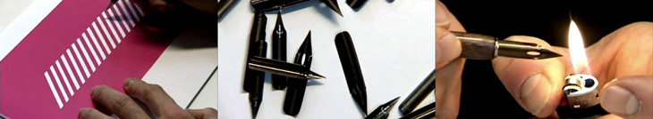
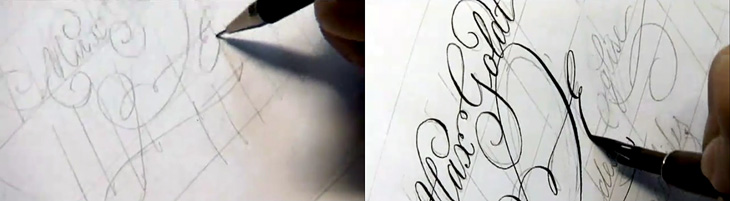
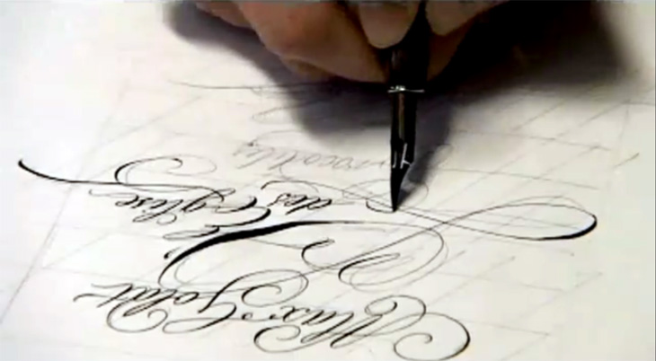
Continuing the process theme of my last post, Jan Middendorp posted a link to this (mostly) non-digital handwriting and lettering process by Frank Ortmann of Freies Grafik Design. I’ve done a few screenshots from the video to give you an idea of it, but nothing beats watching an expert directly. I particularly enjoyed the practice work — this time spent ‘loosening up’ is (I think) a key part of any creative process, digital or not. Go and watch the whole thing, it’s good.
I’m endlessly fascinated by seeing how people work. Everyone who perseveres and creates something will find their own way of doing it, but seeing how other people work is extraordinarily helpful for getting started, overcoming creative block or frustration at the amount of grunt work something takes, or just for gaining the confidence to just get the job done. Sharing techniques doesn’t mean you lose your ‘edge’ or some kind of competitive advantage — if your success relies on something like that it’ll be a short-lived kind of thing anyway, as no matter how good the technique someone, somewhere, will find a better way of doing it. What you actually create is unique to you. If someone wanted to rip you off they wouldn’t copy your technique, they’d use something far easier to master, like a photocopier.
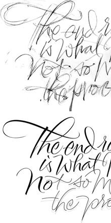
So yes, sermon over. I was thinking of this while reading this post by Alan Ariail on his site The Art of Hand Lettering. In it he describes the results of a discussion with Yves Leterme during one of his workshops, namely the idea that, “The end result is what matters not so much the process”, and goes on to show some of his own processes. I was surprised to see how he goes from sketches to digital monoline ‘skeletons’ of letters, building them up to a calligraphic result. I’ve done a fair bit of stuff like that and always had a niggling doubt, the idea that of course, real letterers wouldn’t do this. Well it turns out that they do. Marvellous!
I would make one personal comment on the whole result/process thing though. I do think that process matters — not in any professional or even moral sense (I use the term loosely) — but in a personal, artistic one. The process is what you spend your time doing so it matters in that it should be enjoyable, satisfying and inspiring. It’s a shame that with many of the digital tools available there’s a distinct lack of joy in using them. But if you do find something that’s good, let the developer know you like it, and just as importantly, tell everyone else. But that’s my original point again.
What would Das Kapital, The Iliad or Faust look like if they were printed on a single page? What about Macbeth? This set of four posters by All The World’s A Page can show you exactly that. Oddly, they’re simultaneously both compelling and repellent — the concept, the flow of text, the exposed structure (especially in Macbeth) and the beautifully consistent and even colour give you a sense of wow, look at that, while the sheer scale of them, the obvious difficulty in reading them feels intimidating, even slightly upsetting. Not too upsetting, I might add; I bought two as soon as I saw them. I can’t wait for them to actually print Ulysses too…
There are many examples of ‘animated typography’ out there, some of them are good, most of them are crap, and some just take you by surprise and are utterly brilliant. This one on Newgrounds, sent to me by a friend, fits the ‘utterly brilliant’ category, but for slightly different reasons than you might expect.
It’s an animation of a review of a game on the site, written by someone who, if we’re being charitable, isn’t a very careful typist. The animation itself (by Mick Lauer) is well done, with some nice touches — the pause to define ‘contrail’ and the ‘explain to me’ parts are particularly good — and Impact is a perfect choice for the subject matter, but what really makes it brilliant is the voice track. It was done by voice artist Deven Mack who I imagine has quite the career ahead of him. Well I hope he does.
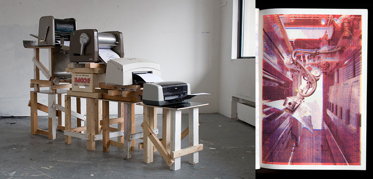
Simon Goode just linked to this on Twitter — a book by Xavier Antin, made by printing each of the four colours on different eras of desktop printing technology in succession. It’s just fun. The results are pretty much what you expect, but still rather attractive and made more interesting by knowing how they were printed, using technology spanning nearly a hundred years. More images here.
This caught my eye on the Lovely Ligatures Flickr group — it’s a piece of client work by the talented bunch at Like Minded Studio. So much of their work is just the kind of thing that has me looking closer, perhaps with a touch of chagrin that it wasn’t me that did it, there’s so much incredibly detailed work going on there. Go and take a look at their site to see more of their work.
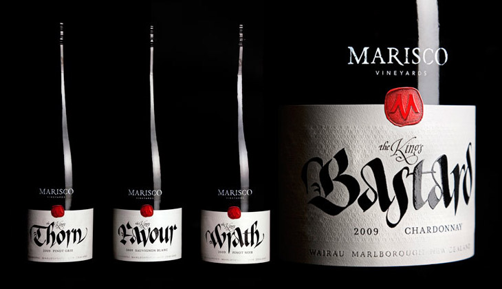
These wine labels, featured on The Dieline, by Marisco Vinyards are beautiful. They’re from “The King’s Series”, a range of wines produced to celebrate the family’s heritage — they’re descended from the tyrannical Marisco family who, during the 12th Century, owned and operated from Lundy Island, just off the coast of Devon. It turns out the family were periodically in and out of (but mostly out of) favour with the monarchy, inspiring the names of the wines, from The King’s Favour to The King’s Wrath. The labels were designed by Hook’s Christopher David Thompson and the beautiful, historically-appropriate calligraphy was done by Peter Gilderdale. I love the finishing on the labels — the textures are reminiscent of lacework and embroidered fabrics, and the strong varnish and deboss on the calligraphy makes it look like bright fresh ink. It’s all really rather lovely.
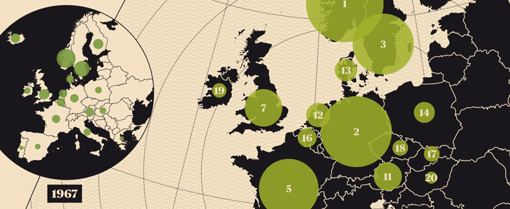
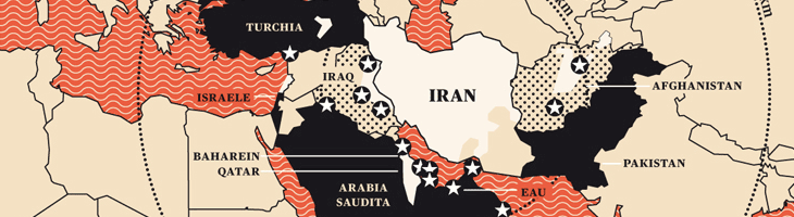
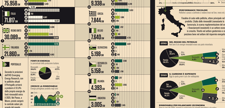
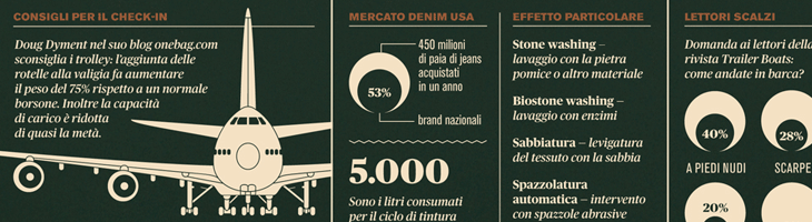
I’ve seen and admired Francesco Franchi’s editorial work before, but I hadn’t seen his Flickr stream until now. It’s quite an inspiration — I love how clearly and crisply everything is rendered, and there’s real artistry in the fine details and the balance of illustration, diagram and infographic in his work. Sadly I’m not fluent (or even competent) in Italian so I don’t know how well the words and pictures work together — any Italians out there like to enlighten me? It certainly looks like it should be a good read, but then, so does Monocle, and it isn’t. Anyway, go and have a look, and be inspired. I’ve put a few details from some of my favourite spreads below: