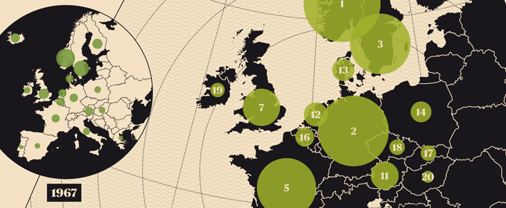
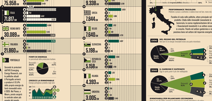
I’ve seen and admired Francesco Franchi’s editorial work before, but I hadn’t seen his Flickr stream until now. It’s quite an inspiration — I love how clearly and crisply everything is rendered, and there’s real artistry in the fine details and the balance of illustration, diagram and infographic in his work. Sadly I’m not fluent (or even competent) in Italian so I don’t know how well the words and pictures work together — any Italians out there like to enlighten me? It certainly looks like it should be a good read, but then, so does Monocle, and it isn’t. Anyway, go and have a look, and be inspired. I’ve put a few details from some of my favourite spreads below:


