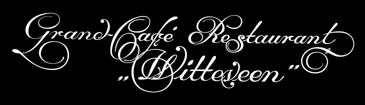
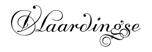
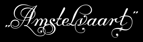
Another gem found through Coudal, this. Re-Type posted an article about the beautiful lettering by Leo Beukeboom on the windows of bars and cafes in Amsterdam (with a nice appreciation of decent, old-style, non-trendy bars in there too). There’s a series of photos with the article, which I’ve traced the lettering from (below), and as a bonus Re-Type themselves are working on interpreting the lettering into an Opentype face, which so far looks great - can’t wait to see it finished.
I did a bit of hunting around for more information on Beukeboom, and found this article on David Quay’s site, containing a lot of background information and an interview, which is fascinating and well worth a read. I’m particularly taken by this:
The letter you use on a pub window depends on the type of pub. If you have a traditional brown café, with lace curtains on copper curtain rods, with stained glass windows, you choose a nice, ornamental curly letter, because it fits in with the environment. It is not the information that counts, because everyone can tell it’s a café, but it’s about decoration, about creating an atmosphere. For the lettering on the traditional brown cafés I developed my own script based on the calligraphy of Jan van den Velde.Leo Beukeboom, from David Quay Design
I love that. The words themselves become secondary to the style in conveying information - without knowing what it says, you know what it says. Certainly not an infallible system, but most types of place (and many things) have their signature look, and as I’ve posted before (warning, extremely wordy article) you should know what you’re doing before you mess with it. They’re the design patterns of urban existence, if you will, though in the case of Beukeboom’s lettering, this is one that is slowly fading - unless anyone wants to become his apprentice that is. If he still wants one.
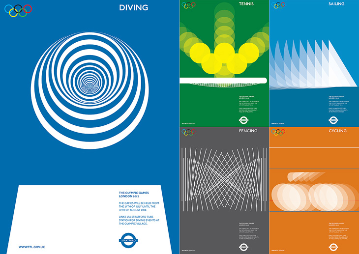
I am indebted to Adrian Giddings for finding the originals of these images. I saw them on Design Crush, and from there to ffffound and from there… a blank. Blogger really needs some kind of reverse lookup for their dreadful impenetrable image URLs, and ffffound needs to better record the URL of the page containing the image. Still, I now know where these posters are from. They’re clever, simple, and have a graphic elegance reminiscent of Otl Aicher’s work for the 1972 Munich Olympics, with typography that is pure London. If Wolf Olins had gone down this route I’m sure there would have been far less controversy about the branding for London 2012.
Of course, these are proposals designed to work with the Transport for London branding, not for the Olympics, and I think work perfectly in that context. For the Olympics itself, for all their cleverness and simplicity, they’d be a bit too classic Olympics, a little too safe. Perhaps.
As for the actual 2012 logo/brand, it’s has been out for quite a while now, but I’m still not entirely sure yet what I think of it - I don’t like it, but it may be exactly right for the event. We won’t really know until after the Olympics, and then, no doubt, we’ll have plenty of learned analyses about it to tell us what to think. I wonder how agnostic I’ll be able to be.
Yes, it’s finally here! Typographica’s Favorite Typefaces of 2008, the fifth annual collection of reviews of the best in typeface design. I’ve not read all the reviews yet (that’ll take a while) but from the ones I have read you should set aside a couple of hours and go and take a look:
Stylistically, this year’s selections run the typographic gamut: slab serif, typewriter, blackletter, stencil, brush script, geometric sans … and some that are difficult to neatly classify. Some represent contemporary innovations in editorial style, while others look back to pre-typographic history for inspiration. Typographica
Also of note is the swanky new design for Typographica itself - the first significant redesign of the site since 2002, heralding its transition from a blog to a full-time review site. Congratulations to all involved!
When I was writing about the St John’s Bible last week I was reminded of the typography of Coventry Cathedral and wanted to post a couple of pictures of it then, but I wasn’t immediately able to find decent pictures. I’ve had a proper look round, done some more research and found some pictures and I think given the history of the cathedral it’s an appropriate post for Easter Sunday, with themes of rebirth and all; Following the destruction of St Michael’s Cathedral (and much of the city) in a Luftwaffe attack on the 14th of November 1940:
…the then leaders of the Cathedral Community took the courageous step to build a new Cathedral and preserve the remains of the old Cathedral as a moving reminder of the folly and waste of war. From that point, Coventry Cathedral became the inspiration for a ministry of peace and reconciliation that has reached out across the entire world.Wikipedia: Coventry Cathedral
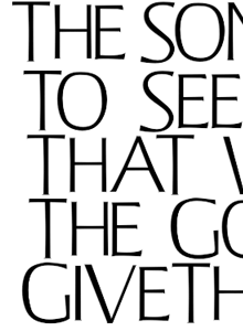
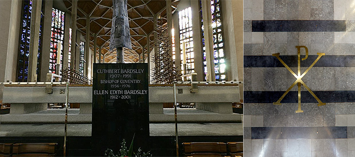
The new Cathedral was designed by Sir Basil Spence (who also designed my alma mater, Sussex University), with stained glass by John Piper and Keith New, the great tapestry by Graham Sutherland, sculptures by Jacob Epstein and John Bridgeman, the Great West Window by John Hutton and last, but absolutely not least, lettering and carvings by Ralph Beyer. It’s this lettering that fascinates me, and it’s strange that there are so very few pictures of it.
Some of the Tablets of the Word by Ralph Beyer. Picture from the QTVR movies in the Virtual Tour. There is also a picture from 1962 on the Time Life website here.
When I was looking for pictures I revisited the Cathedral’s website (which for some reason has no photo gallery) and realised that it’s possible to get some decent pictures out of the well-intentioned but bizzarely designed ‘Virtual Tour’. So with one exception (below), that’s where I got the pictures here. I don’t like being negative, but that virtual tour really could have a better user interface. It dominates and detracts from the movies, which are presented at a size that’s far, far too small - the content and the Cathedral deserves better than that.
Detail of one of the Tablets of the Word by Ralph Beyer. Picture by Herry Lawford on Flickr.
How Beyer came to be chosen for the Coventry Cathedral project is interesting, and includes a fair few other famous names and some remarkable coincidences. I have to quote fairly liberally from his obituary in the Times, or I’d just be rewriting it:
In 1937, aged 16, Beyer visited England where, on the recommendation of Mendelsohn, he spent six months as an apprentice to Eric Gill. Like Gill, and doubtless enthused by him, Beyer was fascinated by the qualities of carved stone, by simple sculptural forms and especially by letterform. Ralph then studied in London, at the Central School of Arts & Crafts and at Chelsea School of Art where he met Henry Moore, for whom he worked briefly before being interned as an enemy alien at the outbreak of the war.The Times
While in the internment camp, he met and befriended the young Nikolaus Pevsner, who had started work on An Outline of European Architecture and would later write the Pevsner Architectural Guides.
Encouraged by Henry Moore, Spence decided that, the Sutherland tapestry apart, the dominant decorative feature of the interior of the new Coventry Cathedral should be lettering rather than narrative sculpture. He knew he was looking not simply for a craftsman but for an artist capable of making a truly distinctive contribution. It was Pevsner who suggested that Spence should meet Beyer, to learn how he might approach a project which was to become the defining challenge of his life.The Times
The Independent has a more extensive obituary, and highlights a good point about the style of the modern Church of England being inspired by the early church, which I think is what reminded me of this work when looking at the St John’s Bible:
Although Spence’s cathedral was criticised for its conventional Latin cross plan, Beyer’s Tablets of the Word reflected post-war ecclesiastical interest in the early church and today they remain strikingly innovative examples of lapidary art.The Independent
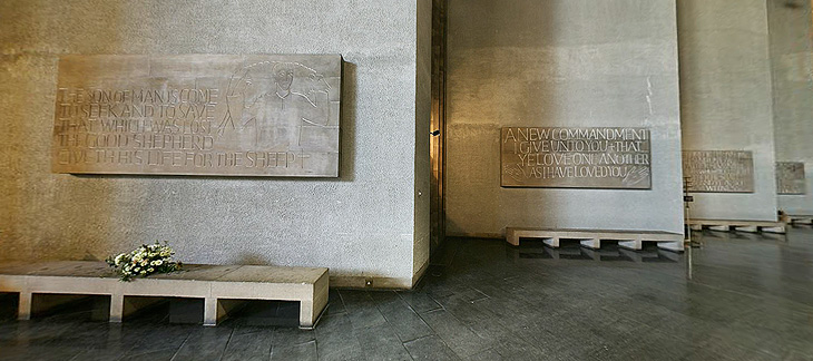
Beyer also designed a typeface for use on hymnals and other publications. The cathedral website makes good use of the typeface using Flash, and using browser zooming and screenshots I’ve assembled the text at right and top right. Of course that’s no substitute for the real typeface; I’d like to see if there’s a lowercase, other weights or styles, what the rest of the numerals look like, and how it’s kerned.
Further use of the Beyer face behind the altar, and at right more influences from the interest in the early Christian church, with the Chi Rho symbol, denoting Christ.
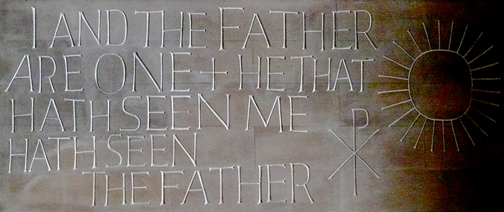
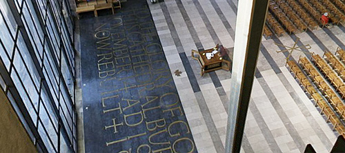
The inlaid lettering by the Great West Window. Finding clear pictures of this is nigh-on impossible, and I’m tempted to turn up with my camera and tripod and make my own. As it is, here’s a closeup.
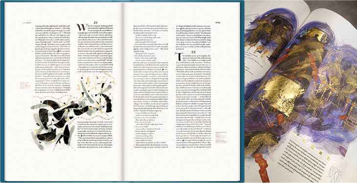
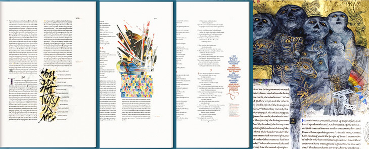
This may be a bit of an old link, but it’s new for me, I think. The St. John’s Bible is a project by Donald Jackson (and team) and Minnesota’s Saint John’s Benedictine Abbey & University to produce a hand-written and illuminated bible to, as they put it, celebrate the new millennium. It’s both a massive project and a massive book - over 1000 pages with spreads 80cm wide by 60cm high, produced over 10 years at a cost of four million dollars (though its value may be denominated in other ways). The origin of the work is interesting in that it comes from the classic desire to complete a magnum opus:
For many years Donald Jackson, Senior Illuminator to Her Majesty’s Crown Office, had dreamed of creating a modern, illuminated Bible to celebrate the new millennium. Finally, in November 1995, he presented the idea to Saint John’s Benedictine Abbey & University in Minnesota.¶ Work started in 2000 and is scheduled for completion in 2007, at a total cost of over £2 million. It is taking place in a scriptorium in Monmouth, Wales, under the artistic direction of Donald Jackson and his team of scribes and illuminators.The Victoria and Albert Museum
Jackson has brought together an incredible range of styles for the bible, from rich, lush, gold-encrusted illuminations reminiscent of Eastern Orthodoxy to crisp and spare compositions more like the modern style of the Church of England (to my mind at least):
The Saint John’s Bible will represent mankind’s achievements over the past 500 years. It will be a contemporary blending of religious imagery from various Eastern and Western traditions, as befits our modern understanding of the global village.St John’s Bible website FAQs
The disparate styles are unified by the common thread of that beautiful lettering and calligraphy, and by the script for the main text designed specifically for this project by Jackson himself. I’d love to hear more about that project! You can just about make out the script on the larger watermarked images. Just.
Which last point leads me nicely onto my one little whinge, not about the project, but about the website for it: I just wish there were a couple of closeup photos of the bible on the site. I can see why they’d be wary of possibly having their hard work ripped off, but it’s not like you need full-page scans to see the quality of the calligraphy and detail; a few square centimetres would do. After all, the prints aren’t all that cheap, and getting a bit of a closer look would be reassuring. Of course, if you’re seriously loaded, you can buy a copy of the Heritage Edition, for $145,000. If there are any left, that is.
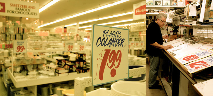
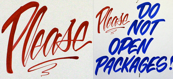
Ah, the things you see on Twitter. Just now @Elianneke linked to this Torontoist article about the hand-painted signs at Honest Ed’s. Yes, they’re hand-painted, in one department at least, by Wayne Reuben and a colleague called Douglas. I bet Honest Ed’s could do a good sideline in selling used signs online - I’d buy some.
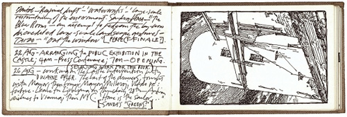
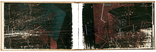
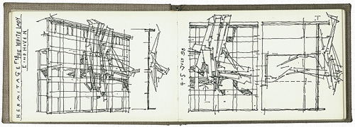
I’ve had these three pages on in tabs for a few days now and I just enjoy reading and looking at them, so I thought I should share the links. They’re three notebooks by Lebbeus Woods, the artist and architect. If you enjoy these (I certainly do), you should also have a look through the rest of his blog, and if you don’t mind all-Flash sites, perhaps look at his official site too.
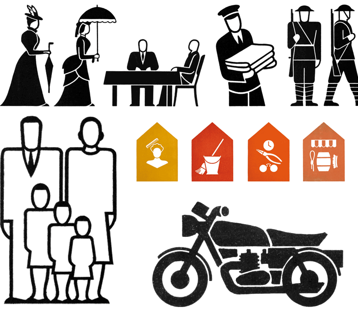
A couple of weeks ago I linked to the AIGA set of passenger and pedestrian symbols, and I find today (again, via Chris Glass) this set of icons by Gerd Arntz. These ones were created much earlier in the 20th Century; as part of the Isotype project set up by Otto Neurath to provide information to the often-illiterate proletariat, newly empancipated by socialism:
This knowledge should not be shrined in opaque scientific language, but directly illustrated in straightforward images and a clear structure, also for people who could not, or hardly, read. Another outspoken goal of this method of visual statistics was to overcome barriers of language and culture, and to be universally understood.gerdarntz.org
The set is worth having a look through, especially if you read this detailed essay on Isotype as well (thanks to Sasha for the link). Gerd Arntz’s earlier work, strongly informed by Otto Neurath, is near the top of the list, while his later work is near the bottom. A few of my favourites from the set here - some of them remind me of the opening titles of the TV series Jeeves and Wooster (set in the same decade most of these were designed):
Some symbols from the Isotype set. There’s much more information on Gerd Arntz, his other works and more about Isotype and Otto Neurath here.
Looking at these, seeing the symbols that were once universal, and those that still are, I can’t help but wonder which of today’s universal symbols will be understood in 50, 100, or 150 years time. Some will of course require updating as technology develops - for example you can see how the shape of cars (and therefore the related symbol) has changed from this vintage one, to this more modern one. Others, such as the family one (above) are still perfectly recognisable today and we can imagine will continue to work perfectly for centuries yet. However, could societal changes mean that future ‘family grouping’ symbols will need to be less gender specific or specify one adult, two, three or more; will extended families or multi-family groups be the norm? How can we design symbols that last when we don’t know what will change? Should we even try? It’s certainly something that occupies the minds of people trying to come up with an effective symbol for nuclear waste. If symbols can become out of date in 50 years, how to design one that still works for 10,000 years ahead?
All the news that’s fit to have yet another icon for.
It’s these changes to what we regard as universal and unchangable that interest me, along with this idea of developing a consistent visual language for a wide range of things. Using a personal example for a moment: like anyone who’s had to design a website or any kind of user interface in the past 10-15 years I’ve designed a fair few icons, and even in that short time there’ve been a lot of changes to once common symbols. There was a time when the prevailing wisdom for corporate websites, intranets and e-learning applications was icons with everything and if you can click it, icon it which meant vast libraries of confusingly similar icons for similar concepts - ones where words would be better. Think how to differentiate (on a small icon) between reloading a file, sending a file, moving a file, receiving a file, copying a file, downloading a file, uploading a file, and so on. Would you use arrows? Pointing which way? Left, right, down, up? Maybe you need curved arrows too. Colours?
Fortunately we’ve moved beyond that (mostly), but I remember that you just had to have an icon for ‘news’, which, so that you wouldn’t confuse it with any ‘documents’ icons, was for a while represented not by a newspaper but by an RKO-style radio mast - indeed, if you remember Pointcast, you may remember the application icon for that was that very thing. Now, our visual language of online icons is part of a rapidly maturing set of design patterns - we see icons, but only for a very small set of functions that are common across sites and often across devices; things such as shopping basket/cart, info, and the audio control icons such as play and pause. It seems that for online applications the idea of a universal visual language is at least seriously out of fashion, and I wonder how much of an influence that will have on the offline world.
Will airports of the future only have symbols for one or two things? I guess that depends less on fashion and more on the growth of literacy in the world, and the decline in the number of languages people will use.
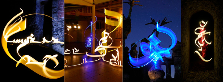
While browsing NOTCOT earlier, I came across this post linking to this frankly quite amazing set of light writing photos by Julien Breton (also via this post). You know the idea; set the camera up in a dark place on a very long exposure, and use something like a flashlight or LED penlight to draw shapes. I’ve seen some beautiful examples before (bottom), but nothing as intricate and detailed as these. These are quite close crops; you can view the full images and get more information on Breton’s site.
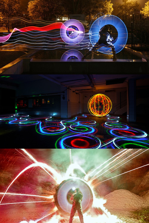
I thought I’d already posted about these images from LAPP - Light Art Performance Photography. I can’t remember when I first saw them but they fascinate me, I’d love to watch some of these being made. The site has added a load of new photos since I last looked so it looks like they’re pretty active in creating new works too. Great stuff:
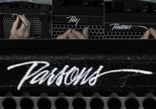
I found this nice little video on YouTube earlier. It’s simple enough, but fascinating to watch; Bob Parsons hand lettering his name in a beautiful style on an amplifier.