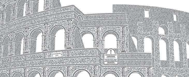
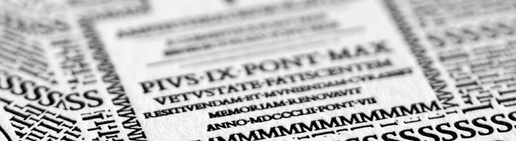
This is a very belated post, but one I’ve been meaning to do for a while. Cameron Moll’s Colosseo Type poster is a joy to behold. The level of detail in it is astounding, using type to create textures, patterns and outlines to illustrate the Colosseum. The piece is letterpress, and took over 250 hours to create; it’s set in Goudy Trajan and Bembo Pro, and interestingly, some glyphs recreated using tracing and redrawing:
Additionally, glyphs have been recreated based on the work of master Italian calligrapher M. Giovambattista Palatino, as featured in Libro di M. Giovambattista Palatino Cittadino Romano, published in Rome around 1550 AD.Cameron Moll
Belated or not, it turns out now is a good time to post this as Moll is having a sale of not just this, but the Salt Lake Temple poster and the EPS of the traced glyphs from the Palatino book (one of which is up at the top right). So yes, 25% off, and you get a free glyphs poster with one of the larger posters. Excuse the sales-y tone, but I think these posters are worth every penny; they’re lovely on screen, but as physical objects they’re quite beautiful.
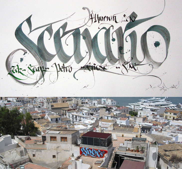
I was convinced I’d written about Shoe before, but it turns out I haven’t. Shoe, or Niels Shoe Meulman, is the master of calligraphic graffiti, creating the label for the artform of calligraffiti - also the name of his site. I must have seen examples of his work in books and photos hundreds of times, yet sadly not in real life. I don’t think I have anyway. I’d have hoped I’d have noticed. So yes, go and look at his site, there are more pictures of his work, a rather impressive bio, and a nice story on the nature of creative work too.
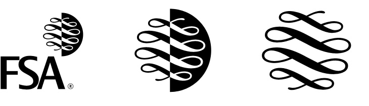
It looks like the UK’s Financial Services Authority, theoretically responsible for making sure financial institutions (like banks) stick to the law, don’t do stupid things and don’t rip people off, is to be shut down, or merged into the Bank of England, presumably because it didn’t do enough of those things well enough and often enough. This will make everything OK again, we are led to assume. Such is life. I guess this is the beginning of the end for the FSA logo though, which is a bit of a shame. The lettering is crushingly dull, but the scroll-and-circle device is lovely — a real I wish I’d done that kind of thing. It’s drawn to resemble a continuous scroll such as you’d find on a certificate or banknote, but is just cleverly constructed to look like that. It’s just so beautifully and simply done it’d be a shame for it to disappear altogether.
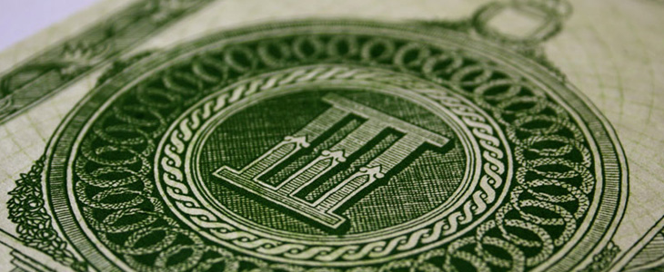
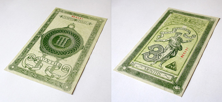
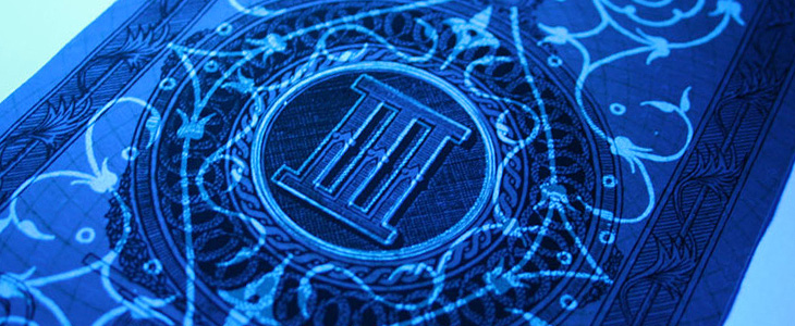
Xavi García is a student at Central St. Martins, and recently produced this banknote-inspired piece, which I find quite beautiful. It’s entirely hand-drawn and has an impressive array of security features: watermarks, UV-responsive inks and see-through images — the attention to detail here is absolutely perfect. There’s a few images here, but go and look at Xavi’s site for more. Interestingly, he’s also a student of Kenn Munk, who I wrote about before here.
Up There is one of those things that’s been linked to like crazy across Twitter and most of the sites I read, but I’d not got around to watching it. I find that with a lot of online video, I mark it to watch later when I’ve a bit of time to devote to it and then, well, don’t get around to it. So, if you’re like me and haven’t seen this yet, I do recommend watching it. It’s only 12 minutes, very well composed and edited and really gives you an insight into the work of people who hand paint signs and adverts on the sides of buildings. It’s a craft that (not surprisingly) is dying out, but one that can be kept alive by commissions from a few enlightened companies and agencies. The film was sponsored by Stella Artois who, as JJ from Graphicology points out, are producing more narrative-based advertising lately. Kudos to them for this, I’ve a lot more respect for Stella Artois the company now. Less said about the lager.
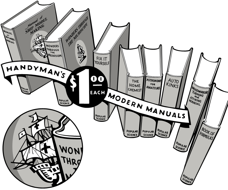
I was having a look through this collection of Popular Science editions on Google Books, and saw this beautiful advertising illustration. Naturally I’ve traced it, but the original ticks so many boxes — it’s hand-drawn, it has a strong sense of dimension, leaping out of the page at you, and the lettering on the banner and especially the price roundel is, like the illustration as a whole, beautifully composed.
My tracing — the detail circle is my own addition, I’d love to see the front of this book properly.
The arrangement of books creates a lovely dance across the page — it’s a shame the type composition of the rest of the advert, while competently done, doesn’t have as much flair. I’d like to know who the illustrator was, and what the front of the books really looked like — I’m fascinated by that little ship illustration and would love to see the whole thing properly. In fact, what are the books like? In an earlier advert there was a hint at some of the cover illustrations, but I’d like to see the ‘real thing’. Anyone out there got some?
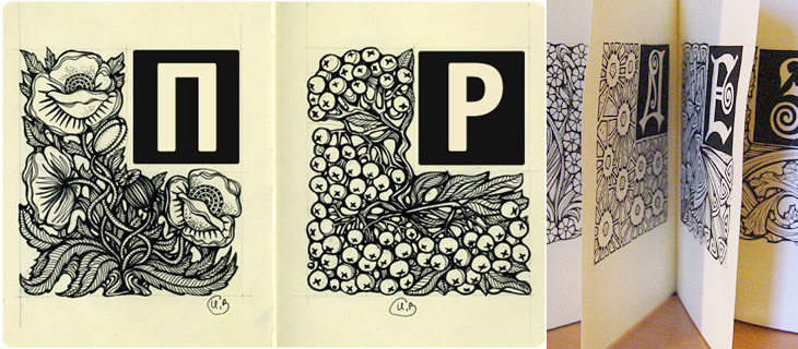
I was looking through this particularly linkbaity article and found the beautiful piece below, Alphabet, by Irina Vinnik. It really reminds me of a couple of books of fables and fairytales I had as a kid — they all had beautifully ornamented capitals at the start of each story and I was completely fascinated by them. I did trace quite a few and spent rather a lot of time trying to draw my own. Sadly I’ve not got any of those early attempts so I can’t see if they were any good or not, but it did get me into a long and happy habit of tracing and redrawing letters and lettering which has been incredibly useful throughout my career. Funny thing with kids, I’ve noticed with friends of mine who have children that shovelling tons and tons of information at them and seeing what sticks seems to be a pretty good strategy. Your mileage may vary, of course.
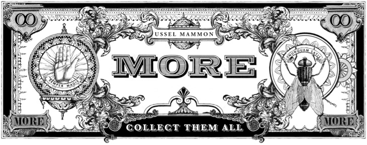
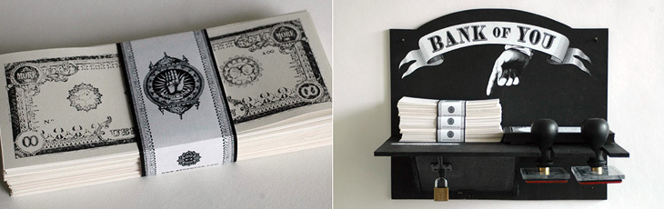
I saw this a couple of weeks ago and I reminded myself of it with my look-at-me post, then didn’t get around to finish writing about it. I really like Kenn Munk‘s designs, they’ve got a real historical feel to them, and remind me of Civil War-era state and privately-issued money in the US. I like the idea of using stamps to print money yourself — I’d love to have a go. I think the only thing I’d suggest adding is a bit of red somewhere, like a serial number or something, but that might just be because I like black and red in print.
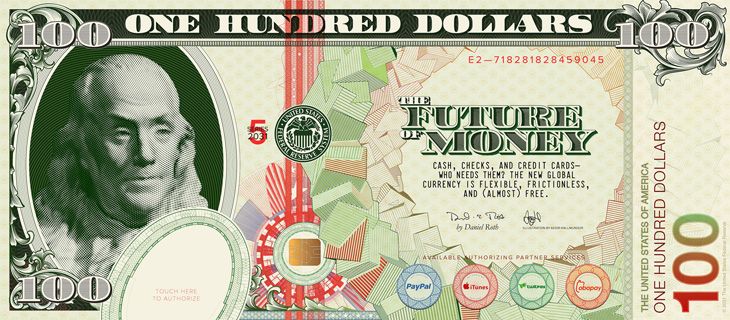
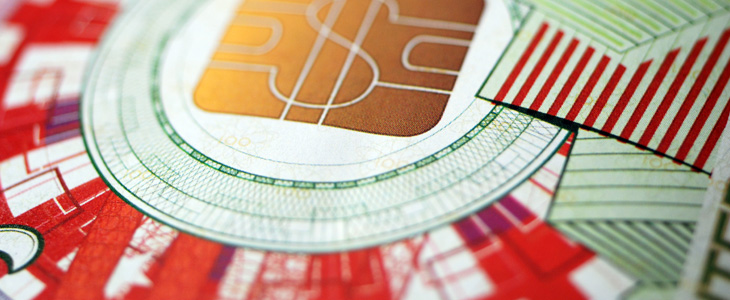
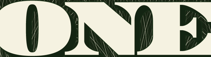
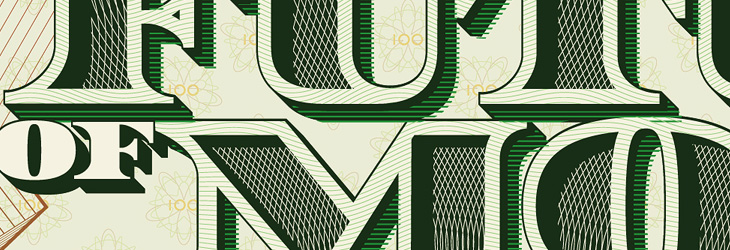
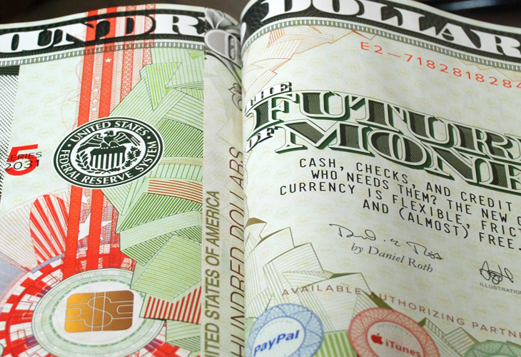
I guess now and again I can promote some of my own work — hey, it’s what keeps me from writing articles for Ministry of Type all the time, and this piece draws together a number of themes I’ve written about before here so it feels pretty relevant. This is an illustration piece I did for Wired Magazine for their US edition’s cover story, The Future of Money. It’s also appeared in the UK and Italian editions and in GQ magazine in Mexico and South Africa, which I’m pretty thrilled about.
The full illustration.
When creating, or even looking at, a banknote design, one of the first things you realise is their inherent and very deliberate imperfections. There’ll be an apparent mis-registration of colour, a strangely ragged line, a discontinuity in a pattern or an odd serif or ligature on a piece of lettering, but it’s exactly how it was designed. Without it, it wouldn’t be right. The design of banknotes represent something I find gloriously poetic — imperfect perfection — if it was perfect by our usual standards, it would be imperfect. Wonderful. So tried to capture some of that in my design, overlaying colours with an offset, adjusting the lettering a little bit to reflect the kind of oddities on real dollar notes and creating the odd layer of extra guilloche-work barely fine enough to see. I’m glad Wired is well printed and that it all came through.
First off, my favourite, guilloches! Guilloches have an irresistable fascination for me, the finely detailed patterning building on top of itself, over and over, to create anything from complex shaded illustrations or subtle fields of colour, and all you need to do is to look a little closer to get drawn in… wonderful. Fractals have a similar kind of appeal, but there’s more of a craft to creating guilloche patterns, some idea of I made this rather than I discovered this. A subtle distinction for some, but it just gives one an edge over the other in my mind.
The lettering was actually the most time consuming part of the piece. The denomination took some time, but the big bit of work was the multi-layered title. The faces of the letters themselves are shaded with two sets of guilloche patterns, and the 3D effect was done mostly by hand — adjusting for optical clarity and to bring in a few of those all-so-important errors. I toyed with the offsetting on the faces (to create the pale outlines and shadowed cuts) especially as the “R” came out a little strange, with that square cut-off on the inner edge of the outline. I left that for a while and when I came back to it I decided I actually liked it, so it stayed.
The cropping out of the guilloche patterns to create the shading took time to set up and then quite a lot of time for the computer to do the necessary intersections. Anyone who was following my Twitter personal account at the time may have noticed a fair bit of bitching about Illustrator’s pathfinder tools, often spitting out “The filter produced no results” after 10 or so minutes of thinking, which generally drives me to use Photoshop’s vector tools for stuff: they have their deficiences, but they do the job without Illustrator’s tedious whining errors. It took 30 minutes of it thinking about it, but it got there in the end. It seemed a bit easier the second time around, when I did the localised title for Wired Italy, though sadly no quicker.
The circular pattern of cubes I did using Google Sketchup, which I’ve been using a fair bit to create another piece (which may be a poster one day), outputting it as an EPS and then going over it in Illustrator changing all the outlines to the right thicknesses and colours, then doing it again for the offset colour overlays. Fun times.
It was great to be able to use many of the ideas I’d explored before and have to make them work together in a full commercial piece. It’s fun when you’re given a brief like this, and pretty exciting seeing your work printed in a magazine.
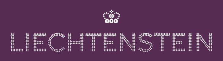
This post falls squarely into an imaginary new-to-me category, as it’s apparently been around since 2004 and I’ve never ever seen it before. I’m not sure how, I’m convinced I’ve looked at stuff related to Liechtenstein in the last 6 years, and this is exactly the kind of thing I like. So yes, the other day I was emailed a link to the portal of The Principality of Liechtenstein with a message to have a look at their ‘new’ brand (I think my correspondent may have seen it here on Creative Roots). I’m wondering whether the brand just hasn’t been promoted much — or maybe I’ve just missed it. That website doesn’t do it any favours that’s for sure. Anyway, big surprise: it turns out the brand was designed by Wollf Olins, so I can only assume that their work from 2004 must predate whatever decision they made to push ugly and huh? as brand virtues, as this is rather lovely.
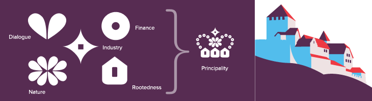
The type is essentially made from dots (an idea I love) and this presents a nice twist on that, using stages on a morph between a flower and a star, theoretically including a circle as one of the steps. According to the brand documentation, the flower represents the agrarian roots of the Principality, the circle is the financial side and the star is ‘industry’. I’m a little unconvinced by that, as I’m pretty sure that industry wasn’t the endpoint in Liechtenstein’s development, nor was finance merely a step along the way. Perhaps it’s best thought of as a device to indicate the range of things you can find in Liechtenstein. Regardless of that, it makes for a pretty story and an attractive logo. The overall effect is of something encrusted in diamonds (or at least Swarovski crystals), though looking at it again I’m reminded a little of early-20th Century theatre illuminations, the old ‘name in lights’ thing. Certainly the associations are of glamour and wealth, which seems to suit the Principality just fine.
The crown is a nice touch as well, and if I’m honest was what caught my eye at first — one of the perils of using a crown as your own logo I guess. Again, as is apparently unavoidable with country branding, the elements of the crown have particular meaning related to aspects of how Liechtenstein would like you to think it thinks of itself as having (sorry). Made of symbols for nature, dialogue, finance, industry and rootedness the crown works well and forms a recognisable little device when used on its own or with the abbreviated LI mark. The component symbols are used across brochures and other materials as a rather refreshingly retro pattern. I doubt I’m alone in being reminded of 1970s wallpaper, but all in all it works well and compliments the other decorative elements — the flowers, mountains, trees and (especially) that nice illustration of Vaduz Castle.