Return

So yes, I’ve been away from the site for, er, way too long. To say, “I’ve been busy” would be a cop-out. I’ve been busy on a few personal projects that have taken up most of my ‘spare’ time and energy, and while they’ve been great fun I’ve definitely missed writing here. I’ve got so many starred “must blog” entries in my RSS reader I’m not sure a lot of them are even relevant anymore. Ho hum.

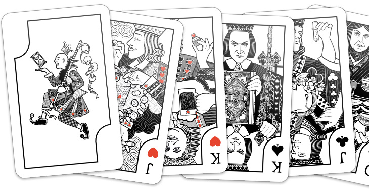
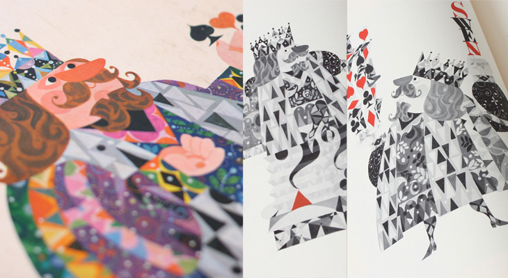
Anyway, those of you who follow my (rather ranty, sweary) personal Twitter account might have already seen these, but the big, huge personal project is nearly done – a set of playing cards. Each of the court cards represents an obsession, with a theme per-suit connecting them, Wealth, Science, Dogma and Pleasure. The joker represents Time and Death, the end of any and all obsessions. I’ve still to design the packaging and (of course) get them printed but when they’re ready I’ll be selling them, probably as some kind of limited edition type affair. They’ve been absolutely enormous fun to do, so here’s a little sneak peek:

Geometric Batman

OK, nothing to do with type or lettering, but I do like to post a bit of illustration from time to time. This caught my eye yesterday on this isn’t happiness, an illustration by Liam Brazier. He’s done a load of other geometric illustrations (including this rather nice Superman one), but the colours and balance of this one appeals to me the most. Lovely stuff. I should mention that you can buy prints of his work from his site, and there’s a short Q&A with him here, on My Modern Met.

The Hungover Cookbook

The cover of this caught my eye the other day, partly for the design but mainly for the deliberate misspelling. It’s a nice looking thing, and the design follows through the inside of the book too. I like the Wodehouse references for the hangover names, though thankfully I’ve not had anything worse than a Broken Compass for quite some time. Not sure if that’s through moderation or worrying signs of tolerance though.

Nice Hat! Or, Mad Brew Productions

As I catch up with things I’ve marked to ‘look at later’, I see a recent post on Graphic Exchange about the new identity for Mad Brew Productions, by Adam Hill. It’s not really a type related thing but I’m very much partial to a nicely executed bit of engraving and linework, so here it is. The premise of the identity is that of ‘wearing many hats’, in that the company does ‘media’ and ‘interiors’ as well as its music production business.

I would link to the page on Graphic Exchange, but to my frequent frustration it’s a site without unique pages, if you can imagine such a bizarre thing.

Charting Information

I just read this well-written and clearly-argued piece by Stephen Few on the work of David McCandless. It expresses many of the thoughts I’ve had on the kind of ‘popular infographic’ going round, though I wouldn’t restrict my criticism to McCandless, nor would I be quite so critical of him personally. The style of work he produces is popular because it presents correlations (and sometimes, coincidences) in data in an accessible, attractive and entertaining way — the error is to assume that this represents the best of graphical analysis or that it’s intended to be viewed as such. As many commenters on this Flowingdata piece have pointed out, there’s a difference between graphical analysis and infographics, and while I disagree with the apparent thrust of their collective argument (that Stephen Few is wrong) it is an important distinction to make.

McCandless’ pieces are often beautiful, and they are indeed based on information, hence the title of his book and site, Information is Beautiful, but they rarely offer deep insight into the data. What I would like to see is the equivalent for graphical charts representing actual analysis. Time for an Analysis is Beautiful perhaps?

Sports Illustrated Book of Bridge

Found via Drawn, this post by Javier Garcia on his blog about the 1961 Sports Illustrated Book of Bridge. The book is illustrated with work by Jerome Snyder, whose work I’ve apparently often admired in the past, even though I didn’t know they were his. His pieces are dense with detail and (when printing allows) rich with colour — that he illustrated a book about bridge with playing-card inspired designs is pretty exciting; how did I not know about this before? I’ve managed to order a copy, so hopefully that’ll arrive soon in all its inspirational splendour and I’ll be able to take my own pictures — these I’ve nabbed from Garcia’s blog post:

Interestingly, Garcia has also featured a set of cards designed by the ceramicist Stig Lindberg that’s worth a look at, and also links to the Grain Edit article about those Jean David El Al cards (which inspired me to buy a set and post about it here).

Lettercult: A Year In Custom Lettering 2010

Lettercult has posted an incredible collection of custom lettering projects by hundreds of lettering artists, all completed in 2010. There are so many projects that they’ve split the post across two days, and there are 33 (quite long) pages in each post. I’ve not had a chance to go through all of them yet, but the variety and the quality is remarkable — so much to look at! I’ve posted a few favourites below, one by David Croy, another by Jordan Jelev of The Fontmaker, and I’d be surprised if you’ve not seen her work already (but very worthwhile admiring again), a piece by Dana Tanamachi.

By David Croy

By Jordan Jelev of The Fontmaker

By Dana Tanamachi

Posters of Film Noir

Andy Clarke (aka @malarkey) tweeted a couple of links to Where The Danger Lives, a site on crime films, which has reviews and in-depth info on classic crime and noir films, studios, and recently, a countdown of the best posters used to advertise the films. Each poster has been restored and cleaned up so you can see it clearly (with links to a decent size larger version to look at) and an illuminating analysis of the design and how it fits the film. It’s all pretty impressive stuff so far (I’ve only read a few of the posts as of writing this), so go and take a look.

Three of the posters that caught my eye.

Dot Dot Dot, An Animated Review

There are many examples of ‘animated typography’ out there, some of them are good, most of them are crap, and some just take you by surprise and are utterly brilliant. This one on Newgrounds, sent to me by a friend, fits the ‘utterly brilliant’ category, but for slightly different reasons than you might expect.

It’s an animation of a review of a game on the site, written by someone who, if we’re being charitable, isn’t a very careful typist. The animation itself (by Mick Lauer) is well done, with some nice touches — the pause to define ‘contrail’ and the ‘explain to me’ parts are particularly good — and Impact is a perfect choice for the subject matter, but what really makes it brilliant is the voice track. It was done by voice artist Deven Mack who I imagine has quite the career ahead of him. Well I hope he does.

Go and watch, and listen.