Browsing earlier, I came across this blog post for The Exquisite Book. It’s a book project involving ten groups of ten artists, including fine artists, illustrators, designers and comic artists, where each artist creates one page having only seen the previous page. It’s roughly the same idea as a game you may have played as a child, which I’ve only just learned was invented by the Surrealists and was called The Exquisite Corpse. I can’t remember what we called it, but certainly not that.
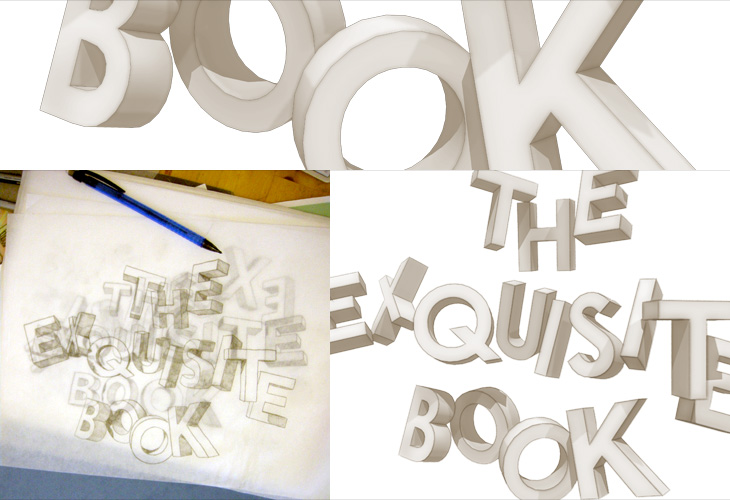
Anyway, the book project looks like one worth following, and the blog post has a few sample pages. I’ll be interested to see how it ends up looking as a collection, and what the binding will be. I was especially interested in the sketch for the book title page (below left) and had a play with the idea in Sketchup.
Some output from Sketchup, from me playing with the ideas in the sketch from The Exquisite Book site at bottom left. To match the sketch I used a mix of Century Gothic and Helvetica - and some hand lettering naturally.
I just read this post by Joe Clark, linked from Daring Fireball, about why you shouldn’t use small caps for acronyms. In it, Clark provides some examples which at first glance seem to support his argument, but a little thought reveals them to be mere examples of ill-considered typography rather than a crushing blow on the use of small caps.
I’m well aware the whole article may well be trolling, but there is one particularly egregious argument I’ve heard many times when the subject of typographic style comes up - though normally about apostrophes:
This nonsense, promulgated by snobs like that bore Bringhurst who have not read anything written after Jane Austen croaked, ostensibly improves typographic colour. What it actually does is inhibit reading.
Of course, anyone who has actually read ‘that bore’ Bringhurst would know that he is far from a bore and that he is all about promoting typography that aids reading. Setting acronyms in small caps does work well in a large number of cases, and it does indeed improve page colour, thereby reducing distractions to the reader, but as in anything there are no universal solutions. From the very section in The Elements of Typographic Style on the use of small caps for acronyms, Bringhurst states, ‘Refer typographic disputes to the higher courts of speech and thinking’. In other words, if you’re not sure, remind yourself how you’d say it or think of it — think of the meaning first and the style should follow.
I feel a little dirty responding to stuff like this, but I have a point to make. Articles like this promote a dichotomy, an idea that this way is right and that way is wrong, this way is snobbish and that way is proletarian — but when applied to typography it boils down to utter nonsense. The goal here is to allow the meaning of words to shine through. If you use small caps and it makes something hard to read, you should stop using small caps for that thing, and vice-versa.
Making a typographic decision based on some political or class motivation is fine if it’s appropriate for the text, but beyond that vanishingly rare case it’s a mere affectation. Don’t be swayed by trash-talking and accusations of ‘snobbery’, please.
Oh, and on the subject of apostrophes (amongst other things), read The Complete Plain Words by Sir Ernest Gowers. It’s a good read, and full of good sense.
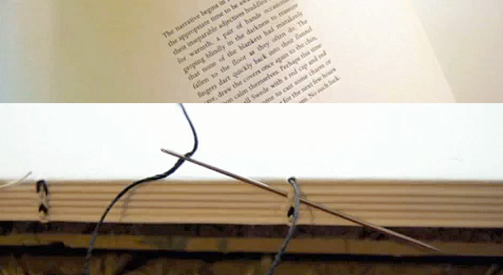
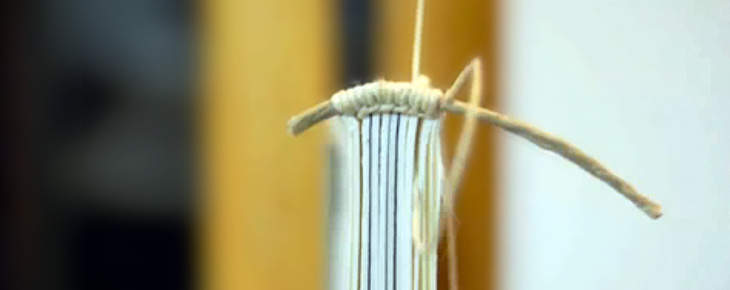
I got the link to this video on YouTube via Jason Santa-Maria on Twitter. It’s compiled from around 3000 images taken over 2 months documenting the creation of 35 hand-made books at the Women’s Studio Workshop in Rosendale, NY. There’s a website with more info and clearer photos here. The whole thing is lovely and worth watching — note especially the attention to detail with the thread colour for the binding and the creation of the headband. These images are all from the video:
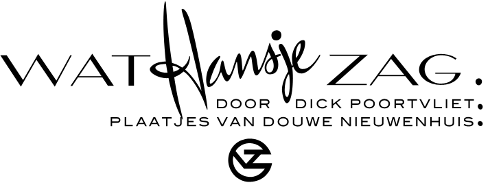
BibliOdyssey put up this great collection of Dutch picture-book covers from 1810 to 1950. There are some lovely illustrations, examples of lettering and type treatments on the covers, one of which I’ve traced below. I was thinking about tracing the illustration on this one, mainly for the overall effect it gives than for anything else, but I figure I’ll save that for a rainy day. Go and look at the rest of the covers, here.
‘Wat Hansje Zag’ by Dick Poortvliet, illustrated by van Douwe Nieuwenhuis, 1948
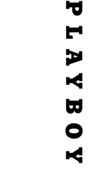
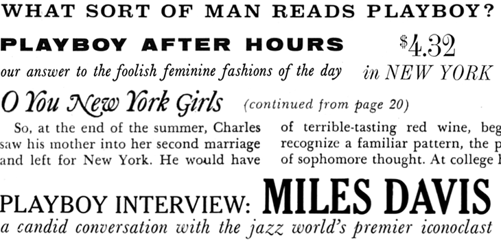
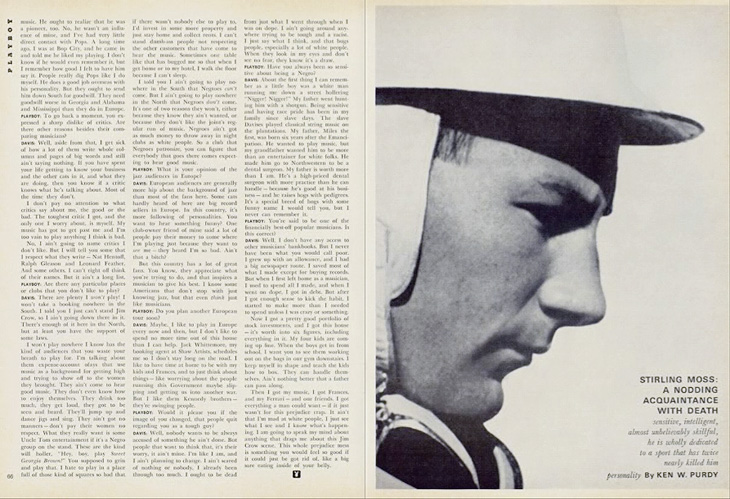
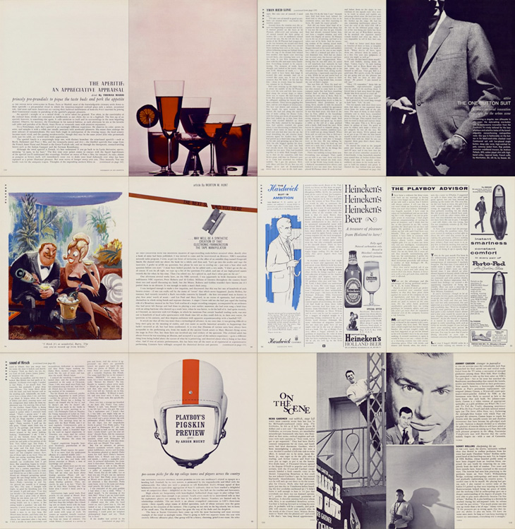
Entirely coincidentally, I get to post about another archive of a long-running and well-known magazine; this time, Playboy. John of I Love Typography tweeted a link to this, just over 50 issues of Playboy from 1954 to 2006. The site will require you to install Silverlight, but is fairly well put together and easy to use, with a nice contents feature that also lists the ads and a search function that works well. To be clear, Playboy is a pornographic magazine that used to use good journalism and good design as a fig-leaf (as it were) to try to get some respectability. It's still a magazine for pornography, objectifying women. Of course, the images and type I’ve included below are not pornographic.
I’ve never looked at Playboy magazine before — its reputation preceded it and there are many better ways to read good journalism. There are some interesting-sounding articles in the earlier editions though; just a quick look through reveals interviews with Fidel Castro, Miles Davis, Sterling Moss, loads of fiction, journalism, pages and pages of dense, dense text. Then, so randomly you almost ask “What’s that doing there?” a picture of a young woman with not much on. I must admit I didn’t really look at the newer issues, as after the logotype changes in 1972 the whole thing looks a whole lot less appealing, and makes me think perhaps the magazine becomes a bit more straightforwardly pornographic from this point. The bits of type and spreads below are mostly from the late ’50s and early ’60s, and are just an example of some of the lovely bits of type and layouts in the magazine. So yes, go and have a look at the Playboy magazine archive, but keep in mind the attitudes and harms it represents.
The ‘$4.32’ bit is from an advert, all the rest is from editorial content. I haven’t verified these forensically, but the editorial text looks like a mix of Clarendon, Nimbus Sans, Caslon, Caslon Italic and Cheltenham.I love the use of the rabbit device to end an article, and that it’s still in use today. Note also that the Playboy wordmark at the top left of the page has a serif on the A, which is missing on all other uses of it. I’ve reproduced it larger at the top of this article.
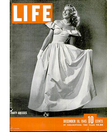
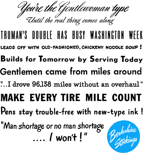
I’ve been browsing through some of the copies of LIFE magazine in this wonderful archive on Google Books, and as well as the photography and journalism I’ve found some real type treasures, especially in the advertisments. Some of the slogans and phrases read just like bits of pangrams or the beautiful mini-stories that Font Bureau create for their type samplers, and some of the type and lettering is quite lovely. The ones below are mostly from this issue from May 1945. A few are also from this one, which also has a short article and some photos (from page 43) of the first Lewes Bonfire night after the end of World War Ⅱ - something of local interest at least to me (and other Sussex people).
I’m sure you could make many amusing stories with a bit of patient searching through the archive.
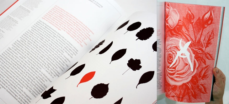
I’ve been marking so many things in my RSS feed either to read later or ‘post about this’ lately, and yet it seems I’ve had no time to do either of these things. This is one I’ve had marked for a while, from the ever-inspiring For Print Only, and perfectly demonstrates why red and black is such a great combination in print. I love the spreads in this report, and I’ll definitely be referring to this as inspiration for a while. Lovely stuff, go and take a look at the other images — a couple of my favourites are below.
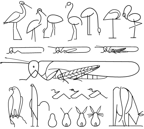
This is a great little instruction book on drawing animals - Les Animaux Tels Qu’ils Sont, full of beautiful little illustrations and diagrams - you can see it on this Flickr set, posted by Agence Eureka. The illustrations are all great, but I find that for most of them I prefer the intermediate stages in the instructions, they’re constructed from spare, sinuous lines and create a beautiful abstraction of the animal - capturing something of the spirit of it rather than an explicit diagram of what it looks like. The ‘final’ drawings seem a bit too obvious, perhaps. So once I’d drawn copies of my favourites, I noticed that they reminded me of hieroglyphs, hence my choice of title - judge for yourself below.
How to draw a cricket, or modern hieroglyphs?
As an aside, I was interested by the authors listed on the book, R & L Lambry. The ‘R’ would be Robert Lambry and, well, there’s nothing definitive on who the ‘L’ is, but I suspect it might be Leon Lambry. That’s the only ‘L Lambry’ that I could find involved with illustration from around the right time. Anyone know for sure?
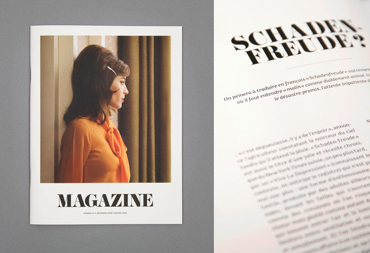
I saw the cover of this magazine, designed by Ill Studio, on ISO 50 and immediately saved the link; I love the type, the photo, the composition, everything. The rest of the magazine is beautiful, but it’s the cover I love - go and take a look at the rest of it. Now if only there was a link to the magazine’s site - with such a generic name it hardly pops right up on Google.
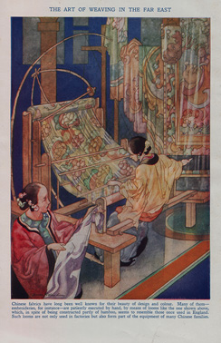
About 25 years ago I was given a full set of 1930s-era encyclopædias, The Wonderland of Knowledge, and I’m glad to still have them in good condition, countless house moves and two burglaries later. They’re fascinating things, with lots of illustrations and an engaging conversational style written to appeal (I guess) to older children. The illustrations are remarkable and are frequently quite beautiful. Each volume has a full colour frontispiece, colour and monochrome inserts throughout and many photos and diagrams in the text.
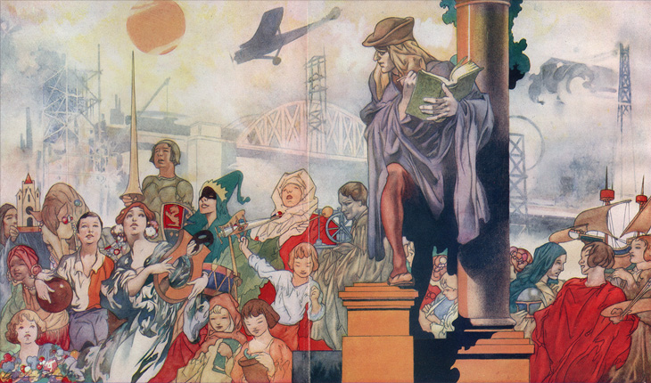
The beautiful frontispiece for Volume Ⅰ, painted by Charles Robinson.
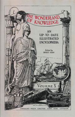
Left: A sample of one of the rotary photogravure inserts. Centre and right: The frontispiece and title page for Volume Ⅹ. You can click each image for a larger version on Flickr.
The content, however, is very much of its time, with antiquated attitudes to race, nationality, gender and so on, and some interesting attitudes to the portrayal of history itself; this account of Oliver Cromwell, for example, shows how anything negative or critical is delicately avoided. Perhaps youngsters weren’t to be troubled with such complexities?
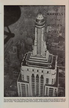
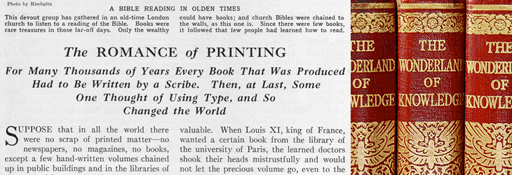
On the less-contentious subjects of science and technology there are some good articles, and some of them stand as being pretty informative and relevant today, including the one I’ve taken the title from for this post, The Romance of Printing. It’s a pretty good primer on the history and techniques of printing, covering ancient origins through Gutenberg and Caxton up to linotype and monotype machines, braille printing, etching, lithography and photogravure. I’ve put it up on Flickr in quite high resolution so you can have a read and see it in all its glory. I’ve also got a lower-resolution PDF here.
A detail of the type styles used, and of the gold blocking on the spine.
When the article gets to a description of the monotype process, there’s a little clue to the typeface used in the books. I did wonder what it was, but never got around to looking it up; it always seemed such a characteristic part of the books that I’d never really thought of it being something used elsewhere too:
So yes indeedy, from that little snippet it’s not a great mental leap to assume the typeface is the original of this Monotype Old Style, with optical weights for the captions and the indices that aren’t included in the digitised version.
The main reason I’d wondered about the typeface was because I did once have a completely mad plan to scan in the whole encyclopædia, do some OCR on it and have it online in some format, but I quickly realised that I’d need something like this to even start the job. Scanning in just the pages for this post took several hours, and considering that without the inserts there are 6144 pages, so the chances of seeing it all online are pretty slim.