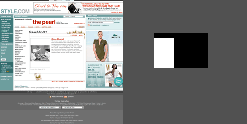
Tufte discusses this a fair bit in his book Visual Explanations, but I thought I’d raise it for a site I’ve just come across; style.com. I’d seen a thumbnail of one of the images from this ‘feature’ on pearls, and clicked to have a closer look. Unfortunately, it turns out that the ‘thumbnail’ was the actual posted size. Look at the area of the screen devoted to stuff that isn’t the article you’re interested in. I’ve coloured the areas below. The grey area is the useless area, the black area supporting text for the useful area, and the white area is the focus of the article, the most useful area. Look how small it is. Style.com is clearly a site utterly devoted to selling ads. They’re perfectly entitled to, mind, but I won’t be visiting them again.