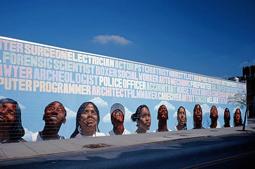
I was just looking through the Time piece on The Murals of Philadelphia, and came across this rather wonderful bit of lettering. I love the subtle changes in the colours to differentiate the words and the slight variations in the letterforms and x-height. It’s a really nice piece, I love the faces at the bottom too, but it was the lettering that caught my eye. Also, this one is just wonderful. Go and look at all of them!