Israeli Stamps of 1975

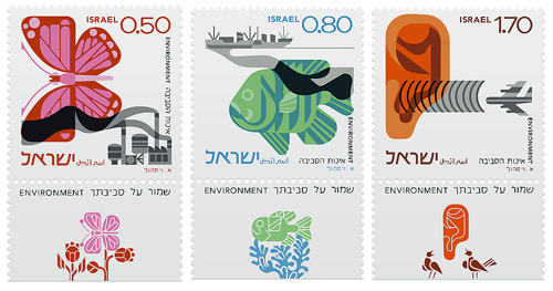
Yes, more stamps! This time courtesy of Richard at Ace Jet 170 who posted this article about a set of Israeli stamps he bought. They depict three environmental concerns, air pollution, water pollution and noise pollution, and were apparently designed by Eliezer Weishoff (thanks to Yotam for the info). The stamp itself shows the problem situation with an additional detachable design depicting (iconographically) the ideal; butterflies visit flowers, fish swim among seaweeds and ears hear birdsong. Yes, that is an ear - the least successful image of the three I think - though I do like the birds in the tear-off.

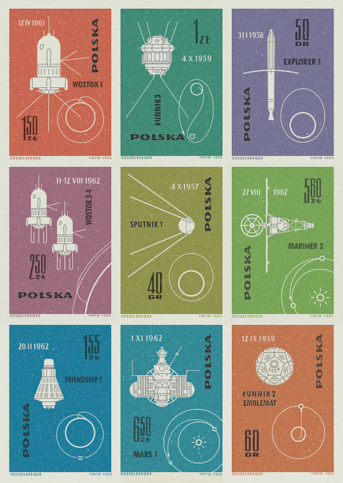
I was asked for prints of the Polish stamp designs and I’d certainly like to, but I need to research the copyright. I traced the designs for my own understanding, and I’d love it for more people to see these designs at large scale and up close, but I’m not going to violate anyone’s copyright - I am a designer after all! Of course, if anyone’s a copyright lawyer in the UK/EU and fancies offering some tips, I’d greatly appreciate it.

Polish Stamps of 1963

I saw pictures of these stamps on Ace Jet 170, and was absolutely fascinated by them. I love the illustrations of the orbits and paths taken by the space vehicles - the Łunnik 3 (Luna 3) one especially. As usual, I felt compelled to redraw them so as to understand them better, and they really are very well done - the orbits of Mars, Earth and Venus aren’t drawn perfectly circular, and the relative sizes of the planets are nicely visualised. The whole collection looks to have been a celebration of 60 years since the publication of Konstanty CioÅ‚kowski’s treatise on powered spaceflight “Изслѣдованiе мировыхъ пространствъ реактивными приборами” (The Exploration of Cosmic Space by Means of Reaction Devices), in 1903 - showing some of the results of the research his work started.

The first (or tenth?) stamp in the collection was devoted entirely to him, and the illustration is that of a design for a powered spacecraft from the cover of published versions of his paper - my redrawing of it is at right. The others show a variety of space missions, with the interesting date convention of having the month depicted with roman numerals. It’s not something I’d come across before, but it looks quite useful*. No longer would Americans and Europeans have any doubt over whether 01/03/08 is the 1st of March or the 3rd of January. Anyway, that’s another one of my must-do-something-with-this bookmarks cleared up, and it’s been quite a fun process in redrawing them. Here are the images I made based on the stamps. I’ve got them as vectors, so I’m thinking of getting them printed out A3 size.

The Economics of Typography

I just read this fascinating article on GT!Blog, presenting a theory of why Japan never made the iPod. The basic premise is due to the increased memory and processing requirements of representing Japanese text on screen adequately, Japanese manufacturers tended to develop appliances, rather than general purpose computers. So Japan (and by extension, east Asia in general) became leaders in electronic gadgetry such as games consoles, fax machines, watches, stereos and the like, with the trend reaching its (possible) apotheosis with the mobile phone - not one of which devices required a general purpose personal computer as the connecting hub. Each device did its thing, and was specialised for that - if anything became close to a general purpose device, it was the mobile phone itself, though it was, and is, quite limited in what it can do and what people want it to do.

Now, as the article points out, modern computers can handle Japanese (and Chinese, Korean, etc.) and the computer-as-hub idea is gaining popularity in east Asia, but it’s fascinating how the typographic requirements of a language have apparently altered the entire economy (and culture!) of not just a country or region, but the whole world.

Using the characters from the GT!Blog article, you can see how an 8×8 grid is inadequate for representing Kanji.

Kix

I’ve had this link on Hello Bauldoff hanging around for ages - the design of the box and the bold typography are fantastic, and the colours in the photo really appeal. One thing I noticed was the old-style General Mills logo which is far nicer than the version on their website, though they still use the crazy ‘G’ symbol. It’s the kind of thing that would drive me bonkers if I had to stare at it at breakfast every morning - is it a ‘G’? Is there an ‘M’ in there? Or is it some bonkers ampersand?

I know it’s the main point of the campaign they’re doing, but I’d remove the t-shirt promo flash, or massively simplify it - to me it looks like it’s trying too hard for that retro-Americana thang. The rest of the box carries that off perfectly, so it’s just not necessary.

New UK Coin Designs

In 2005 The Royal Mint announced a competition to design six of the eight kinds of coin in circulation in Britain, the first full redesign of the coins since decimalisation in 1971. Open to everyone and with a top prize of £30,000, they received 4000 designs from 500 people, and I just saw on the news that the final designs have been completed and the first coins ready for issue. Not only that, but the £1 coin is now included in the redesign, and somewhat appropriately becomes the uniting element of the set.

You can tell they were done by a graphic designer; even with the complexity of the Royal Arms, the designs are clean and sparse, with pleasing variation in placement of the inscription, and on the 20p there is a sense of refraction through the thick border of the coin. Just take a look at them though, they’re fantastic, in fact, they’re astounding - I can hardly believe that these are actually official coins of the real United Kingdom, instead they look like they’re from some sleek, efficient, science-fiction alternate-universe version of the country.

The one thing that gives me pause in the whole process is the thought that we won’t be seeing any more of the beautiful 50 pence designs*. I’m not exactly a numismatist but I do enjoy seeing the new designs every couple of years or so. I suspect that the one coin not included, the £2, will continue to have commemorative designs on it. I wonder when we’ll get a £5 coin actually in circulation?

While researching this article, I was looking through earlier coin designs on the Royal Mint site, and I notice the 1948 Half Crown used the Royal Arms as well, but with a more elaborate shield design. I think it’s rather attractive, and I’m intrigued by the crowned GG ligature either side of the shield.

Imaginary Products

I’m fascinated by imaginary products created for films and games - there’s an art to creating something just similar enough to real products to be recognisable as a brand type, but without actually copying any particular identity. Some films and games come very close to existing brands (RUF in Children of Men; GAP for pets, Tube in GTA 3; Subway) while others work within the conventions of a product type so you know what kind of thing it’s supposed to be (pretty much everything in the Truman Show). I have an article I’m writing on brand conventions, but that’s not for today. The reason for this post is some of the work featured in this interview with Sarah Bradley, graphic designer and typographer at Pixar, and ex-lead title designer at Disney. In the article is a matrix for a box of rat poison shown in Ratatouille, which I just had to make into a fake box shot - I do this a lot at work and it’s fun to do, so I couldn’t resist.

The original matrix:

The Lure of the Collection

I remember as a kid finding a load of little glass bottles buried among some building waste in the garden. I’m not sure where they came from or what they were for, but I know one still had a bit of cork stuck in its top, and each one had a different shape embossed into the front. I was fascinated with them, and what they could have been for - clearly nothing environmentally persistent, nothing toxic anyway. I washed them out and kept them for a while, eventually losing track of them in the whole growing-up thing. So, when I came across this collection of perfumes (via Non 2) I had quite a nostalgic moment. It’s an oft-remarked phenomenon that things that are individually uninteresting or unremarkable gain a special significance and appeal when collected together. A scan of a coffee stain on paper is nothing special, but scan a whole load of coffee stains in and upload them to Flickr, hey presto! It’s interesting!

Another Glass of Type?

I just came across this site, The Dieline, which claims to be “The Web’s Leading Packaging Design Blog”. There are some very nice things on there indeed, including these wine labels. I must admit to being rather heavily influenced by the labels on wine - if I like the label, generally I think I’ll like the wine, and oddly enough it’s been quite successful in the past. Is that so wrong? After all, I’m not alone (same site, another nice wine label). So, having said that, I think I would definitely like to try this:

Manhole Art

I’ve had this page of manhole covers open in the browser for the past few days, one of those things in the should-look-at-more-closely category. I’ve had a better look now, and I was reminded of seeing Japanese manhole covers, and they come in a much greater variety of designs (and colours!), so I was wondering why manhole covers are often so dull. I watched a How it’s Made on manhole covers the other day, and there’s no real reason why a city, region or département (say) shouldn’t have its own design.

This site has a good collection of images of Japanese manhole covers, four of which I’ve cut out below.