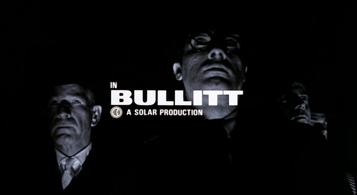
I recently rediscovered The Art of the Title Sequence site, which is a goldmine of inspiration for anyone who needs to animate type, and I’m surprised I’ve not posted about it before. Title sequences are remarkable in that they have to fulfil some important roles in a film - they’ve got to tell you who made it, who’s in it, who paid for it, in a way that complements and introduces the film (but is clearly not the film itself, so you can get all your arrangements with popcorn/noisy snacks/coughing/sneezing, etc. out of the way), and all in a short a time as possible. Those requirements provide a fertile ground for all sorts of creativity, to the extent that the title sequence becomes a genre in itself: a very specific kind of animated short; an animated infographic if you like. So we have sites like this one for people like me to trawl through and drool over lovely examples of typography, lettering and iconography. First up, one of my favourite films, Bullitt.
Isn’t that just perfect? See it as part of the full sequence, here.
When I first saw this sequence I was scrabbling for my camera to try and get some shots of the lettering, but didn’t manage to get much worthwhile. The typeface is just beautiful, and I’ve always wanted a copy of it, but after a lot of investigation it turns out there isn’t an exact digital version of it. There’s a very, very similar one called XXII Black Block, but you’ll notice that it has slanted terminals on the E and T - almost there, but not quite.
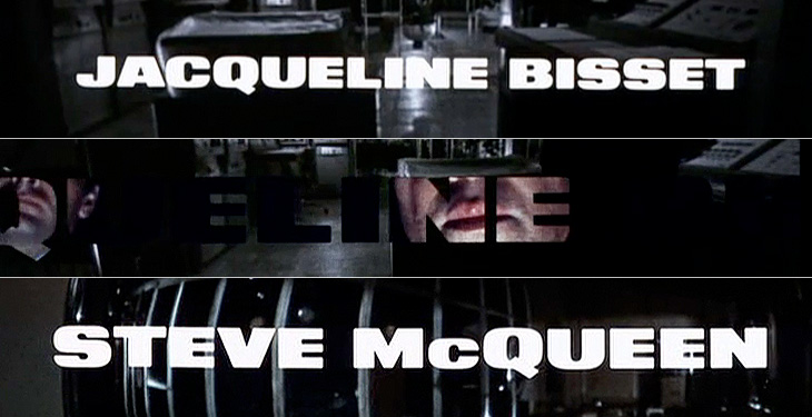
I love the way the lettering leaves a ‘hole’ in the current scene, which expands to show the next one.
Next up is Stranger Than Fiction, a film I’ve never seen but might get around to watching one day just because the title sequence is interesting. It looks like it could be great or dreadful, and nowhere in between. Either way, the title sequnce is great and makes playful use of type, instructional iconography and labelling to enhance the story. I like the way the labels for everything definitely feel like part of the main character’s world, his obsessions, so real to him, made visible (and real) in the world for us to see.
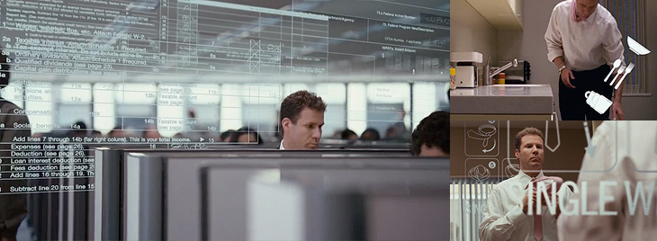
Mmm. Numbers. Labels. Sequence here.
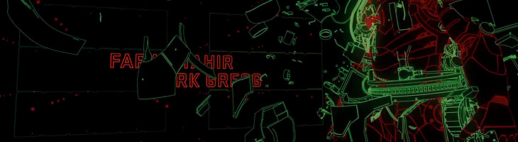
This next one is not so much about the type. It’s not really about the type at all. In fact, I hate the type in this one. The exploded diagrams are lovely and the way they tie in with the live footage of the Farnborough Air Show is highly compelling, so to have this clumsy uninspired type stuck over it is a real disappointment and a wasted opportunity. I’m including it in my favourites because you can imagine how nice it could be if a typographer had been given a chance to polish it up before delivery:
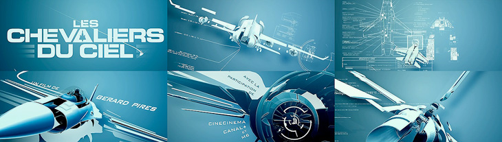
Nice graphics, shame about the type. Full sequence here.
Gradually coming back to nice type with this one - I remember, years ago, playing around with analogue electronics to draw letters and simple shapes on oscilloscope screens and though it was pretty painful it was satisfying when it worked. The animations in Tron were done this way, with the flat surfaces coloured in later by hand. The end sequence for Iron Man deliberately references these very first vector graphics with these CAD-style animations, with the type done perfectly to match:
A still from the Iron Man end sequence. Full animation here.
Next I’ve got this one which is just good solid no-frills typesetting, enlivened with great use of a close-up and, again, those vector graphics:
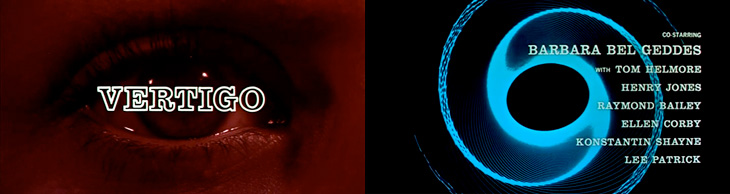
It’s Hitchcock’s Vertigo. Original sequence here.
And last of all, a very satisfying and clever use of 3D to form the names and titles by constantly changing the camera angle. I imagine it would be a nice way to tell a short story, as I found myself watching it and reading the words quite comfortably. It’s paced very well, and the fascination you develop for how the letters come together makes it an entrancing experience:
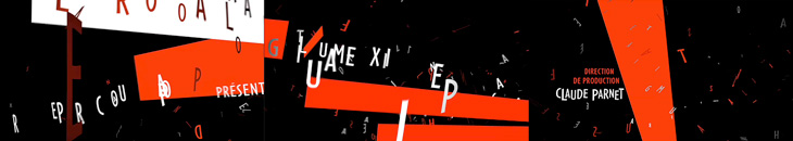
It’s Le Souffleur. Full sequence here.