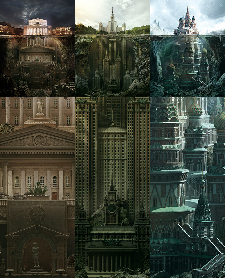
I could look at these illustrations all day. They’re for a press and outdoor campaign promoting the Schusev State Museum of Architecture. Compositionally they remind me of that iceberg image, which seems appropriate given the brief to show the history of architecture going much deeper than the buildings you see. The quality of the modelling and illustration is excellent and are well worth looking at more closely in the larger images. I think the sketch images included on Behance and Design You Trust are nice, but (somewhat unrealistically) I’d love to see all the discarded sketches and roughs they made along the way, I bet there are loads of good, interesting ideas that didn’t make it through. The extended buildings (The Bolshoi Theatre, Moscow State University¹ and St Basil’s Cathedral) look amazingly plausible, if a little reminiscent of something Nicolae Ceaușescu might have actually tried to build². The Moscow State University one is already a high-rise building so perhaps looks the most likely, if rather Gotham-esque. The St Basil’s one is just astounding.
Amazing. I rather like the red, green and blue theming of the images too.
As mentioned above, there’s a load of who-did-what information and bigger images on Behance and Design You Trust (where I first saw them), and a zoomable set of images on Carioca Studio’s site too.
DKNG recently launched their ICON series of posters, showing a single scene or prop from a range of movies that are so recognisable they’re actually iconic. My knowledge of cinema is clearly lacking (hey, an opportunity to watch some more!) as there are a fair few I don’t recognise. They’re lovely things though, and tap into the current resurgent fashion for simple vector style illustration and desaturated flat colours. I’m very much a fan of the style and love how something so often linked to retro ephemera is being updated and made fresh and new again. However, I do feel a little sad that we’re going to see it so often that we’ll all get fed up of it pretty soon. In the meantime though, let’s enjoy it.
I already have so many prints that need framing, but I might need to get one or two more.
There’s plenty out there to look at in the style, and at the risk of being terribly commercial (I have absolutely no connection to either of these, I just want to link to them), there’s another link to stuff-for-sale that I rather like, these three icon sets, Flatties by UI Parade:
I do have a license for these, but for obvious reasons I’m showing only their obfuscated images.
I use the title guardedly, as these words featured and illustrated by Ella Frances Sanders at Maptia are all perfectly translatable, but as phrases rather than as neat single words. There’s probably a neat word in a language somewhere that we could use to describe concepts-as-single-words that can’t be translated into single words in other languages. We could of course make one up, say, we could call them uniglottal, i.e. existing as a word in only one language. Words like this get borrowed pretty quickly if they’re useful enough, for example, Schadenfreude — and while words get borrowed all the time, here they’re a special kind of loan word, describing an idea rather than a thing.
One of the words in the list, the lovely Japanese word komorebi reminded me of a word that’s been sufficiently borrowed long enough not to be included in lists like this anymore: bokeh, which is well-known in photography, and like a lot of loan words doesn’t venture much outside a particular profession or technical niche. Then you get to thinking of it and notice more and more, and it reminds me of a French colleague half-jokingly saying, “You can tell if an English word is one of the ones we brought over*: it has more than one syllable”. Controversial.
If you’re interested in the idea of words like this, Better Than English posts a new one fairly frequently.
I’ve been enjoying Patricio Betteo’s 365 project for a few years now and somehow never linked to it here. The illustrations are (I think) added daily, though there’ve been a few months where it’s not been updated at all (sounds familiar, can’t think why). It’s a regular source of inspiration for me, with a mix of illustrative styles, with occasional photographs and typographic designs, and always in a square format — the variety and quality are quite brilliant. Patricio Betteo is extraordinarily talented, and if you look through his blog or DeviantART portfolio you’ll probably notice you’ve seen some of his work at some point even if you’ve not heard his name. Well worth a look.
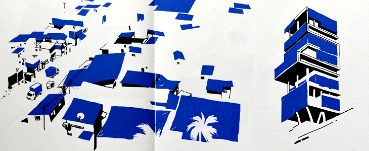
The illustrations highlight the use of basic blue tarpaulins in Indian cities by abstracting all the other elements and leaving just the shadows and the blue colour to define the scene. If in India the blue tarp is ubiquitous, as in Kulavoor’s words, “it makes for excellent sun-proofing, dust-proofing, pigeon-shit proofing, packaging, and temporary refugee camps.” they’re certainly familiar globally; I recall my father’s motorbikes being protected from the rain with them, a neighbour’s shed-rebuilding project shrouded in one (for years) and various festivals and outdoor markets seemingly constructed from them (and thickets of scaffolding poles). The book is available from Tadpole Store.
Created by Bart De Keyzer and Frederik Jacques, This is how I learn my ABC is a beautiful little educational app (or digital book, should you prefer) for the iPad. Clearly aimed at children, the app is delightfully presented with clean, crisp illustrations, bold typography and subtle animations, and therefore will probably get just as many designers as parents buying it (and I’d guess most of the overlap between those). The app is in three sections, the first a tour through the alphabet where you get to admire the big illustrations, hear the sounds of the animals and read a fact or two about each one, and the other two are quizzes that let you match the letter to the animal or vice versa, and keep score on how well you’re doing.
There are some posters available to buy on Society 6 as well (there’s no page listing all of them that I can see, so I’ve linked to D for Dog here). I think the name of the app is a little too dominant on them, if you got a ‘full set’ it’d look pretty strange — I’d rather they be more traditional with the illustration and animal name front and centre with the name of the app much less visible. After all, if you buy these for your home, who are you advertising to?
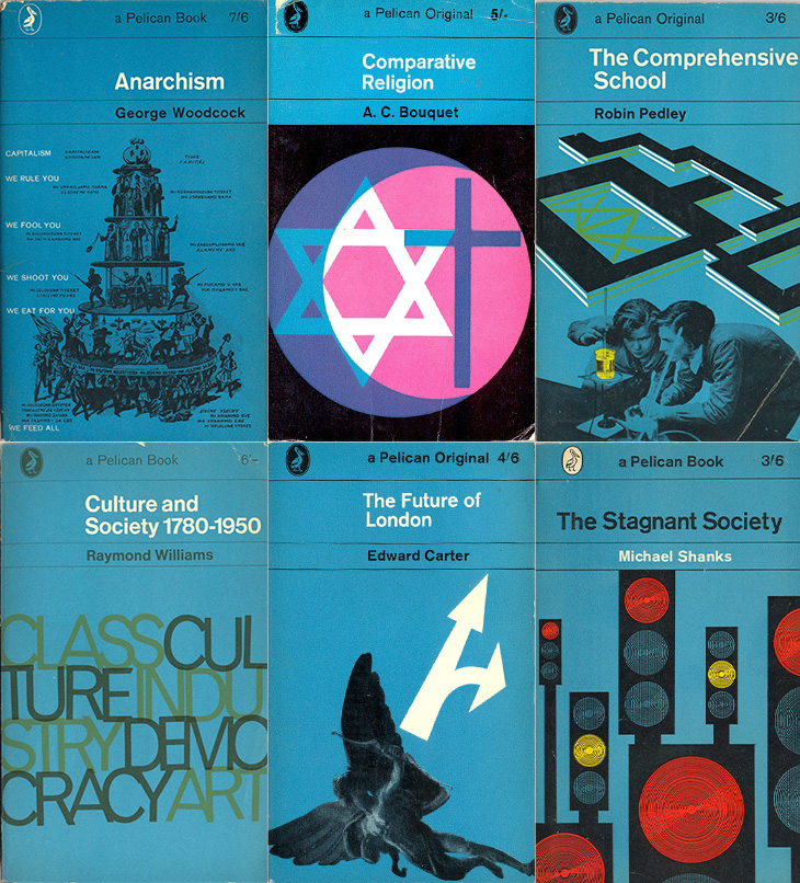
Very much a hey, look at this post, this. I’ve just seen a link to this collection on Things Magazine of Pelican Books covers for the 1960s (and each decade they were published). It’s interesting to see how the template developed along with the Penguin series until it all got a bit chaotic in the late ’70s and was discontinued in the 1980s. Joe Kral also maintains a collection of Penguin and Pelican covers on Flickr.
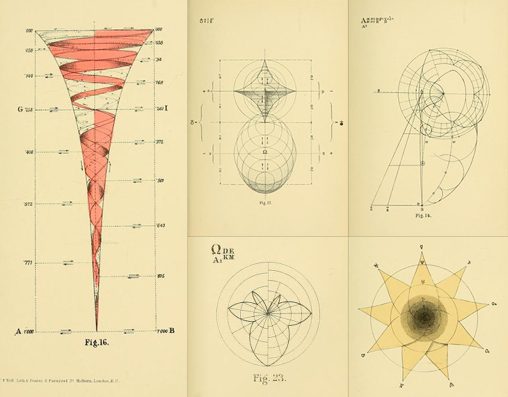
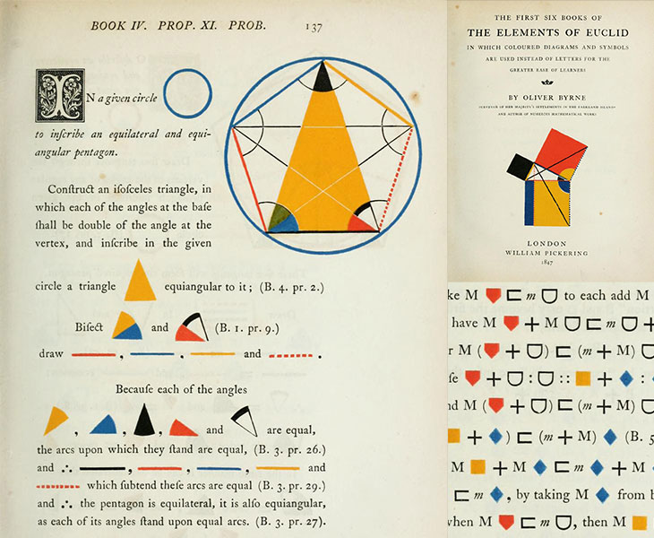
I had been searching for something geometry-related when I found the Euclid book in the last post so when I found the Public Domain Review I wondered if they had anything else about the subject. Turns out they do, and I found this fascinating and somewhat bonkers book from 1887, Geometrical Psychology. Nothing to do with what I was looking for, but it has some remarkable illustrations in it where the author attempts to diagram the evolution of human consciousness. Some of my favourites:
The back of the book also has several pages of adverts for other works available from the publisher, and just the titles alone are fun to read through. Some of my favourites again:
Lunacy, drugs and booze! I’d imagine this was a rather popular set of publications.
A series of unsuccessful (and unrelated) searches led to the happy result of finding this book (and the site it’s on). The Public Domain Review is a fascinating collection of articles about (and a collection of) out-of-copyright texts, images and films, and somehow I’d never seen it before.
I’d seen a page from the book and thought it to be something quite modern, something produced by some later follower of De Stijl or Bauhaus (something the Public Domain Review also comments on), but it is in fact from 1847. Not something you’d associate with early Victorian publishing at all. It’s a remarkable book, and thinking back to when I first learned geometry I wondered if something like this would have helped. In all honesty (and of course entirely my opinion) I can’t say it would. The pages are a visual delight but they compel the learner not only to learn the concepts and mathematical language but a whole new graphical one too. From my memories of Euclid you need a good guiding commentary (or a good teacher, or both) rather than a new translation to help you make the necessary connections and learn the principles well.
The long-s characters and the ornamented capitals are a clue to the age of the book, but the diagrams appear very modern.
It’s a fantastic thing which has the potential to be very useful. You are drawing with a biro though so adjust your expectations accordingly. The software is awful, but not so bad as to make the device useless. Just make sure you export as SVG.
Far TL:DR
If you sketch a lot and need a digital copy of your sketches, get one. I’m glad I did. Actually, I’m not. See below.
Update: I discovered that Wacom believe the Sketch Manager software is so vital to your everyday computing needs that they’ve set it to launch on startup. What’s more (and I suspect this is down to the dodgy Windows to Mac port) it doesn’t do this properly, in a way you can change using the Mac OS ‘Login Items’ setting. To stop it launching at startup, have a look at this Apple Discussion entry. I found entries for Sketch Manager in both the main and user ‘Library’ folders. What’s more the user library folder is hidden, so you might want to ‘unhide’ it first. This is a terrible thing to do, requiring technical knowledge that shouldn’t be expected of any buyer of a consumer product to fix.
Update 2: I bought mine from Wacom directly. I don’t know anywhere that has them in stock. You might want to reconsider anyway, given the above.
Wacom have (finally) started sending out orders of their new product, the Inkling. I got mine the other day and I’ve been having a good play with it. It’s very good. Not perfect, but very good. The announcement video set some very high expectations, some of which are matched by reality, while some… aren’t.
The whole idea of the device is to record what you draw so that you can import it into image editing programs later, either as a bitmap or (more excitingly) as a vector image. It keeps a track of every stroke, in the order you made them, and records how hard you were pressing on the pen, so the recorded lines vary in thickness with pressure. I think it was this that really got everyone interested.
As a gadget, it’s a lovely little thing. There’s a pen, a receiver, some spare nibs and a USB cable, all neatly packaged in a case that doubles as a charger. Closed, the case looks like a rather glam pencil case with an elaborate hinge.
Using it
Getting started with it is straightforward. You clip the receiver onto the edge of your paper (or notepad, envelope, napkin or whatever) turn it on, and draw. The pen turns on when you start drawing, though I found best to give the nib a preparatory tap on the page somewhere first, just so you know it’s ready, otherwise you’ll lose the first stroke.
The receiver has a couple of buttons, one to turn it on, and the other to create a new layer in your drawing (yes, you can create layered drawings). Turning the receiver off and on will create a new file, as will squeezing the clip – as you might do when changing the paper, which is a nice touch.
Does it actually work?
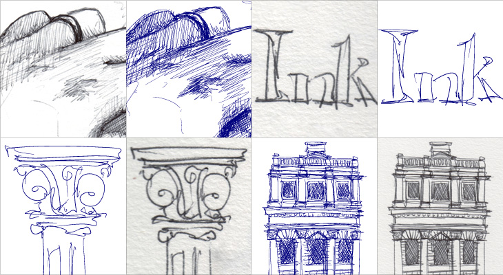
Well yes it does, rather well actually, but it does depend on your drawing style and your expectations. It does a very good job of recording your strokes, from the faintest to the heaviest of lines, and it’s as good as my tablet at recording the fairly fast and loopy lines of my handwriting. I tried a few drawing styles, from handwriting to fast and loose scribbles to a sketch of my hand, crosshatched shading and all, to see how it would record them, and for the most part it did a very good job. Looking at the vector output I can see why Wacom supplied the pen with only ballpoint tips; you can probably play with the settings to improve things but ballpoints aren’t particularly nuanced or subtle drawing devices, and the output reflects that. As I said, it records things well, but not beautifully. When exporting as SVG, the vectors are made from very short line segments (they aren’t smooth beziers) and very faint lines tend to come over a bit thick, so what you’d drawn as subtle crosshatching is recorded as a rather heavy bit of shading, while thicker lines come across as a bit thin.
Scans of various sketches, compared to how they come across as SVG. This is using all default settings the device comes with.
I don’t see any of this as a serious problem though. I think by making the pen a ballpoint Wacom are signalling the quality and style of drawing that the device records well. With a few tweaks to the settings, I can see myself using it to record some actual illustrations for use as final artwork, but its real strength seems to be in recording rough ideas. My sketches of lettering ideas, flow diagrams, outline illustrations, logo and site ideas all came across perfectly (though with provisos, see below) and were great to use in Illustrator as guides for finished artwork. Because the output is vector and faithfully records pen pressure it works far better than a scan might, and means I don’t feel I need to delete the guide layer to keep file sizes down (as I might with a scan).
What the device offers is convenience, and a bit of magic. It’s less hassle than scanning or photographing your notebooks, and you get scalable vectors nicely separated into whatever layers you want. You can draw an outline sketch and then feel free to scribble and annotate all over it, knowing each addition can be turned on and off and moved about at will, or even deleted entirely. That’s the real appeal of this thing.
The software
There are some extra special bits of magic the Inkling hints at, but isn’t yet backed up by the software that comes with it. When you look at a sketch using the ‘Sketch Manager’ software, you can replay the drawing process as an animation, or use a scrubber to focus on a particular sequence of strokes. There’s something quite fabulous at seeing a time lapse of something being drawn, and here it is with your very own sketches! But, and I found this a little disappointing, you can’t export the sequence as an animation. The whole purpose of the player and scrubber is to allow you to split your drawing into multiple layers, as you might want to if you’d not pressed the ‘new layer’ button at a particular point. Useful, I’ve no doubt, but a rather mundane use case compared to the “can you see what it is yet?” fun potential. It would be nice to be able to export animations, and I know it’s not the main purpose of the software, but it seemed like such a big potential win that I was surprised it wasn’t there.
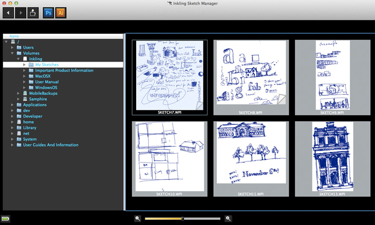
The main interface of Sketch Manager. Pretty horrid. Showing the directory tree is a very strange choice, especially for a Mac app. It’s not useful at all. Note how the toolbar icons look borrowed from another app.
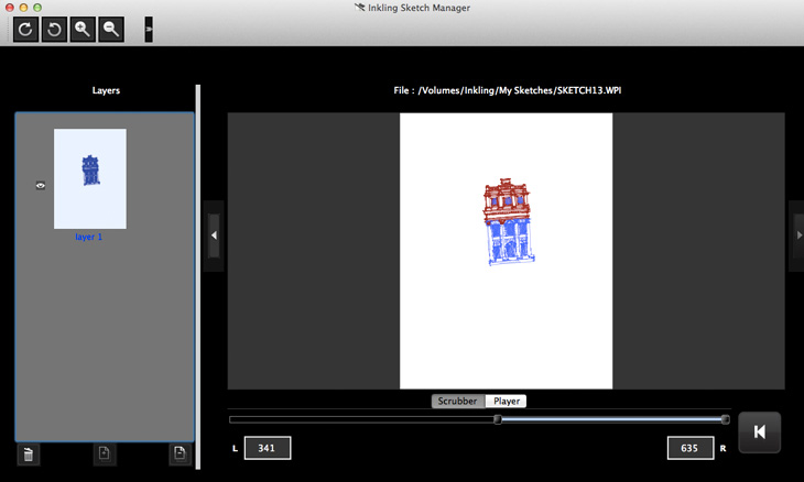
The other issues with the software are less structural and more down to (it appears) a rushed job and skipped testing. The screenshots in the manual show the software running on Windows, looking fairly good, with everything looking like it’s in the right places. Seeing what it looks like on the Mac, I would hazard a guess that it was designed originally for the Windows UI, written for Windows, tested on Windows and then ported over to the Mac. Button assets look clumsy against the Mac’s grey UI, some buttons end up in the kind of drop down that you get when there’s no room to show everything and the text is jargon-filled and doesn’t feel like it was written for humans. There are some very odd labelling choices too; for example, the scrubber for the drawing timeline shows two numbers, one labelled L, the other R. Left, and right. I had no idea what these meant other than to wonder whether it was a count of left versus right handed strokes, which would be an odd thing to show since I’m fairly sure ambidextrous illustrators are quite rare. But no, as you move the scrubber bars, it shows you how many strokes are to the left of the scrubber (i.e. earlier), and how many to the right (later). I can’t imagine why this would be at once so important to show, and yet not label properly.
The document interface. Also pretty horrible, and largely incomprehensible. That large button down the bottom right takes you back to the main screen. Placed next to the scrubber and player like that, I thought it was a rewind control.
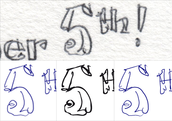
More serious problems show up when you try exporting sketches to Illustrator and Photoshop. At this point you really need to have restarted your computer after installing Sketch Manager (yes, it’s rather old school), if you don’t, Illustrator will give you a dialog asking whether you want to import the text as ANSI or not. Whatever you pick, you’ll get a large text field with the contents of an XML file in it. If you have restarted, you’ll get a series of very strange paths with stroke widths set using Illustrator’s calligraphy tool. It’s not great. Sharp corners get filled in as splodges and the whole thing looks like a vector trace of a bitmap.
A scan of the original drawing, and three different outputs. First is direct to Photoshop, the second is direct to Illustrator, and the last one was exported as SVG and opened in Illustrator.
Exporting to Photoshop was a bit better in that I got an actual image first time, but it created a 600dpi document with what looked like a scaled-up 300dpi image in it, which I think is exactly what it is; when you choose to export to any of the bitmap formats they create a 300dpi image. Also, when you choose to export to Photoshop, it changes your Photoshop settings so that the units of measurement are inches. I can’t even begin to comprehend the utter boorishness of this. I’ve checked, and checked again. I set my units back to pixels, export a picture from Sketch Manager, and there it is, inches again.
Not good. Really, really not good.
The only way to export vector data reliably is to use the ‘Save as different format’ option, and choose SVG. This works well, but is a faff as it defaults every single time to PNG and defaults the file location to the device itself. As I said above, the vectors are short straight-line segments rather than smooth beziers, but it does at least create a faithful replica of your drawing.
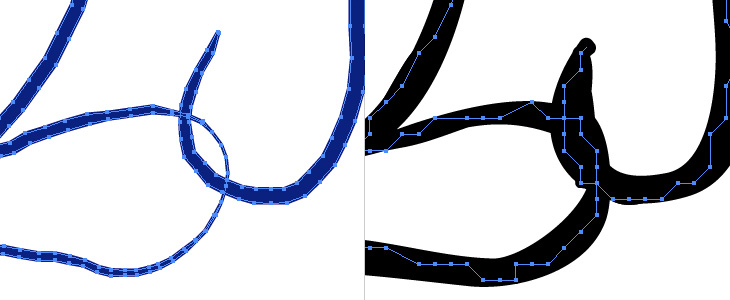
Viewed in Illustrator, the paths of a sketch exported as SVG (left) and direct to Illustrator (right). Even without looking at the scan, the difference in fidelity is clear.
I should point out that the Sketch Manager is far better than any vendor-provided scanning software I’ve ever used. Not exactly praise, but it is something.
The upshot
The Inkling feels very much like a tool for designers more than illustrators. If you sketch rough ideas – layouts, lettering, schematics and the like, you’ll find it very useful. If you want to record your sketchbook of illustrations, you certainly could, but it might cramp your style having to use that pen - Wacom themselves say it’s good for preparatory drawings, and I agree. I don’t use ballpoints very often for a couple of reasons – I don’t particularly like the quality of line they offer, and the ink smells bad. For the sheer convenience of this tool though, I could live with both.
