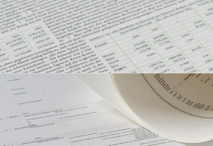
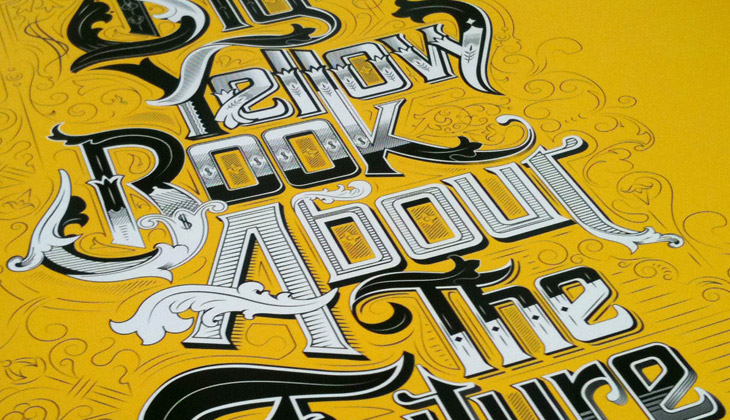
What would Das Kapital, The Iliad or Faust look like if they were printed on a single page? What about Macbeth? This set of four posters by All The World’s A Page can show you exactly that. Oddly, they’re simultaneously both compelling and repellent — the concept, the flow of text, the exposed structure (especially in Macbeth) and the beautifully consistent and even colour give you a sense of wow, look at that, while the sheer scale of them, the obvious difficulty in reading them feels intimidating, even slightly upsetting. Not too upsetting, I might add; I bought two as soon as I saw them. I can’t wait for them to actually print Ulysses too…
There are many examples of ‘animated typography’ out there, some of them are good, most of them are crap, and some just take you by surprise and are utterly brilliant. This one on Newgrounds, sent to me by a friend, fits the ‘utterly brilliant’ category, but for slightly different reasons than you might expect.
It’s an animation of a review of a game on the site, written by someone who, if we’re being charitable, isn’t a very careful typist. The animation itself (by Mick Lauer) is well done, with some nice touches — the pause to define ‘contrail’ and the ‘explain to me’ parts are particularly good — and Impact is a perfect choice for the subject matter, but what really makes it brilliant is the voice track. It was done by voice artist Deven Mack who I imagine has quite the career ahead of him. Well I hope he does.
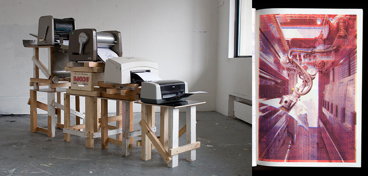
Simon Goode just linked to this on Twitter — a book by Xavier Antin, made by printing each of the four colours on different eras of desktop printing technology in succession. It’s just fun. The results are pretty much what you expect, but still rather attractive and made more interesting by knowing how they were printed, using technology spanning nearly a hundred years. More images here.
Advice To Sink In Slowly is a project set up in 2006 for graduates to pass on advice to first-year students when they arrive at university. Graduates design posters to illustrate their piece of advice, and each new student is given one at random — the idea being that each graduate now knows something they wish they’d known when they started, and that this is how to pass on that advice in a creative and welcoming way. It’s a great idea, there are some really good bits of advice in there — even the more obvious ones are cleverly illustrated so are made fresh and new. I wish I’d had some of these when I arrived at university.
This caught my eye on the Lovely Ligatures Flickr group — it’s a piece of client work by the talented bunch at Like Minded Studio. So much of their work is just the kind of thing that has me looking closer, perhaps with a touch of chagrin that it wasn’t me that did it, there’s so much incredibly detailed work going on there. Go and take a look at their site to see more of their work.
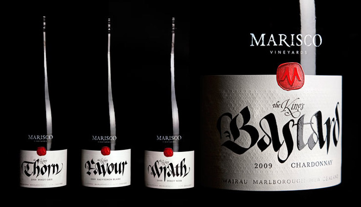
These wine labels, featured on The Dieline, by Marisco Vinyards are beautiful. They’re from “The King’s Series”, a range of wines produced to celebrate the family’s heritage — they’re descended from the tyrannical Marisco family who, during the 12th Century, owned and operated from Lundy Island, just off the coast of Devon. It turns out the family were periodically in and out of (but mostly out of) favour with the monarchy, inspiring the names of the wines, from The King’s Favour to The King’s Wrath. The labels were designed by Hook’s Christopher David Thompson and the beautiful, historically-appropriate calligraphy was done by Peter Gilderdale. I love the finishing on the labels — the textures are reminiscent of lacework and embroidered fabrics, and the strong varnish and deboss on the calligraphy makes it look like bright fresh ink. It’s all really rather lovely.
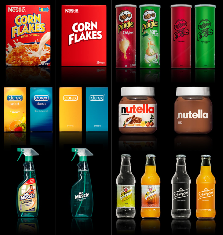
A few people tweeted links to this brilliant collection of packaging redesigns by Antrepo — they’re done as an exercise to illustrate the idea of reducing the design of the labelling to its simplest form, while also showing an intermediary step of a ‘partially simplified’ design. It’s interesting the effect it has on the different products. Some gain a sense of being a premium, high-value product, while others start to resemble economy, basic versions. The Pringles packs look pretty basic; with the full-colour printing gone, the basic nature of the cardboard tube stands out, and with the simple black printing it looks like a supermarket own-brand or something bulk-bought by caterers. On the other end of the scale you have Nutella and the Schweppes drinks — both of them look like the kind of ‘artisanal’ packaging you’d see featured on the Dieline or similar targeted at people who want the same old stuff but to feel a bit special about buying it. And having said that, the Corn Flakes one is just great. It’s absolutely perfect — if I ate cereal then packaging like that would definitely have shelf appeal with that beautifully simple and stark lettering, and how. It reminds me a little of the General Mills Kix packaging, which I also like a lot.
Visit Antrepo’s site for more info and links to the full set.
Of course, packaging for most fast moving consumer goods is brightly coloured and covered in imagery for a reason — it’s to draw the eye and make its purpose, contents or intended use immediately obvious to the shopper. Without going into some kind of pop-psychology analysis of consumer habits, it’s interesting to think what the manufacturers are intending with each package. The simplified Mr Muscle one looks great, but on the original you can easily tell it’s for windows and tiles even without reading any of the words. Similarly for the Durex boxes, I’d hazard a guess and say the orange box contains flavoured ones — the word ‘select’ hardly makes that clear — again, the original packaging wins out.
The food ones all have some kind of serving suggestion (albeit a ridiculous one in the case of the Corn Flakes, I mean, that’s quite a tempest going in the bowl) designed to put the image of the food in your mind, a simple association that makes you more likely to buy it. The only one I think where that doesn’t happen is with the Schweppes bottles. The type is pretty small on the simplified one, but it’s a hell of a lot more legible than the original. Given that you’re likely to see bottles like these in a fridge behind a bar, you’re going to be hard-pressed to read the label and form an idea in your mind that maybe you’d want mandarin as the mixer in your drink, as opposed to orange juice, say. You’re going to look and see confusing labels all done up with sparkles and images of bubbles, and not know if it’s soda and plain old OJ in them or something more special. You’d just end up asking for something generic, and end up (in a lot of British pubs at least) with some rank pre-mix out of a tap on the bar. I could mention at this point that Red Bull might be considered drinkable by some, and therefore a food. It’s not, but it is easily recognisable in a behind-the-bar fridge, which tells you something about British pubs and the drinking culture they encourage, but that’s an entirely different rant.
So yes, beautifully simple packaging is a wonderful idea, but I doubt we’ll see many big manufacturers opting for it, sadly.
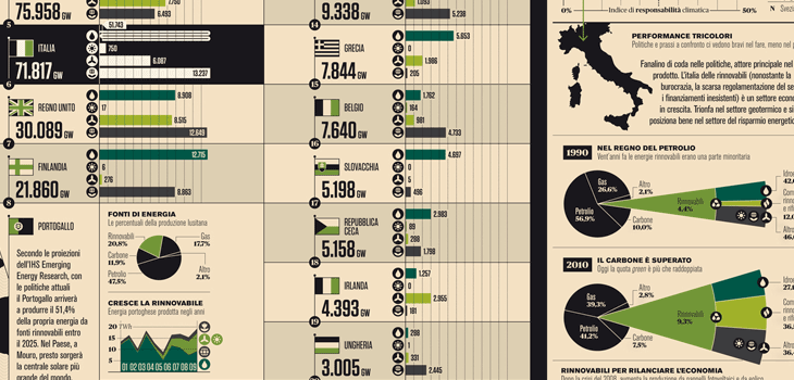
I’ve seen and admired Francesco Franchi’s editorial work before, but I hadn’t seen his Flickr stream until now. It’s quite an inspiration — I love how clearly and crisply everything is rendered, and there’s real artistry in the fine details and the balance of illustration, diagram and infographic in his work. Sadly I’m not fluent (or even competent) in Italian so I don’t know how well the words and pictures work together — any Italians out there like to enlighten me? It certainly looks like it should be a good read, but then, so does Monocle, and it isn’t. Anyway, go and have a look, and be inspired. I’ve put a few details from some of my favourite spreads below:
I’ve had these lined numerals by Steven Jockisch bookmarked for a while — too busy tweeting and working to get a decent post up here I guess. They remind me of a few things I’ve seen, which made me wonder whether I’d posted about them (or a similar project) before, but it seems not. Noted for inspiration.
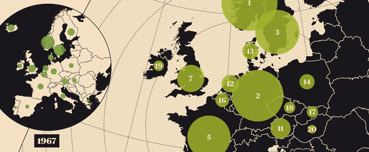
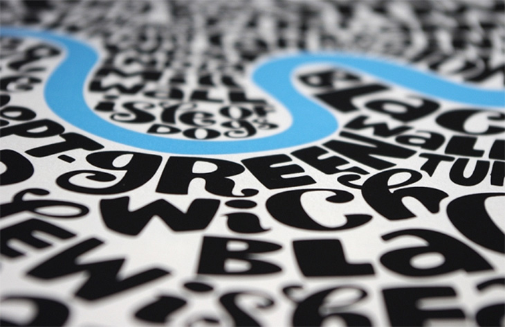
The last time I posted about a set of maps made of words I was a bit hesitant about it. The map itself was attractive, and I liked a lot of things about it (I wouldn’t have posted it otherwise) but I did wonder how much of it was automatically generated, and how much of it was done by hand.
Not that there’s any problem with generating things automatically, as it takes just as much (if not more, sometimes) craft and creative energy to design, program and build something to do that, but sometimes with the computer generated stuff there’s a question of, “How much of this did you do?” Is it a plugin or script you downloaded? Should we be crediting someone else with the creativity and diligence to program the thing, and you with the idea to use it like this? Does it actually matter? It’s not like effort is ever any measure of quality, but of course we naturally associate a premium with something made in a way that doesn’t scale (through difficulty, moods, inspiration, randomness and so on), so that it becomes a unique object, or at least a rare one — this is the premium of the handmade, the crafted object. So this is what I was wondering about when I saw these maps by Seagull’s Hut, not made of type but hand-lettered, and then printed as limited editions:
It’s not like you can buy the original artwork, but it is in itself is unique, and the prints from it can only be copies of it; you can’t make new originals, which is something you can’t say for anything algorithmically produced. Well, unless you create AIs and they become conscious and develop an artistic sensibility that is. I’ve raised that issue before and had quite the flood of crazy comments from the internet’s vibrant and vocal apocalyptic tendency, including the gloriously and perhaps unwittingly eloquent, “humans will be instinct”.
So yes, don’t get me wrong, I do like the maps from Seagull’s Hut. Shame I can’t link to them directly, but go and take a look at their store. I don’t think I’ll be posting about any more maps made from lettering or type though. The inspiration has become a meme, and is ever more dulled by the transformation.