Quote, Unquote

What is an apostrophe? What is a quote mark? Are they curved, or can they be straight? It’s hardly a question on everyone’s lips, but it’s certainly raised the ire of people on this site, Apostrophe Atrophy (via Daring Fireball). With the link text on DF, I was fully expecting the usual suspects of grocers’ apostrophes - potato’s, orange’s, apple’s and the like - and instead finding a set of “straight” apostrophes and quotes in place of curved ones.

Call them what you will, “straight”, “dumb”, “ambidextrous” or whatever*, the apostrophes and quotes shown on the site appear (from the ones I saw) to be otherwise grammatically correct, which is reassuring. The point of the site however, is to say that it is entirely incorrect to use a straight quote or apostrophe instead of curved ones. Is it though? A comment by Michael Beiruit garnered this response:

Michael Beirut linked to us on Design Observer. He says that if people understood the difference between its and it’s he wouldn’t care what kind of quotes they use. Our opinion is that if you are setting type you should know about the correct kind of apostrophe and ALSO [sic] know about proper grammar. We have never shown html [sic]** text before, but when the site is for designers, you would think they would take the time to use the correct apostrophes and quotes…

All very true, and yet we have this, on MetaFilter. I’ve reproduced some comments here in case the page goes away:

I always turn off “smart quotes” in Word. I think it looks pretentious.I agree! Up with the “dumb quotes” backlash!I agree with the smart quotes issue. But the apostrophe thing… sometimes a dumb apostrophe looks better.Smart quotes are the fastest and easiest way to make your web page look like garbage on half the computers that visit, particularly since most designers use cute PHP tools that replace the dumb quote with the Unicode or Windows-font smart quote characters rather than with an HTML entity.

So there are people who would rather use straight quotes, for aesthetic, ease-of-use, technical and even social reasons, and their reasons do have some validity. But why do we have straight quotes at all? If they’re incorrect, where did they come from? Well, perhaps rather obviously, it’s a compromise created by the lack of space on original typewriter keyboards (more specifically, lack of space inside the typewriter for the extra workings for more keys). There wasn’t room to have an extra dedicated key for left or right quote/apostrophe marks, so a single key was used for a new “ambidextrous” set of quotes and apostrophes. As typewriters were a way of getting words hammered onto a page; faster than a scribe, easier to read than most people’s handwriting and always consistent, no matter who was doing the typing, this compromise was acceptable. If you wanted to publish your words, you would send it to a printer where typesetters would take your words and use their typographic skills to make them readable and (hopefully) beautiful.

With the advent of word processors that do everything except what you wanted to do, people are used to picking a font, typing their stuff and printing it out. The operative word here is typing. The keyboard still only devotes one key to the two symbols, and they are used for mathematical primes, feet, inches, minutes, seconds and arc as well as quotes and apostrophes. It’s up to the program you use to work out the context and hopefully replace it with the correct typographic entity. Of course, not everyone agrees that this is desirable:

For the better part of the twentieth century, the distinctive forms of typewriter type (notably its single-character width and unstressed stroke) characterized the immediacy of thought: getting the idea down without dressing it up. Now that computers have replaced typewriters, most word processing programs default to Helvetica or Times Roman (or their derivatives) as the typographic expression of simple typing. [...] As a typographer, you should recognise the difference between typing and typesetting. Time and usage may ultimately make Inkjet Sans the expected typeface for letters. For now, however, on paper, typewriter type is still the best expression of the intimate, informal voice - direct address. Imitating the formalities of typesetting in a letter is always inappropriate because it suggests an undeserved permanence - the end of a discussion, not its continuation. John Kane, “A Type Primer”, p85

So why the problem? Why do some people prefer straight quotes? Perhaps it has something to do with how the symbols are perceived. If you type something and the program you’re using changes it, then your first reaction may well be one of resentment, “How dare this program claim to know better than me!?” If what it changed it to is better, for example, a spelling correction, then you will accept it and move on. However, if it made what appears to be a superficial change, a stylistic correction, then it is more likely your resentment will remain, and you’ll go looking for that know-it-all option in the program preferences and self-righteously turn it off. I’ve done stuff like that before, and I doubt I’m unique with it! Curved quotes are perceived as ‘proper’, the kind of thing that people who publish things for money would do, people who care about such details. To use them in your work might make people think that you are one of these people, and we end up with the first quote above: curved quotes are pretentious. Think how this consideration would influence companies when they create their advertising, their billboards, their brochures and leaflets.

There are also a few technical reasons for preferring straight quotes - the main one being that they exist in “low ASCII” and no special codes or character encodings need to be used to show them. This is important consideration when programming, but is just a convenience for the lazy when creating (say) web pages. I keep my browser encoding in UTF-8, and frequently come across pages where the encoding is different from mine and the page hasn’t been put together properly with this possibility in mind. I’m left looking at a page with loads of question marks and “unrecognised character” marks everywhere. There’s no excuse for getting it wrong accidentally. Most word processors will automatically replace the straight quotes with curved ones, and for online editing, most CMS tools will automatically insert the correct HTML entities so that the symbols appear consistently on all browsers, and will usually handle (say) Word’s smart* quotes perfectly well too.

In the end, I would say that of course it is always preferable to use type correctly, but typography is the servant of meaning, not the master. If straight quotes, however much of a modern bastardisation of type they may seem, enhance the meaning of a piece (or if curved quotes would distract the reader), then you must use them. Otherwise, don’t.

From Pride and Prejudice, on the low-ASCII and straight-quoted Gutenberg Project.

* I absolutely refuse to use the terms “smart quotes” or “dumb quotes”.

** Capitalising ‘also’ but not ‘HTML’ is unfortunate, for a site so apparently devoted to correct typographic usage.

Mongolian Script

If you’re here to ask me to translate something into Mongolian for a tattoo, please go and read the note at the bottom of the article now.

It’s not every day you come across something that you’ve not only never heard of before, but never even suspected existed. Such it was with me and Mongolian Calligraphy until yesterday evening. I found some examples of it in a Google image search from here and here and decided I needed to learn more about it.

It turns out that thanks to Stalin and the Soviet Union we nearly ended up losing the classic Mongolian script as a living writing system entirely:

Introduced in the times of Chinggis Khaan, some eight centuries ago, it was widely used until 1942, when Stalin decided that Asian nations including Kazakhstan, Uzbekistan, Turkmenistan and Mongolia must all use Cyrillic instead of their native script. Mongolia Today

Thankfully, now that the Soviet Union is dead and gone there are now efforts to revive interest and skills in ‘Old Script’. There are a couple of other writing systems used for Mongolian, but I’m mostly interested in the classic script, and especially the calligraphy it makes possible. It really is beautiful. Interestingly, it’s read from left to right, as Wikipedia explains (from the classic script article):

Most other vertical writing systems are written right to left, but the medieval Uyghur alphabet and its descendants - the Mongolian, the Oirat Clear, the Manchu, and the Buryat alphabets - proceed from left to right. This is because the Uyghurs rotated their script 90 degrees anti-clockwise to emulate the Chinese writing system.

I noticed the left-to-right reading direction after a bit of research led me to The Mongolian Bible site, which has the New Testament translated into Mongolian and presented in classic script. You need Internet Explorer to see it, as it uses Microsoft-specific things to display the font and the vertical type, but if you have IE it’s worth a look.

A Kaleidoscope of Planes

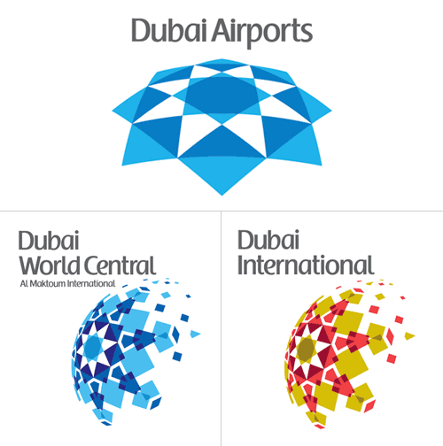
A few weeks ago, I spent a good hour trying to find some background info on the rebrand of Dubai International Airport, without success. I just went back to the Brand New post on it and there it is, a link, courtesy of Ty Wilkins.

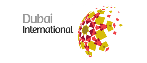
While the airport logos have patterns similar to the tesselations characteristic of islamic art, the main logo pattern is rather reminiscent of a compass rosette, perhaps to imply that Dubai is at the centre of things? I generally agree with the Brand New post (and many of the comments) in that the positioning of the type on the individual airport logos seems clumsy and distracting. Having the type endpoint line up with the apex of the implied sphere is a straightforward solution, and yes, it’s not all that bad, but it’s not all that good either.

There’s something oddly old-fashioned about the choice of typeface and colour too, like something from the late 1980s. I’d prefer to see either the word “Dubai” or the airport identifier in a different weight, or black (instead of grey), or something - anything to give the type some life. I’m not sure about the face - it does look a bit like the Emirates logo, and I’m interested to see that there’s no arabic version of it too. Changing the positioning of the type, as below, focuses attention on that centre of the centre-of-things pattern and would look even better in arabic right-to-left lettering - in my everso humble opinion, naturally:

Mind, when we get some wider applications of the logo to brochures, signage, wayfinding and the like, it could appear quite different, with the odd type integrated and comfortable with the patterned globe.

Oh, and I have to point out the odd language on the logolounge article,

Dubai Airports tapped Cato Purnell Partners in 2007 to develop an identity system that would not only unite the organization’s holdings, but also mark Dubai as an international air hub.

Tapped? How do you tap an agency? I have horrific visions of plumber-surgeons installing chromeware directly into living flesh, a media agency relationship direct from the mind of Guillermo del Toro! Of course, this would hardly be the only linguistic horror inflicted on the language by the media industry, I say over and over again, the word creative is not a noun, no, not even when applied to a person, and especially not when referring to artwork. Rant over.

Toronto Type

I’ve had this page open in my browser for weeks now, demanding that I say something about it. Joe Clark writes a comprehensive critique of the state of typography on the Toronto subway system, from great beginnings to the chaos of today. From the introduction:

You might not expect something typographically unique to come out of Toronto, a B-tier city that stands in the shadow of A-tier cities even in the minds of some residents. But the margins are where originality can thrive, and the typography of the Toronto subway is a prime example. It is also an example of subverting, ignoring, and actively destroying a special typographic heritage - quite an achievement considering that the type involved is almost a foot high and permanently sandblasted into subway walls.

The article goes on to describe the poor state of information design for signage across the subway system, provides comparisons with New York’s system and shows us what can happen to type when people really don’t care (check out the letterspacing on Leslie, about halfway through the article). It makes you appreciate, even more, just how good London Underground’s type system really is.

The appalling thing is that the original type in Toronto’s system was really rather good, I love the R especially - it is, dare I say it, cute. See some more examples from the article below, then set aside half an hour or so and go and read the article.

The Nature of the Beast

Jeremy Pettis has produced a wonderful series of typographic illustrations, representing 26 animals - one for each letter of the alphabet. For each, custom lettering is designed to convey the appearance or behavioural characteristics of the animal. They’re all very clever, and some require a bit of contemplation to ‘get it’. My favourite is the (perhaps) rather obvious, but beautiful Zebra one, though the Kangaroo one has an ‘ar’ ligature that’s just perfect:

He’s put the background sketches and roughs on Flickr, which is a great use of the site and for once, a use of the site that I actually can get behind. Flickr’s soviet, rigid, artless presentation is actually ideal as a kind of digital scrapbook for roughs.

Wayfinding in the Medina

I’ve had this link stored for a little while now, waiting for me to explore further and write about it. I was initially taken by the use of arabic script to form directional signs (at right) and downloaded the beautifully designed and illustrated thesis by Luigi Farrauto. It’s well worth a look, even if you don’t read Italian. There’s a Q&A in English too:

Which are the main differences between the typography of arabic countries using arabic script and the one of non arabic country using arabic script?
I find that there is more typographic freedom within the Arab world that outside of it. There is a perception, or maybe that’s just how I see it, that Westerners are more focused on fully calligraphic styles for Arabic typefaces, and so they are unaware that we need other typefaces to suit our daily life. Calligraphic styles are great but you can’t set a dictionary in 5 pts size with that.

That’s what I noticed about the sign in the first place - clean, sans-serif (as it were) arabic type. OK, anyone who watched a news broadcast in 2003 would most likely have seen motorway signs written in arabic, but the films crews were hardly focusing on the finer details of the typography.

Lam-Alef ligatures
How has been faced the problem of vertical ligatures in typography?
Opentype provides us with GSUB (glyph substitution) lookups that can exchange a string of characters by a pre-designed ligature. That means that there is a large number of ligatures to be designed, and I’m not a fan of that. In my Naskh style typeface, I kept only horizontal stacking and so I have no ligatures except the Lam-Alef. I find that simpler to read and clearer.

This is also interesting. There are fonts that have been designed with loads of ligatures, but I guess sometimes, less is more.

Reporting Font Piracy

I came across a site this morning offering a 9Mb RAR file offering fonts for free download. It’s quite a list:

Agency Bold, Alternate Gothic No. Two, Arial Rounded Bold and Bell Gothic Black, Avenir (Book, Medium, Heavy), Avernus, Base 9 Regular SC, Catull (the Google font), Digital Sans Medium, FF Cocon Bold, FF DIN Medium, FF Dot Matrix Two Regular, FF Meta Bold and Book, Frankfurter Medium or Bryant Bold Alt, Frutiger Black, Frutiger Bold, Handel Gothic Bold, Helvetica (complete set), Hoefler Text, Interstate Black, Interstate Regular, ITC Bauhaus Medium, ITC Officina Bold, ITC Ronda, Klavika, Lisboa Sans, Myriad Pro (complete set), Neo Sans Medium, Pixel Fonts, Proxima Nova, Syntax Bold, Trade Gothic Bold, VAG Round (Round, Rounded BT, Rounded Lt-Normal, VAGRundschriftD)

From the language used on the site, I’m not sure that the person involved actually knows that fonts are licensed software products, that you have to pay for with actual money:

By the way i would like to share 9mb file contained with web 2.0 font type files archived in *.rar format in order to fulfill some of my loyal reader request.

Whether he does or not, ignorance is no defence, so I did my civic duty and shopped him to ITC, FontFont and Linotype. I’ll be interested to see what happens (if anything). The thing I notice on the three companies’ sites is that there is only a general contact email, but nothing specifically to report piracy of their products. Very strange. David suggested a good way to encourage reporting of piracy would be to give the first person to report an instance of theft a bounty of those fonts being used illegally.

Font-size Glyph Substitution

I was just reading “Why Bembo Sucks” over on I Love Typography, and I was led to wondering why Opentype doesn’t allow for alternate glyphs based on size, at least, that’s how I understand this. After all, as Kris Sowersby points out, fonts were cut for a specific size, with variations in the glyph forms created as a result of aesthetics and practicality. Looking at the Opentype font I have with the most optical weights (Arno Pro) and what options Photoshop offers for Opentype, there isn’t anything in the OT menu or the application itself to set the optical weight based on size.

So why not? Of course, if it does and I’m misreading the spec, do let me know. Mind, I’ll then have to ask why no-one is doing it yet.

And, for comparison, Arno Pro Caption (left) and Arno Pro Display (centre) scaled to the same point size and overlaid on each other (right). Wouldn’t it be nice if the software could switch between the weights automatically?

The Other Ministry

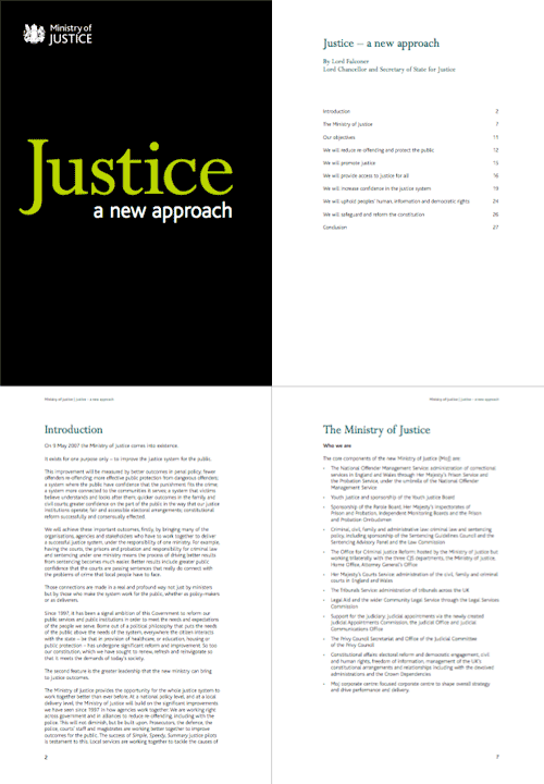
Digging around in my files this afternoon, I found this PDF. I’ve had it since early June 2007 after being sent it by David, who noted that they’d developed a branding remarkably similar to the far more important Ministry of Type, something I still find amusing. Hey, I was here first - just. The combination of white, black and chartreuse must be quite the current fashion for ministries - though I notice that the website carries the oh-so-accessible-but-dull Standard Public Sector branding. Shame that, as the branding of the PDF is rather pleasant.

I was trying to identify the typefaces used. It’s unlikely to be a custom job since the time between the announcement of the MoJ and the publication of this document was only a couple of months. I doubt they’d have been able to create a whole new typeface in that time. Also, the branding was included in the costs of “capital, hardware, accessibility, branding, templates, desktop” - £700,000 in all, and after the costs of IT that doesn’t leave much. So yes, I think it’s a modified version of Bliss - the y is not quite exactly the same, so perhaps some tweaking was done (if I’m right). As for the serif, that’s Perpetua. Quite a nice combination really.

The logo and some sample pages:

Long-Term Consistency

This one’s a bit of a “Fancy that!” post. I came across this interesting post on Kit-Blog about the remarkable typographic consistency of Woody Allen’s film titles. For pretty much all his films, the titles are set in Windsor-EF Elongated, by Elsner+Flake. Not having seen a great deal of his films, I’d not noticed, but looking at these images, they just say “Woody Allen film”. How about that for brand identity?

Go and read the full article for more info and images.