Something I found the other week and caught my eye, a project by Jonathan Puckey to convey some of the aspects of handwriting, namely speed, into typographic weight. I like the idea, I remember having a pub conversation along similar lines many years ago. It was after a fairly difficult day and the old problem of conveying tone or mood in emails came up. A friend suggested a keyboard with pressure-sensitive keys and software that varied the size, weight, and perhaps even the style of the text depending on your typing speed and the force you were typing with.
The possibilities are still interesting (which is why this caught my eye) and might be an entertaining set of dimensions to add to OpenType. I guess you’d have to be careful with the calibration—some people type as if there are bankers hiding under the keys—otherwise you’d be known as “the shouty one” based on nothing but your emails.
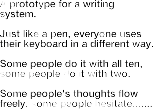
Image via Jonathan Puckey‘s site. Also check out his Lettering Tool. Sadly it’s not available to download.