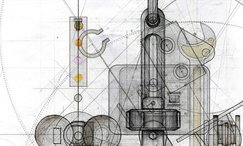
I’ve had this great gallery of technical illustrations open in a tab for a little while now, and if you’re at all into super-detailed diagrams it’s well worth a look. The one of the fan (below) is my favourite. Via Chris Glass.

I’ve had this great gallery of technical illustrations open in a tab for a little while now, and if you’re at all into super-detailed diagrams it’s well worth a look. The one of the fan (below) is my favourite. Via Chris Glass.
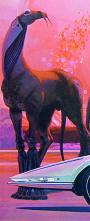
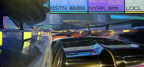
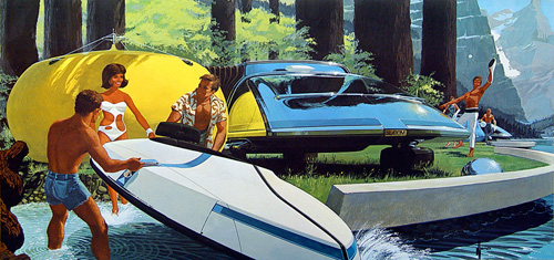
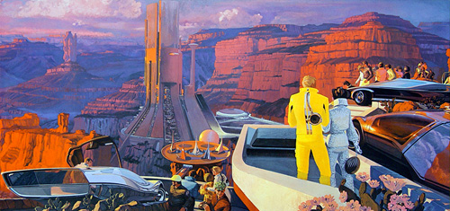
In the future, we will all have very low, flat cars, road signs will be hard to read, we will have genetically modified pets and will build large industrial entertainment complexes in areas of astounding natural beauty. That’s the future according to these amazing 1960s illustrations from United States Steel International, by Syd Mead*. Naturally, the implication is that we will be using lots and lots of steel, and will continue to use it to make sleek, shiny cars.
It’s strange how these pictures remind me of a book I had at primary school (I was about 7) which showed two possible futures. One was positively pastoral, with blue skies, happy people cycling along clean white paths through a garden city. The other showed what would happen if we didn’t reduce our energy dependency (apparently), and showed gigantic skyscrapers looming against brown, smoggy skies, with traffic jams and people wearing gas masks. They were both illustrated in an almost identical style to these retro futurist ones, and showed almost the same subjects - they could have been taken directly from this series.

I was looking through my site earlier trying to find an article about Ian Kim’s work, and found that somehow I hadn’t done one. I’ve admired his work for a while, especially the piece below. I was doing some work today that needed illustrations of books flying around (right) and wanted to look at it again for inspiration.
As you can see, my style is rather different (I love working with vectors) but it’s always good to acknowledge your inspirational sources! The similarity in colours is entirely coincidental - the project I’m working on has a scheme of red and blue already!
Make sure to have a look at the ‘personal’ section on the site too, as there are some powerful images, some on some emotive and important subjects.

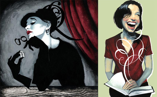
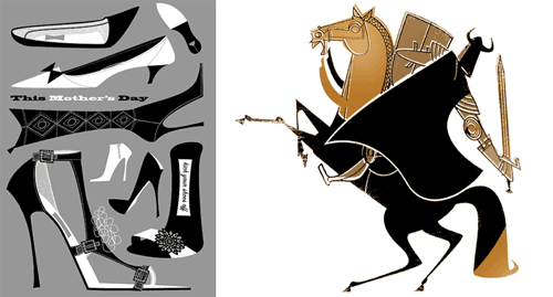
Found while reading Drawn! yesterday, the portfolio site of Fernando Vicente which shows some of his amazing work. I love it.
These two especially - the one on the left is called ‘Type Face’ so I just have to show it here, and the one on the right I like for the expressiveness of the laugh - it makes me smile. Go and have a look.

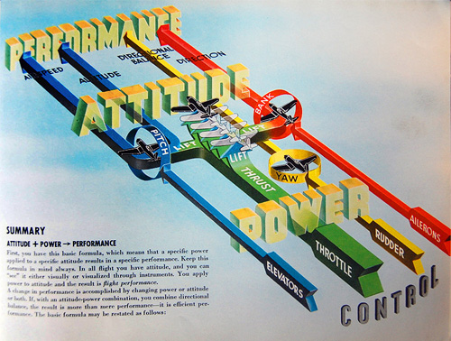
Over on Telstar Logistics there’s a great post on the book “Flight thru Instruments” which has some of the best information graphics I’ve ever seen. There is, as ever, a Flickr gallery of images from the book, which are a great source of inspiration, especially the seemingly simple ones like this and this. Go and take a look. There’s a nice bit of background on the production of the book:
It turns out, “Flight thru Instruments” is so beautiful because it was created by the General Motors “Graphic Engineering” Staff under the leadership of Harley Earl. And who was Harley Earl? Earl worked as a designer at General Motors from 1929 until 1959, where he rose to become the postwar chief of GM’s styling section. He drew styling inspiration from airplanes throughout his career, and Earl’s most famous design innovation was a little trick he cribbed from the swooping rear fins of the P-38 Lighting fighter flown during World War II.
The illustration below caught my eye especially. I’ve read definitions of pitch, bank and yaw in the past, and yes, they’re fairly straightforward concepts, but they never really seemed to stick in my mind. I always had to draw a little diagram to make it clear, and while the diagram below is much more complex (and I think it’s the least successful of the set for being hard to interpret) it contains a fantastic visual description of pitch, bank and yaw. I’ve redrawn them at right, a bit larger, mainly because I like redrawing things and I wanted to make a wallpaper of it (which you can get here: widescreen, square/4:3, and even iPhone). Yes, I know the text is a bit wonky, but I was trying to match the original, honest.
And, because I like the cover too:

Wow. Want. ‘Nuff said.
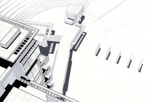
Who says banner ads don’t work? I was looking at this beautiful building (check out the staircase) and there was a banner link to the 2007 winners of the KRob Architectural Delineation, Architectural Drawing & Illustration Competition. The winning pieces are fantastic, well worth a look. Preview samples here:
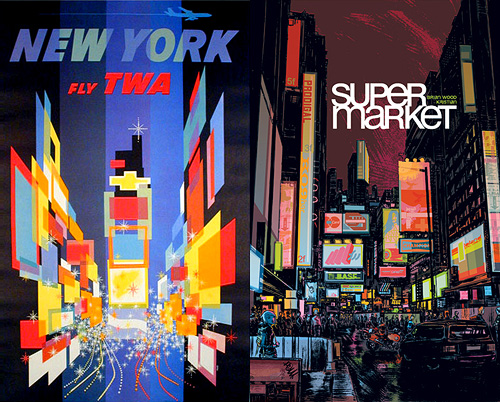
I’ve had these Supermarket covers knocking about for a while now, I love the subject matter (I love drawings of cities) and the styling and detail in them. I must be in a mode to make connections between things right now, but what struck me was the similarity between the night-time Supermarket cover below and this TWA poster for New York.
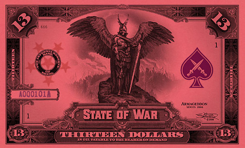
You know that feeling you get when you’ve had an idea to do something, and you’ve not got around to doing it for ages, then you come across something that shows that not only did someone else have the same idea, they’ve gone and implemented it? And very well, too. Well, I’m getting that now. Stephen Barnwell has made these incredible banknotes for the fictional Antarctic colony of Nadira, and for various other fictional microstates. There’s also the non-existent denominations of the Dream Dollars, which you can download, and various other products which you can buy. I think the whole thing is fantastic.
Still, it doesn’t stop me doing what I intended to do as my intention is different. I just like banknotes, I could look at the designs of them for hours, and hours, and hours. A bit like maps really - give me a good atlas and I could look at it all day. Maybe I just have an obsession with finely drawn lines? Either way, I have a collection of images grabbed from around the net. I’ve linked to the original page where it still exists.
First, the aforementioned Stephen Barnwell’s latest. The 13-dollar note from the State of War:
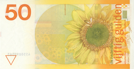
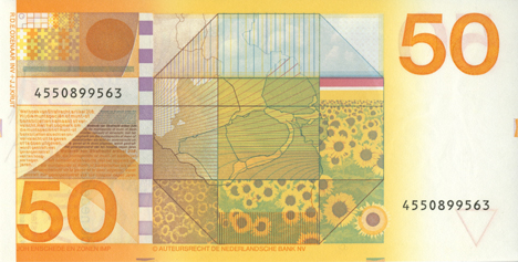
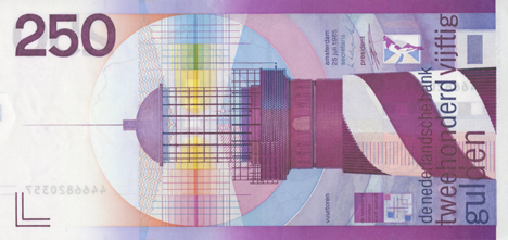
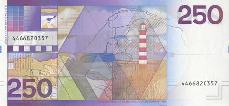
Then a selection of Robert Deodaat Emile Oxenaar’s designs for the banknotes of The Netherlands, which to me represent the only real argument against the Euro. Why couldn’t the European Commission have got him to design the money? Found on this article on Creative Review’s blog:
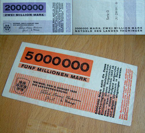
And then (and it took me a while to re-find these) the beautifully simple banknote designs by Herbert Bayer of the Bauhaus. These were done for the 1923 emergency issue of banknotes for the State of Thuringia in the Weimar Republic. The only place I could find a decent image was through the eBay store “Room 606”, where you can actually buy original notes.
I also came across some images of banknotes that feature scientists, engineers and mathematicians. I won’t post the full images, but here’s a couple of exquisite details from the old one pound note. It’s about time Newton was restored to one of the denominations of the British pound:

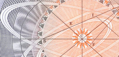
From the same site, various details:

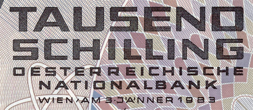
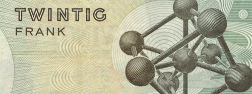
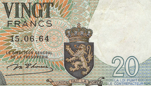
I love banknote designs so much.

Yet another great discovery, the portfolio site of Jonas Bergstrand. I love the style of these examples, though look at his site, as it shows his full range of skills, including some fantastic sculpture and typography.