Skanno

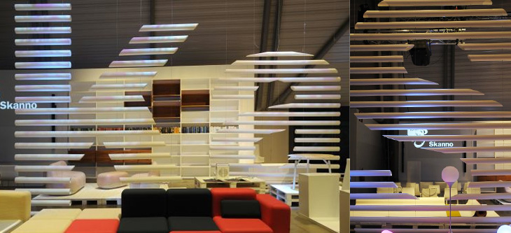
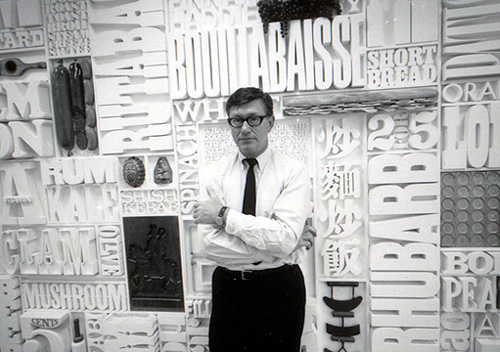
This feels more like a found type entry than anything else, even if I didn’t strictly find it, and that it’s more lettering than type. The Contemporist posted an article and series of photos of Habitare ’09, Finland’s largest furniture and interior design fair. Buried deep in the photos were these two, of Finnish store Skanno‘s stand, showing large letters (presumably spelling the name of the store) made out of plastic tubes and suspended like venetian blinds as dividers. It’s a simple technique, well done. I want some letters like that.

Creators Inn

I’m often saving links from the Contemporist, but this hotel, Creators Inn by Elvine (and others), caught my eye for the nice labelling of the wardrobes and the printed history of Elvine on the shower screen. It’s a nice touch, but I wonder if it doesn’t seem a little incomplete as an implementation - things like this are best left subtle or taken to the extremes; if every item in the room was labelled in the same way, with usage notes perhaps, it would be quite the thing. Also, as one of the commenters pointed out, it’s hard not to notice the similarities between the hotel logo and that of a rather large hotel chain. Still, it does look rather nice, and if you’re a creative person visiting the city, you can get free accommodation there. Now that’s a nice touch.

Typographic Tree Columns

The Denver Egotist sent me a link to this rather nice piece of work, for Crawley Library in West Sussex. The new library is due to open in January 2009, so I might have to go up and have a look - I’ve not been to Crawley in years. There’s some more info on the Crawley Borough Council website, and some pictures on the Crawley Library Flickr set.

I can only hope that their new library gets a better logo than the one for Brighton’s, which is a typographic abomination.

gastro-typographical-assemblage

I was catching up on Oh Joy! earlier today and saw this post about Lou Dorfman’s gastrotypographicalassemblage. Wow, what a piece. Cho links to a collection of images on Flickr (where else) showing some original photos of the piece in situ, and some of the work being done to restore it - more on that here. I love the restoration pictures, with all the letters laid out like that.

I would love to have something like this at home, or even at the office for that matter.

Beautifully Simple Signage

I came across the hi site today via Computerlove. There’s some great work on there, but one in particular caught my eye, this very simple and effective signage treatment. The back is painted with a UV-reactive paint that causes the shadow behind the sign (which are mounted at a distance from the wall) to have a greenish glow. My limited German leads me to understand the writing on the wall below are the names and interests (Chuck Norris?) of the new student intake for a particular year, though I couldn’t be quite certain.