I’ve had the basic kernel for this article sitting around since 2007, when I was sat around recovering from an injury and needed regular doses of painkillers to make it comfortable. I was surrounded by the empty boxes of these painkillers (hey, who thinks of cleaning when injured?) and started thinking about the ‘brand space’ of consumer drugs. Writing about the Arabic logos and brands reminded me that I’d not finished the article, so here goes.
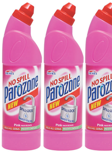
Years ago I’d read how there’s a great deal of conservatism in various industries, and especially the Fast Moving Consumer Goods (FMCG) sector when it comes to designing packaging and logos. The basic idea is that when your Average Punter goes into a shop to buy, say, bathroom cleaner, he will span the shelves for the specific and familiar constellation of bright colours, dramatic lettering and packaging shape that would identify the product type. It is the combination of all these things, taken in at a glance, that helps us quickly identify bathroom cleaner from, say, furniture polish even though they may share some aspects (in this case, packaging type and lettering, but not the colour range). For the designer of such packaging, coming up with something new and different enough to get noticed without being so different as to move it out of the visual category entirely is the difficult job, rewarding to some and incredibly constraining to others. I follow The Dieline regularly, and while there’s a steady flow of new and often beautiful products and rebrands, FMCG packaging design seemingly only evolves through a glacially-slow process; any slight innovations that improve the success of one product are adopted by them all until they’re all exactly the same again.
Returning to the design of pharmaceutical packaging, it seems that for branded consumer drugs, the category has a checklist that all packaging must follow. It must scream from the shelf with bold and oblique sans-serif type, bright oranges and reds against dark blues and greens (or silver metallic, if you have the budget) and have at least one swoosh, arrow or starburst, but preferably all three. If you can squeeze an airbrushed diagram of the body in there, then so much the better, especially if you can put a warm orange glow on the medicine’s intended body part. Before you know it you’ll have something perfect for any discerning pharmacy shelf, and there’s no chance someone will mistake your box of headache pills for ground coffee. That’s your brand-name drugs anyway.
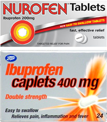
Most supermarkets have a range of common remedies with deliberately plain and understated packaging, and like any range of products identifies itself to the consumer from the shelves with its own signature characteristic; usually a blaze of unadorned white semigloss cardboard. Own-brand stuff can be gloriously simple and often highly compelling, especially when some real thought has been put into it, as in Target’s ClearRx packaging system for example. Other times, own-brand stuff just looks like the brand-name product, type styles, layout, colours and all. In the UK, Boots had a beautifully simple and clear packaging style for its range of own-brand medicines, but recently its ibuprofen has taken on the red-on-silver-with-a-swoosh look, very similar to the brand-name version, Nurofen. From a designer’s point of view it’s disappointing, but there is a very good reason for it in that for most people branded products simply work better. In making their ibuprofen look like the brand-name version, they’re actually boosting the analgesic effect:
In a British study, 835 women who regularly used analgesics for headache were randomly assigned to one of four groups. One group received aspirin labeled with a widely advertised brand name (“one of the most popular” analgesics in the United Kingdom that had been “widely available for many years and supported by extensive advertising”). The other groups received the same aspirin in a plain package, placebo marked with the same widely advertised brand name, or unmarked placebo. In this study, branded aspirin worked better than unbranded aspirin, which worked better than branded placebo, which worked better than unbranded placebo. Among 435 headaches reported by branded placebo users, 64% were reported as improved 1 hour after pill administration compared with only 45% of the 410 headaches reported as improved among the unbranded placebo users. Aspirin relieves headaches, but so does the knowledge that the pills you are taking are “good” ones.Annals of Internal Medicine
And, to make it clearer that this is a more of a symptom of being human rather than a modern result of sophisticated marketing practices, how about this quote (from the same page) from Socrates:
[The cure for the headache] was a kind of leaf, which required to be accompanied by a charm, and if a person would repeat the charm at the same time that he used the cure, he would be made whole; but that without the charm the leaf would be of no avail.Socrates, according to Plato
Returning to the original example of bathroom cleaner, could this cultural placebo effect apply to more than just pharmaceuticals? I think it most certainly does, and that we usually suspect it when we compare the prices of brand-name and own-brand products on the supermarket shelf, and yet, and I include myself in this too, we so often end up buying the big brands. If a style of packaging, labelling and use of colour identifies the product category, then surely the one that is most identifiable, most familiar, has the best marketing, is the acme of that category, the best one? So unless we have a strong reason not to, and reasoning implies some analytical thought, we buy it.
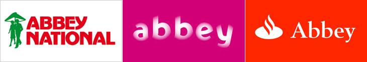
Extending beyond groceries, we can see this culturally-imposed brand conformity in almost any market sector. Something that I had in mind when thinking of this article in 2007 were the Abbey National rebrands of 2003 and 2005. In September 2003, Abbey National adopted a soft, squishy, pastel-coloured brand identity created by Wolf Olins, and started trading under the all-lowercase moniker ‘abbey’. The new tagline, “Turning banking on its head” signalled the intent of the dramatic change in the brand, and the whole process certainly got Abbey a lot of media attention, but:
In marketing terms, however, the rebrand was a clear disaster. Last year, pre-tax profits in Abbey’s core retail business shrank by 20% to £814m compared with 2003 and there was another big slump in market share. New mortgage lending is also down year on year from 9.9% to 3.1%, reducing its overall mortgage share from 10.7% to 8.6%.Ian Fraser
Of course, it is unlikely that the rebrand caused all of that. The rebranding itself came about to a large extent because the bank was already in trouble, but it’s pretty clear that it didn’t turn banking on its head, and more importantly it didn’t bring them any of the kind of success they needed. In fact, it was only a year and a half later that Abbey was bought by Spain’s largest bank, Santander, and the whole brand identity was unceremoniously ditched. The Abbey name is now set in Santander’s typeface and style, placed next to Santander’s flame logo, with Santander’s colours, and soon, I suspect, will be itself replaced with Santander’s own name too. For various reasons, Abbey did a lot better after being bought out, but the thing about the Santander brand is that it looks like a bank, and that’s important. If a bank looks like a bank, we treat it like a bank. I would say we trust it like a bank, but this is early 2009 and the word ‘trust’ and ‘bank’ don’t seem to go together very well anymore. But still, the principle holds - things need to look like what we expect them to look like; there’s a contract of trust associated with brands and you break that contract at your peril.