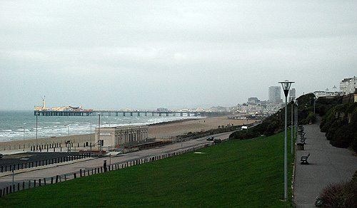
This sign on Brighton’s seafront (click for a larger view) is one of the worst, if not the worst bit of information ‘design’ I have ever come across. I am a long-time resident of Brighton, and most of my time here has been spent living very close to the seafront. I am also very familiar with maps of the place (being obsessed with maps in general). When I first saw this sign, I had to look closer to see what it was about, as I hadn’t recognised that it was a map of Brighton seafront!
So what’s wrong with it? Let’s look at some properties of it in turn.
- The orientation
There are two usable ways to orient a map. The first is to place the ‘You Are Here’ point at the bottom of the map, and have everything that lies in front of the person looking at the map above that point. The further away it is, the closer to the top of the map it is. This is the most usable orientation for a map where you know the position and orientation of the person reading it. The second, and most usual, way is to honour the generally-accepted global convention of having north at the top, and south at the bottom. This is a good idea for maps that may end up being moved around, or duplicated and placed in different locations you don’t know or can’t control.This map does neither. It places south at the top of the map, and yet if you look at what you see when facing towards the map, south is to the left. - Landmarks
A look at this map shows that it has various landmarks marked on it, most prominently the Brighton Pier and the West Pier. The problem here is that the broken south-at-the-top orientation of the map gives the impression of a skyline, rather than the top-down view of a map, and as you can see from the actual view below, for Brighton this represents a different idea. Brighton has two prominent tall buildings on the seafront - Sussex Heights and Chartwell Court. Showing the piers sticking up like that is more likely to evoke these two buildings, even for a local resident who is familiar with the two piers. For a visitor, they would look out from this position and see one pier, the West Pier having burned down and largely collapsed into the sea (I must point out that this happened long before these signs appeared) and two tall buildings. Despite the names on the map, it would be enough to trigger doubt in the reader regarding whether they were reading it correctly. - The typography
While much of the type on the sign is perfectly readable and reasonably well-set, it is again the map that has the problems. The lettering on the labels for the Marina, the two piers and the other landmarks is pointlessly, and needlessly, excessively casual and hard to read. I wonder sometimes if the mantra to ‘make it look friendly’ doesn’t get so locked into people’s minds that they lose sight of what the purpose is of what they’re designing. After all, surely it is far friendlier to make signs informative and easy to read? - Drop shadows
One of the pitfalls for a computer-based designer working for print is to be distracted by the benefits and limitations of screen display technologies. In other words, things look different on screen than they do in print. Colours on screen are made by generating light, colours in print are made by selectively absorbing and reflecting ambient light. Drop shadows are a boon to a screen designer, outlining and adding definition to otherwise indistinct or low-contrast images, whereas in print, a drop shadow will come out as incredibly dark and heavy. Quite often you don’t see this until the final print proof has been made, if you get one. Printing workflows are so quick and easy now that often a obtaining a proof is considered in the same the way that maintaining a effective and robust backup strategy for your hard drive is, i.e. a chore to be put off, if possible. Printing a copy out on an inkjet photo printer doesn’t make an effective proof either, as these printers tend to be a lot more forgiving. On this sign, the designer has fallen right into the trap. Almost all the graphical elements have drop shadows, and the label for ‘Hove Lawns’ is barely readable thanks to the great blob of black ink surrounding it. The label with the fish jumping over it… I can only guess that that says ‘Fishing Museum’, and only then because I know that it’s there. Any tourist looking at this wouldn’t have a clue! - The roads
I’m at a bit of a loss over the choice of roads chosen as landmark routes. It shows ‘East Street’ just to the right of the roundabout, but the main road that any visitor could identify in Brighton (after the seafront) isn’t shown - The Steine. Just take a look at a real map of Brighton to get an idea of how strange the omission is. I wonder whether they thought that for a map promoting walking it shouldn’t show main roads, despite them being obvious and easy to identify? The other roads are a bit odd too - why Seafield Road? I’ve never actually heard of the place, and yet just two streets along is Hove Street, leading to Sackville Road, very much main roads and easy to identify. A poor map indeed. - The graphics
This is more of a personal dislike. I detest ugly things, and the graphics on this sign are relentlessly hideous. Poorly drawn, garishly coloured, artless, unpleasant abominations mocking everything that is beautiful and graceful about the human form and the world in general, these little icons would be best left off this sign. It doesn’t help that they have strong drop shadows under them too - the blue blob under the ‘West Pier’ label is, I assume, a pool of water, and yet it has a shadow under it. Since when did a pool of water have a shadow? And one so dark? - The route itself
Yes, the very point of this map, is in essence, wrong! It shows you having to cross the roundabout by the Brighton Pier, when in fact you pass around it. The colours of the background too, they imply that you’re nowhere near the beach on your walk, and yet in actuality, you’ll be right on the beach. - The logotype
Last, but by no means least, what is going on with the italicised ‘walk’? Perhaps they thought they needed to add some ‘dynamism’ to the name, but this really is not the solution.
In short, I detest this sign. Whoever did it should be placed in remedial graphic design training.