A short post this one, and mainly because I came across it here while doing some more research on repeating patterns. The work of Yehrin Tong:
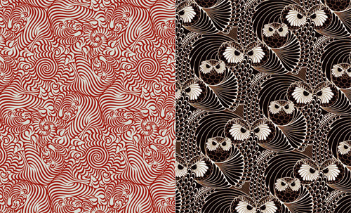
A short post this one, and mainly because I came across it here while doing some more research on repeating patterns. The work of Yehrin Tong:


I’ve been pondering this article for a while, since coming across Jonathan Hoefler’s posts (and here) about Glagolitic script in my RSS reader. It’s a script I’d never heard of before, and I’m always fascinated by writing systems, so I followed some links, sent a couple of emails and did some research on it.

First off, I have to say thank you to Typonine for sending me the font used for some of the illustrations in this post, and specifically Nikola Djurek who designed and developed it, based on the first Croatian printed book in the script: the “Misal po zakonu rimskoga dvora”, printed in 1483. A page, and details, from that book are shown below.
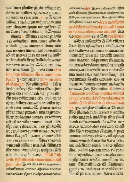
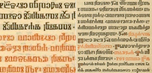
One of the things I noticed when looking at examples of Glagolitic is the way some characters appear and disappear; I was trying to set some text in it, and whichever bit of text I tried had some extra characters that weren’t in the font or in any other examples - each one seemed to have characters unique to it. Of course, this isn’t a deficiency of the font (or of the language), but more a sign of the evolution of the written language and of the strong influences on it from Latin, Cyrillic and Church Slavonic over the years. Croatian was written in all three systems in parallel, and as a local system not widely known outside of the Balkans (despite being the oldest of the Slavic alphabets), the form of written Glagolitic has perhaps been more influenced than influencing; In some written examples there are Cyrillic characters, while in others the characters are presumably the original Glagolitic ones, or newer hybrid forms.

This leads on nicely to arguably the most interesting feature of Glagolitic (for a typographer at least) - the sheer number of ligatures. This interesting PDF states that in one work alone, the Brozić breviary, there are 250 ligatures - a number you’d more expect to find in a hand-written work from a top scriptorium rather than a printed book of over a thousand pages. Also unique to Glagolitic among printed languages are the broken ligatures, where half of one letter is joined to another letter, adding thousands of apparently new glyphs to the language. Of course, for anyone (like me) trying to set some text in Glagolitic, it all appears rather confusing and frustrating - but the reason why I tried (and why I’m always tracing things) is to learn more about something, and in that it’s certainly succeeded. If you’re interested in finding out more, for further reading there are a few articles out there, including (of course) Wikipedia, and this introduction to the history of the script.
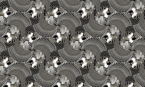
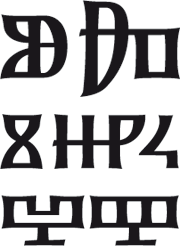
So after all that I didn’t get to set some text properly in Glagolitic. I think to do so I’d need to spend some time learning a lot more about the language - so it’s added to ‘the queue’ of Things That I Must Learn More About. In the meantime, for my own pleasure and so you can see how attractive the glyphs are in Nikola Djurek’s font, I’ve created a pattern using it.
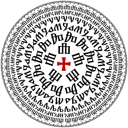
Now, if reading across the circles spells anything rude or inappropriate, let me know, OK? The contact form should be working again after the server move.
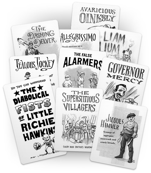
I’ve been enjoying The Superest for a while now (since it started I think) after following a link from Chris Glass (I think), and while every post on it is good, it’s the ones by Kevin Cornell that I look forward to the most. Apart from the fantastic illustration, there’s often gorgeous lettering to look at. His site, Bearskinrug, is a joy to visit as well.
I’ve nabbed some of his work from The Superest to illustrate the point - I put them on a cards for my own amusement, as the site reminds me of Top Trumps (and because I think you need to visit the site to see the full ones). Go and visit this, and his main site.
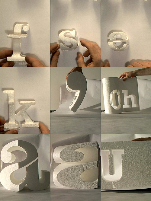
This video I found while trawling through Computerlove - apparently it’s old and may well have been posted elsewhere, but when has that ever been a concern? I’ve never seen it before today, so I’m going to put it here. So there.
I like the shapes that form different letters depending on which way you look at them. I wonder if you could have a set of shapes that each show different characters (say, from three directions) with no repetition? It’d be tricky, especially if you restricted it all to one typeface… Even if not, I wouldn’t mind a couple of the ones in the video, just to play with, you know?
It’s got to that point: I’ve got three browser windows open with more tabs in each than there’s room for (hello little arrow at the right of the tab bar) so maybe I should get on with doing something about them.
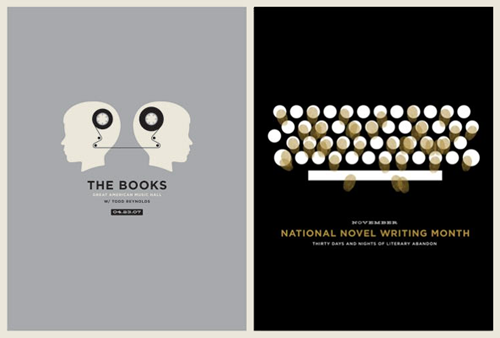
First up is the work of Jason Munn. I’d come across the books poster before, but for some reason not gone on to Munn’s website, The Small Stakes which has the added bonus of allowing you to buy some of his work. There’s a short, but interesting, interview with him on Grain Edit too. Go and have a look at his site though… it’s a shame the National Novel Writing Month one isn’t available to buy! It’s one of my favourites, along with the book one of course:

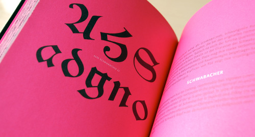
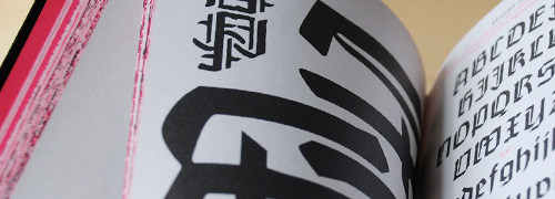
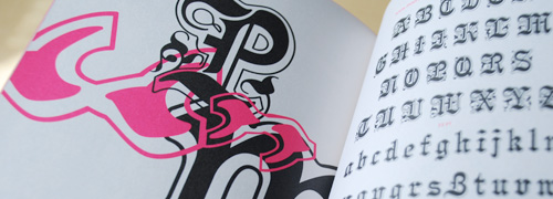
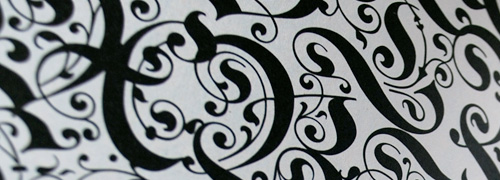
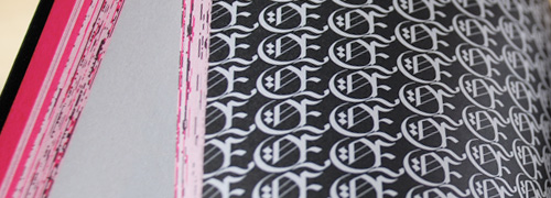
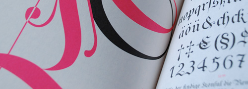
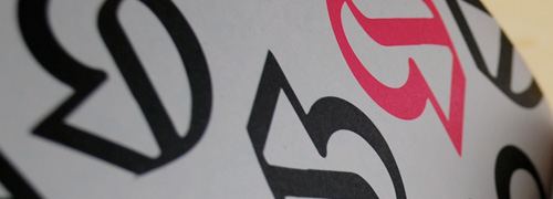
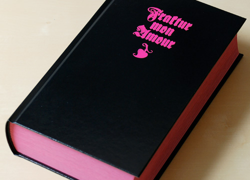
I mentioned this (obliquely) a while back, and I’m not sure why but I only ordered the book for myself recently (it’s also available on Amazon.de). It’s a beautiful book, full of blackletter samples, and for each face in the book there’s a wonderful abstract design created using it which would make fantastic posters in their own right. When closed, from the size and shape of it you’d be forgiven for thinking that it’s an old bible, though the glorious pink perhaps gives it away that it isn’t. I love that pink.

I went to the Seeking Inspiration conference at the St Bride Foundation last week, and it was excellent. I was glad to find that I left many of the talks feeling genuinely inspired and encouraged in my work - such a concentration of good ideas, interesting personal histories and genuinely fantastic examples of work is rare to find in everyday life, so I was exhausted after it all. But yes, the conference highlights, according to me.
This was a great start to the conference - Hardie promises to deliver a new ‘truth’ in each of the talks he does, letting us know something new (and secret) about his past works or methods. I won’t reveal them here, but his talk set the theme of the day, in that collections (hoarding, perhaps) are central to much of the inspiration of the designer. I certainly have a vast collection of found images, and it was the problems of keeping track of, and categorising them, that led to me creating this site. Collections are good, provided you know what you have and you can find it all easily.
I was fascinated by this one. Edwards is another avid collector, and had acquired a collection of antique microscope slides which she wanted to find out more about. Interestingly, this led to a project where the slides became only a secondary interest, and where the techniques and equipment of microscopy over the last three centuries were the main focus. Apparently this was largely due to funding constraints - Edwards spent many months on the project and got funding from The Arts Council (if I remember correctly). I was fascinated by the techniques of taking photographs through the variety of ancient microscopes, and by the people who are involved in microscopy and restoring and caring for microscopic samples. It’s a shame the talk couldn’t have been longer, as there was clearly a lot of material and not all of it could be given full justice. I was extremely disappointed that some of the attendees thought fit to laugh at some of the people who’ve devoted their lives to the niche, often neglected subjects and professions Edwards introduced. It is perhaps obvious to say (but I’ll say it anyway) that typography, letterpress and such arcane topics as type design are considered laughable by some members of the public, so to ape their reaction to yet more esoteric disciplines seems ignorant and at best hypocritical. Edwards dealt with the reaction graciously, but I got a hint that she was disappointed too.
Um. Well. This wasn’t a highlight. I’m not sure what this was about to be honest. I think Ridout would do well to drop the whole eccentric act and just speak normally. This was one of those talks that could have been fascinating, considering it was about the British Library’s vast collection of ephemera, but in the end came across as a bit twee and pointless.
This is where the limitations of the St Bride sound system really made themselves felt, and hard. For the whole conference we were instructed to make sure that our mobile phones were switched off, in order not to interfere with the radio mikes. Unfortunately the radio mikes interfered with themselves quite well to the extent I nearly had my ears driven six feet into my skull by the noises they made. It made the talk incredibly hard to follow.
It’s funny how some of the more interesting talks don’t lend themselves to discussion. Jake Tilson’s talk felt very short, but that was because he explained his ideas and inspiration so very well - you’re just left thinking, “Well, yes”. I have in my memory a collection of images of his books and his sketches. Probably best to buy some of his books really.
Normally, when the topic of linearity is introduced you’d expect something linear, such as a clear narrative. There’d be maybe a few branches here and there, but in the end it would provide useful support for a theme. Not so with this talk. There were so many tangents and diversions, and so few conclusions or even complete sentences that it was nigh on impossible to follow what Baturan was trying to say. I got the impression he was trying to say that different cultures have different words for ‘inspiration’ and that this gives some clue to whether those cultures place value on the initial idea, the process of implementing it, or the end result. Which cultures do what, and the relative value of each of the different approaches are, you’d be hard-pressed to discover them from this talk.
The premise of this talk: that the drive to always come up with something new and suprising is contrary to producing good design, was in itself compelling and interesting. Hall started with this topic, and did a good job of criticising some of the ways a creatively-blocked designer might seek ideas, but then carried on to recommend many of the other, equivalent and quite usual ways designers seek inspiration. It was rather odd. Hall came across as the kind of design manager that might appeal to readers of The Economist but would be universally loathed by any designer who had to work with, or for, him. An illustrative point during an anecdote he gave of reviewing the work of one of his designers; first the stabbing pointed finger, then, “That’s the design we’re going to use! Now, come up with something better!” Inspirational for any design manager of how not to behave.
Well, it’s Spiekermann, so, you know. Bloody marvellous, though I was waiting for the Fire Brigade logo at the end of the talk, because there are few stronger arguments for installing a fire alarm and having lots of fire extinguishers than Spiekermann’s tales of losing pretty much all his early work (and his letterpress!) in a fire after he first moved to London.
I had a lot of hope for this talk, and battled a dodgy delay-ridden Underground to get there on time. The first part of the talk was rather pointless PR flackery (though amusing) but the second apparently unpolished part was utterly fascinating, and got the greatest number of questions and comments of any talk in the whole conference. Basically, A2B is switching the size of paper you generally use from A4 to B5. This would save 30% of the actual amount of paper - assuming you shrunk-to-fit everything you printed. Recycling paper apparently ends up costing more in terms of energy and resources than creating brand new paper, so while it may reduce the amount of virgin forest sacrificed to invoices and the like, it is always better to use less, far less. I can’t remember the exact number (I did ask Moorehead to mail me the presentation) but as a rule of thumb, for every tonne of any end product, five tonnes are wasted in the supply chain (retail) and twenty tonnes in the manufacturing. Applied to paper, this leads to many trillion tonnes of waste per year. I think we would do well to encourage people to use less paper, and to just damn well get used to reading stuff off screen - I mean for crying out loud, you’re not reading a damn novel - you don’t need to print it! One of the questions near the end was about printing web pages, and how a plugin should be developed to save wasted pages (you know the ones, the pages with nothing on them but a full stop or two pixels of a banner ad). I was offended by the complete abdication of personal responsibility this question represented. When I suggested that you don’t print the web page, there were objections that “not everyone has internet on their phone” and therefore needs to print the page sometimes. If I want to print something on a web page, I use print preview, or I copy the text to a word processor or a simple text editor and print that, or (I admit this isn’t available to everyone) I print to PDF and tell Acrobat to only print the page I’m interested in. If you actually care about not wasting resources, put some effort in.
One of the best descriptions of this talk (from another attendee) was that it was “earnest”. And indeed it was. Luce lives on Vancouver Island, and highlighted a number of problems with the timber and paper industries there (and elsewhere). About 50% of Vancouver Island has been logged, and now the more inaccessible parts are being logged with the help of helicopters. Luce explained how much this all costs, giving an impression that logging and paper production is very much Big Business, and that there is often scant regard from mill owners for local economies, ecologies or communities. The example she gave of Cathedral Grove was instructive - in that this region of old-growth forest is protected, but just beyond the boundaries are large areas of clearcut and monoculture areas of genetically modified cultivars. Whatever your politics, it’s clear that this new growth is unfortunately not quite the restoration and ‘forest management’ we are told is helping preserve our environment. This, and Moorehead’s talk before it, really make you want to reduce your paper usage to the absolute minimum necessary.
Again, another one that was so good there’s comparatively little to write about. I left this talk genuinely inspired to get cracking designing some new typefaces and that despite the thousands of faces out there, there’s massive scope to create something genuinely new, and yes, inspired. Fantastic. Buy his stuff. Go on. Buyyyy.
This was reminiscent of the first day of the conference, as Hughes showed his collecting instincts with a display of some excellent examples of vintage lettering. I was a bit miffed that he was going through the examples a bit quickly - I wanted to really absorb some of them - but he had nearly 300 samples to show. He’s producing books of his collections soon, so I’ll be ordering those as soon as they’re out.
I can’t believe this was half an hour, it went so quickly. Antonio described his upbringing and discovery of calligraphy in Trinidad, explaining some of the limitations of learning a niche subject in a developing country. He finished by demonstrating the relationship between calligraphy and the musical rhythm of the period the style of writing is from, and this is where he showed what an astounding singing voice he has. Bloody marvellous.
So yes. I missed the last few talks, which is a shame, but the whole conference was exhausting, and I wanted to go and look at the books and the stone carving demonstration downstairs.
Would I recommend the conference? Most definitely. The only improvement I’d suggest is to the venue itself - the sound system needs some serious attention, if only to allow better Q&A sessions. Oh, and sort out the wifi! It’s one of those “login and minimise this webpage” systems that completely fails on mobile devices.
What happens if you produce a map of, say, the United States of America, only showing the streets? Will you be able to recognise non-man-made elements of the landscape, like mountains, or rivers? Well, it turns out yes, you can, as Ben Fry has done so. Interestingly, you can see how in the midwest there are counties that appear to have hardly any streets right in the middle of ones that are riddled with them - though this is apparently more due to how they identify a street than a lack of any thoroughfares. The difference between the east and the west of the continent is quite marked too - the west’s street patterns appear much more strongly influenced by the topography than the east, though given the scale and type of said topography, that’s hardly surprising. Here’s a scaled down image as a teaser, but definitely go and look at the originals.

Just followed this link from Design Observer, to this great clock by Christiaan Postma. I daren’t think how long it took to work out. It’s made out of lots of smaller clockworks that all combine to spell the time. For a large part of the day though you’d be at a loss what time it is, say at half-five, so if you wanted to make it practical (why?) you could stick a big set of hands in front… but I like it the way it is. Watch the animation (page 3) to see it in action.
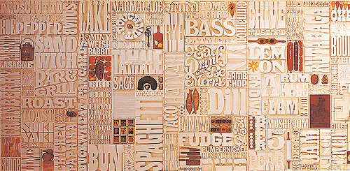
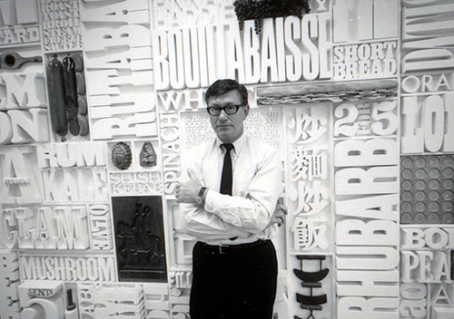
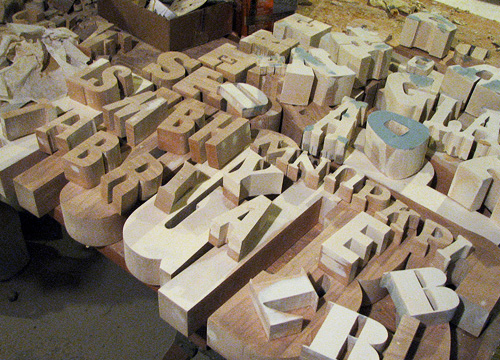
I was catching up on Oh Joy! earlier today and saw this post about Lou Dorfman’s gastrotypographicalassemblage. Wow, what a piece. Cho links to a collection of images on Flickr (where else) showing some original photos of the piece in situ, and some of the work being done to restore it - more on that here. I love the restoration pictures, with all the letters laid out like that.
I would love to have something like this at home, or even at the office for that matter.
