The Colour of Type

I can’t quite recall why I’ve not blogged this before. For the life of me I can’t recall where I found it (I’ve had it on my hard drive for a while), but it was made by the “United Designers Network - Berlin”, a search for whom redirects to Spiekermann Partners.

Now and again I look at it and marvel how two entirely different types work so well on the same page. Viewed scaled down (below, in positive and negative) you can see that the whole piece has an even colour, and yet a closeup (right) shows that it’s set in Adobe Caslon and Wittenberg Fraktur (OK, I cribbed the name of the blackletter from the original PDF). I’d never have thought the two faces could have the same colour like that. I love it, it’s a really nice bit of inspiration.

Update: I guess I should have had a closer look through the Spiekermann Partners site! Alessandro Segalini mailed me with the blog entry describing the design motivation of the poster, apparently by Erik Spiekermann himself. Excerpt here:

The poster designed itself: the English text is set in Caslon, the typeface that George Bernard Shaw always specified for his writings; the German copy is set in Fraktur, the typeface used for setting German and other northern languages since Gutenberg. If it hadn’t been for the Nazis misusing these faces for their sinister purposes, we would still be reading Fraktur. It is the typeface of Goethe, Martin Luther, Karl Marx and Hegel. And it is perfectly suited to set our long words and interminable sentences, still evoking Gothic cathedrals and narrow streets with timbered houses. The one used is called Wittenberg Fraktur, after the town where Luther nailed his theses on a church door in 1517.

Incidentally, Spiekermann Partners developed the Deutsche Bahn brand system which I’ll no doubt blog about some time in the future.

Eat Fish!

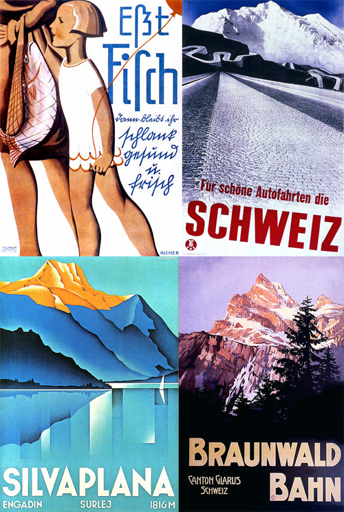
One of those old images I’ve had around for a while found here (I think). I saved it because of the interesting script lettering (extracted on the right). It’s bloody hard to read (even if you can read German) and yet it’s really attractive. Maybe for a native Swiss German speaker it’s easier to read?

Update: Steffen wrote to tell me that this is Sütterlin script, and sent the Wikipedia entry on it. Thank you! From Wikipedia:

Sütterlinschrift (Sütterlin script), or Sütterlin for short, is the last widely used form of the old German blackletter handwriting (“Spitzschrift”). In Germany, the old German cursive script developed in the 16th century is also sometimes called Fraktur. ... The beautiful version that Sütterlin developed was taught in German schools from 1935 to 1941.

The full image below (top left) and a few others I rather like from the set.

Typographic Maps

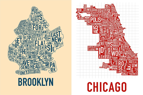
Have a look at these great typographic maps of city neighbourhoods from ORK. There’s only Chicago and Brooklyn at the time of writing, but coming soon are Manhattan, San Francisco and Boston. I can’t wait for the Manhattan one.

They remind me a little of this typographic map of London, though I’d be interested to see London represented in the same style as the ORK ones. Well, that and other cities of the world too.

Update: The Manhattan one is now available

Wow, The Beauty of Numbers

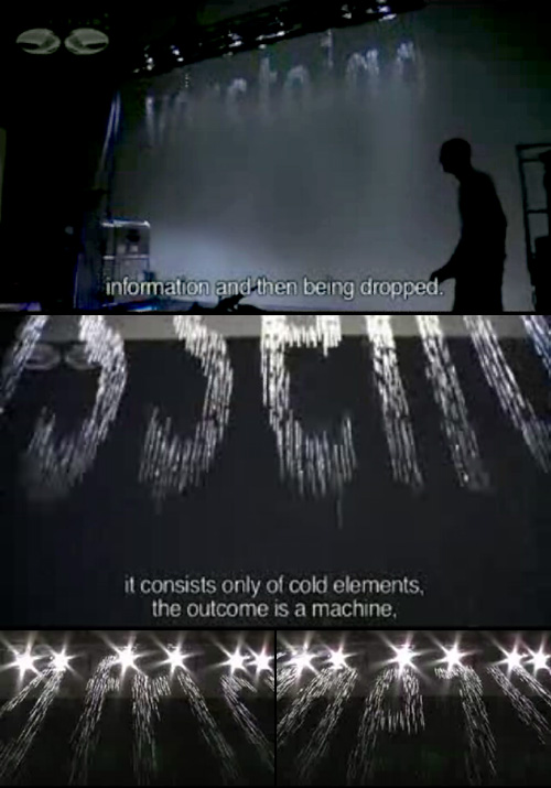
Discovered over on Fubiz, this beautiful animation from zero to ten using imagery from the arts of bonsai and ikebana. This really is a beautiful short film, and it reminded me of something I’d seen before, so a little bit of checking through my saved files and links I realise I saw some of the preparatory work on artless. In fact, I wrote about it here. The artwork is by Shun Kawakami, Illustration, Suibokuga, Drawing by Tadashi Ura and the photography (?) by Taisuke Koyama

The first picture here is from artless, the remainder are stills from the animation.

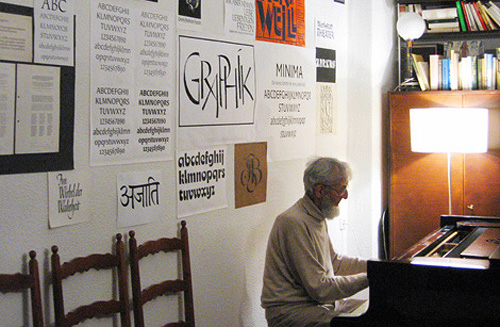
VEB Typoart

Another great article on pingmag: VEB Typoart: The East German Type Betriebsstätte. Go and read it, it’s got a good history of the organisation and on Karl-Heinz Lange, designer of Minima (both pictured at the end of this article). I’m thinking of ordering the limited edition Freundschaftpacket.

I’m particularly fascinated by these two bits from the article. The second being from the interview with four members of Typoart Freunde:

At Typoart, the principle “frugality and effectiveness” lead us to work with representatives from the printing enterprises to develop a type program that met all the important requirements: a Renaissance roman for literature, like Garamond, a classical, like Bodoni or Didot, then a slab-serif, for example Clarendon. There had to be something from each major style. Naturally also sans-serif, in different styles, like Helvetica and Futura. The “Zentrag” would even request imitations of specific western-made typefaces they couldn’t afford to license.
It’s the history of VEB Typoart, as an example of the fate that many GDR businesses met after the German reunification. Also, to the very end, their working methods were so modern and advanced. Unlike in West Germany, type design in the GDR wasn’t subject to the pressure of business competition. So, typefaces could be created with more care and craftmanship. You could truly call it Schriftkunst [typographic art]: No effort was spared in order to stay on the cutting edge.

So this is fascinating. They had to copy western designs (the article makes mention of Times New Roman) and yet the work they were producing themselves was of a higher quality than those western ones. They were working at the cutting edge, producing the best work, and yet when the business was taken over after reunification, it was run by someone not interested in type, and the place went under and the typefaces were all nearly lost. It reminds me of other businesses producing excellent products, most notably Adobe, which are now run by accountants and managers rather than by the engineers and designers who develop and use the products. Of course a business must have managers and accountants, but why must they be placed at the very pinnacle of the organisation? Their motivations can only be to profit and organisational efficiency, rather than to creativity and excellence. VEB Typoart avoided this for much of its life by operating under a soviet system where profit was not a motivation (and organisational efficiency came about through a scarcity of resources, rather than SMART objectives and the like) and collapsed under a new system with a rush for profits as an advertising agency. I guess it proves to me once again that placing managers, accountants and administrators in control of creative professionals always seems like a good idea to managers, accountants and administrators, and almost never works to improve productivity and creativity.

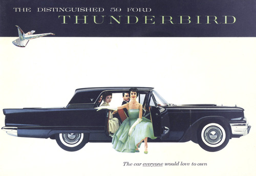
1959 Thunderbird

The car everyone would love to own!

Well, based on this fabulous brochure, who could blame them? Found on the Old Car Manual Project, another of those collections-of-things sites that you bookmark because you know you’re going to find them useful someday. This site is a great resource for 20th Century typography, illustration and layout, not to mention car design.

Lettering Scans

I recently came across the excellent site, Liam’s Pictures from Old Books, and while browsing came across scans from Letters & Lettering: A Treatise With 200 Examples.

When I had first decided I wanted to design typefaces I looked around for books on the subject, and yet could never find any book that worked as a primer, a beginner’s how-to manual*. If I’d have come across Letters & Lettering back then I’d have found a very good book from which to learn about constructing letterforms. The examples you can see here (and lots more on the page on Liam’s site) are lovely and clear and show the construction of, say, Trajan-esque forms. There are other examples in the book, blackletter and modern type forms, but it’s the large outlines that interest me here. This site will definitely go in the bookmarks.