Clearly I’m not party to some vital information here, perhaps Xerox are planning to move into the manufacture of cricket, or petanque balls. Nice wordmark though.
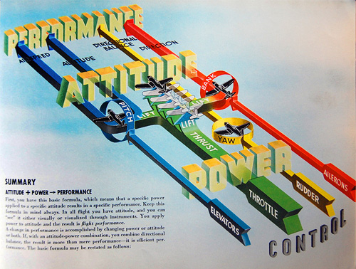
Over on Telstar Logistics there’s a great post on the book “Flight thru Instruments” which has some of the best information graphics I’ve ever seen. There is, as ever, a Flickr gallery of images from the book, which are a great source of inspiration, especially the seemingly simple ones like this and this. Go and take a look. There’s a nice bit of background on the production of the book:
It turns out, “Flight thru Instruments” is so beautiful because it was created by the General Motors “Graphic Engineering” Staff under the leadership of Harley Earl. And who was Harley Earl? Earl worked as a designer at General Motors from 1929 until 1959, where he rose to become the postwar chief of GM’s styling section. He drew styling inspiration from airplanes throughout his career, and Earl’s most famous design innovation was a little trick he cribbed from the swooping rear fins of the P-38 Lighting fighter flown during World War II.
The illustration below caught my eye especially. I’ve read definitions of pitch, bank and yaw in the past, and yes, they’re fairly straightforward concepts, but they never really seemed to stick in my mind. I always had to draw a little diagram to make it clear, and while the diagram below is much more complex (and I think it’s the least successful of the set for being hard to interpret) it contains a fantastic visual description of pitch, bank and yaw. I’ve redrawn them at right, a bit larger, mainly because I like redrawing things and I wanted to make a wallpaper of it (which you can get here: widescreen, square/4:3, and even iPhone). Yes, I know the text is a bit wonky, but I was trying to match the original, honest.
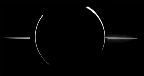
No, it’s not a logo, it’s today’s Astronomy Picture of the Day. It really looks like a logo though don’t you think? It reminds me of all the swooshes and planetary logos we’ve seen over the years, except this time it’s the real thing. That’s what it looks like.
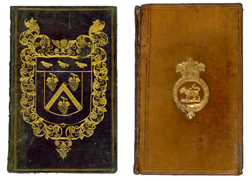
I used to read the Nonist ages ago, and then it went ‘on sabbatical’ for ages. I’ve only just noticed that it’s back (despite posting a link to it recently - I thought it was an old post).
Anyway, this post brought me to a great selection of interesting bindings from the British Library. Worth a look through the site as there are lots of inspirational links and posts.
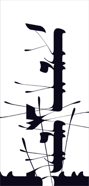
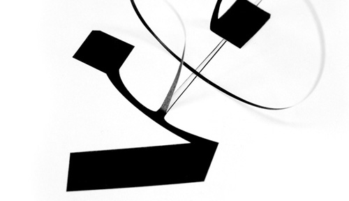
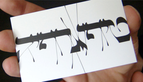
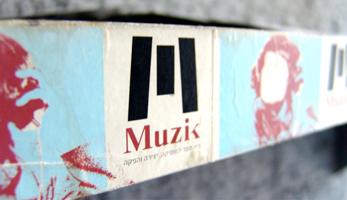
I’ve been meaning to write something about Oded Ezer for ages, ever since seeing his contribution to the Urban Forest Project (at right). Unfortunately I know only a little about Hebrew typography and calligraphy so I can’t write from any qualified angle on it. Ezer’s work is just amazing though, and so I add another entry to my ever-expanding Things To Learn Or Find Out More About list - Hebrew! Recently I saw a link on Notcot about his recent Ketubah project, which looks great, but I’m having a little difficulty working it out. The closeups show what appear to be cut out letterforms folded over to form new shapes, but the photos don’t say whether they’re printed to look like that or they’ve actually been cut out and stuck down again. I’m hoping the former. Below are some images of his work that I’ve saved for inspiration. Take a look at his site for more, and here for some samples of his poster work.
From Ketubah:
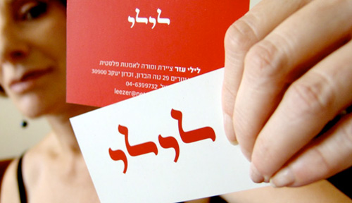
Other inspirational images from Oded Ezer’s site. These really are lovely.
I came across these ambigrams by Tiffany Harvey during the big Christmas/New Year break. There are some great examples in the gallery (on Flickr, of course), but these two caught my eye especially. I’m fascinated by ambigrams, and always thought words suitable for making them were fairly rare, but Harvey seems to promise any word can be made into an ambigram, even two, three or four words. Fascinating.
Font Constructor claims to be “a standalone mac only application to build fonts in an intuitive way”. It certainly looks interesting, but I was mostly taken by the look of the lowercase ‘g’ on the example it shows. Very nice indeed:
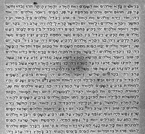
I’m a bit loath to post another article on something to do with the Bible, after the flood of mostly offensive, illiterate and incomprehensible emails I got the last time I posted on the subject. However, needs must, and I think this is remarkable enough to post on. Researchers at Israel’s Institute of Technology, Technion, have enscribed the entire Hebrew Bible onto a silicon surface smaller than the head of a pin.
I could quip that, of course, the kerning’s all wrong but I suspect these letters were created by a process akin to dot-matrix printing. I think it’s amazing. Beat that, microfilm!


