A Kaleidoscope of Planes

A few weeks ago, I spent a good hour trying to find some background info on the rebrand of Dubai International Airport, without success. I just went back to the Brand New post on it and there it is, a link, courtesy of Ty Wilkins.

While the airport logos have patterns similar to the tesselations characteristic of islamic art, the main logo pattern is rather reminiscent of a compass rosette, perhaps to imply that Dubai is at the centre of things? I generally agree with the Brand New post (and many of the comments) in that the positioning of the type on the individual airport logos seems clumsy and distracting. Having the type endpoint line up with the apex of the implied sphere is a straightforward solution, and yes, it’s not all that bad, but it’s not all that good either.
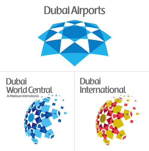
There’s something oddly old-fashioned about the choice of typeface and colour too, like something from the late 1980s. I’d prefer to see either the word “Dubai” or the airport identifier in a different weight, or black (instead of grey), or something - anything to give the type some life. I’m not sure about the face - it does look a bit like the Emirates logo, and I’m interested to see that there’s no arabic version of it too. Changing the positioning of the type, as below, focuses attention on that centre of the centre-of-things pattern and would look even better in arabic right-to-left lettering - in my everso humble opinion, naturally:
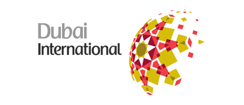
Mind, when we get some wider applications of the logo to brochures, signage, wayfinding and the like, it could appear quite different, with the odd type integrated and comfortable with the patterned globe.

Oh, and I have to point out the odd language on the logolounge article,

Dubai Airports tapped Cato Purnell Partners in 2007 to develop an identity system that would not only unite the organization’s holdings, but also mark Dubai as an international air hub.

Tapped? How do you tap an agency? I have horrific visions of plumber-surgeons installing chromeware directly into living flesh, a media agency relationship direct from the mind of Guillermo del Toro! Of course, this would hardly be the only linguistic horror inflicted on the language by the media industry, I say over and over again, the word creative is not a noun, no, not even when applied to a person, and especially not when referring to artwork. Rant over.

Toronto Type

I’ve had this page open in my browser for weeks now, demanding that I say something about it. Joe Clark writes a comprehensive critique of the state of typography on the Toronto subway system, from great beginnings to the chaos of today. From the introduction:

You might not expect something typographically unique to come out of Toronto, a B-tier city that stands in the shadow of A-tier cities even in the minds of some residents. But the margins are where originality can thrive, and the typography of the Toronto subway is a prime example. It is also an example of subverting, ignoring, and actively destroying a special typographic heritage - quite an achievement considering that the type involved is almost a foot high and permanently sandblasted into subway walls.

The article goes on to describe the poor state of information design for signage across the subway system, provides comparisons with New York’s system and shows us what can happen to type when people really don’t care (check out the letterspacing on Leslie, about halfway through the article). It makes you appreciate, even more, just how good London Underground’s type system really is.

The appalling thing is that the original type in Toronto’s system was really rather good, I love the R especially - it is, dare I say it, cute. See some more examples from the article below, then set aside half an hour or so and go and read the article.

Font-size Glyph Substitution

I was just reading “Why Bembo Sucks” over on I Love Typography, and I was led to wondering why Opentype doesn’t allow for alternate glyphs based on size, at least, that’s how I understand this. After all, as Kris Sowersby points out, fonts were cut for a specific size, with variations in the glyph forms created as a result of aesthetics and practicality. Looking at the Opentype font I have with the most optical weights (Arno Pro) and what options Photoshop offers for Opentype, there isn’t anything in the OT menu or the application itself to set the optical weight based on size.

So why not? Of course, if it does and I’m misreading the spec, do let me know. Mind, I’ll then have to ask why no-one is doing it yet.

And, for comparison, Arno Pro Caption (left) and Arno Pro Display (centre) scaled to the same point size and overlaid on each other (right). Wouldn’t it be nice if the software could switch between the weights automatically?

Graphis Collection

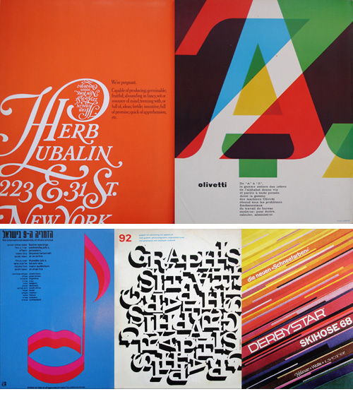
Here’s a good collection of photos of Graphis Magazine from between 1965 and 1982 which might be useful for inspiration. I’ve moaned about Flickr before, but I still wish that people would take the opportunity to write something about the pictures they dump there. Still, I shouldn’t complain too much, as I’d rather people put them there at least than not share them at all! I’ve assembled a few of my favourites, and at right is a particularly nice logo - I’ve played around with fitting a J into a round letter (an ‘O’ I recall), and it can be hard to get it just right.

Long-Term Consistency

This one’s a bit of a “Fancy that!” post. I came across this interesting post on Kit-Blog about the remarkable typographic consistency of Woody Allen’s film titles. For pretty much all his films, the titles are set in Windsor-EF Elongated, by Elsner+Flake. Not having seen a great deal of his films, I’d not noticed, but looking at these images, they just say “Woody Allen film”. How about that for brand identity?

Go and read the full article for more info and images.

Manhole Art

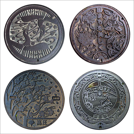
I’ve had this page of manhole covers open in the browser for the past few days, one of those things in the should-look-at-more-closely category. I’ve had a better look now, and I was reminded of seeing Japanese manhole covers, and they come in a much greater variety of designs (and colours!), so I was wondering why manhole covers are often so dull. I watched a How it’s Made on manhole covers the other day, and there’s no real reason why a city, region or département (say) shouldn’t have its own design.

This site has a good collection of images of Japanese manhole covers, four of which I’ve cut out below.

The Nanoscale Bible

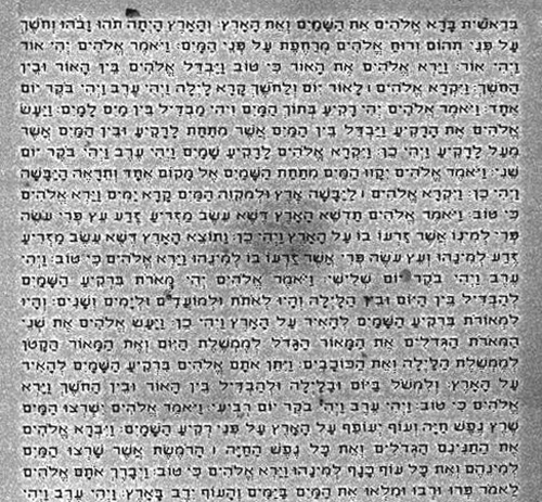
I’m a bit loath to post another article on something to do with the Bible, after the flood of mostly offensive, illiterate and incomprehensible emails I got the last time I posted on the subject. However, needs must, and I think this is remarkable enough to post on. Researchers at Israel’s Institute of Technology, Technion, have enscribed the entire Hebrew Bible onto a silicon surface smaller than the head of a pin.

I could quip that, of course, the kerning’s all wrong but I suspect these letters were created by a process akin to dot-matrix printing. I think it’s amazing. Beat that, microfilm!

The Colour of Type

I can’t quite recall why I’ve not blogged this before. For the life of me I can’t recall where I found it (I’ve had it on my hard drive for a while), but it was made by the “United Designers Network - Berlin”, a search for whom redirects to Spiekermann Partners.

Now and again I look at it and marvel how two entirely different types work so well on the same page. Viewed scaled down (below, in positive and negative) you can see that the whole piece has an even colour, and yet a closeup (right) shows that it’s set in Adobe Caslon and Wittenberg Fraktur (OK, I cribbed the name of the blackletter from the original PDF). I’d never have thought the two faces could have the same colour like that. I love it, it’s a really nice bit of inspiration.

Update: I guess I should have had a closer look through the Spiekermann Partners site! Alessandro Segalini mailed me with the blog entry describing the design motivation of the poster, apparently by Erik Spiekermann himself. Excerpt here:

The poster designed itself: the English text is set in Caslon, the typeface that George Bernard Shaw always specified for his writings; the German copy is set in Fraktur, the typeface used for setting German and other northern languages since Gutenberg. If it hadn’t been for the Nazis misusing these faces for their sinister purposes, we would still be reading Fraktur. It is the typeface of Goethe, Martin Luther, Karl Marx and Hegel. And it is perfectly suited to set our long words and interminable sentences, still evoking Gothic cathedrals and narrow streets with timbered houses. The one used is called Wittenberg Fraktur, after the town where Luther nailed his theses on a church door in 1517.

Incidentally, Spiekermann Partners developed the Deutsche Bahn brand system which I’ll no doubt blog about some time in the future.

Wow, The Beauty of Numbers

Discovered over on Fubiz, this beautiful animation from zero to ten using imagery from the arts of bonsai and ikebana. This really is a beautiful short film, and it reminded me of something I’d seen before, so a little bit of checking through my saved files and links I realise I saw some of the preparatory work on artless. In fact, I wrote about it here. The artwork is by Shun Kawakami, Illustration, Suibokuga, Drawing by Tadashi Ura and the photography (?) by Taisuke Koyama

The first picture here is from artless, the remainder are stills from the animation.