When I was writing about the St John’s Bible last week I was reminded of the typography of Coventry Cathedral and wanted to post a couple of pictures of it then, but I wasn’t immediately able to find decent pictures. I’ve had a proper look round, done some more research and found some pictures and I think given the history of the cathedral it’s an appropriate post for Easter Sunday, with themes of rebirth and all; Following the destruction of St Michael’s Cathedral (and much of the city) in a Luftwaffe attack on the 14th of November 1940:
…the then leaders of the Cathedral Community took the courageous step to build a new Cathedral and preserve the remains of the old Cathedral as a moving reminder of the folly and waste of war. From that point, Coventry Cathedral became the inspiration for a ministry of peace and reconciliation that has reached out across the entire world.Wikipedia: Coventry Cathedral
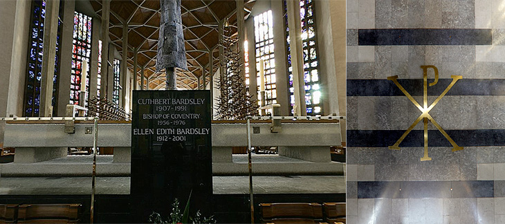
The new Cathedral was designed by Sir Basil Spence (who also designed my alma mater, Sussex University), with stained glass by John Piper and Keith New, the great tapestry by Graham Sutherland, sculptures by Jacob Epstein and John Bridgeman, the Great West Window by John Hutton and last, but absolutely not least, lettering and carvings by Ralph Beyer. It’s this lettering that fascinates me, and it’s strange that there are so very few pictures of it.
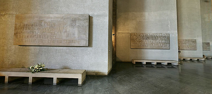
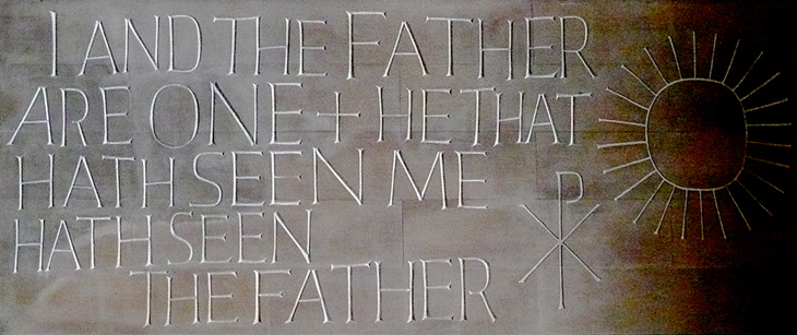
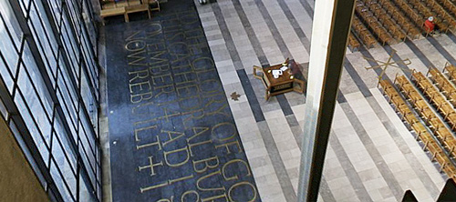
Some of the Tablets of the Word by Ralph Beyer. Picture from the QTVR movies in the Virtual Tour. There is also a picture from 1962 on the Time Life website here.
When I was looking for pictures I revisited the Cathedral’s website (which for some reason has no photo gallery) and realised that it’s possible to get some decent pictures out of the well-intentioned but bizzarely designed ‘Virtual Tour’. So with one exception (below), that’s where I got the pictures here. I don’t like being negative, but that virtual tour really could have a better user interface. It dominates and detracts from the movies, which are presented at a size that’s far, far too small - the content and the Cathedral deserves better than that.
Detail of one of the Tablets of the Word by Ralph Beyer. Picture by Herry Lawford on Flickr.
How Beyer came to be chosen for the Coventry Cathedral project is interesting, and includes a fair few other famous names and some remarkable coincidences. I have to quote fairly liberally from his obituary in the Times, or I’d just be rewriting it:
In 1937, aged 16, Beyer visited England where, on the recommendation of Mendelsohn, he spent six months as an apprentice to Eric Gill. Like Gill, and doubtless enthused by him, Beyer was fascinated by the qualities of carved stone, by simple sculptural forms and especially by letterform. Ralph then studied in London, at the Central School of Arts & Crafts and at Chelsea School of Art where he met Henry Moore, for whom he worked briefly before being interned as an enemy alien at the outbreak of the war.The Times
While in the internment camp, he met and befriended the young Nikolaus Pevsner, who had started work on An Outline of European Architecture and would later write the Pevsner Architectural Guides.
Encouraged by Henry Moore, Spence decided that, the Sutherland tapestry apart, the dominant decorative feature of the interior of the new Coventry Cathedral should be lettering rather than narrative sculpture. He knew he was looking not simply for a craftsman but for an artist capable of making a truly distinctive contribution. It was Pevsner who suggested that Spence should meet Beyer, to learn how he might approach a project which was to become the defining challenge of his life.The Times
The Independent has a more extensive obituary, and highlights a good point about the style of the modern Church of England being inspired by the early church, which I think is what reminded me of this work when looking at the St John’s Bible:
Although Spence’s cathedral was criticised for its conventional Latin cross plan, Beyer’s Tablets of the Word reflected post-war ecclesiastical interest in the early church and today they remain strikingly innovative examples of lapidary art.The Independent
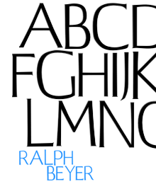
Beyer also designed a typeface for use on hymnals and other publications. The cathedral website makes good use of the typeface using Flash, and using browser zooming and screenshots I’ve assembled the text at right and top right. Of course that’s no substitute for the real typeface; I’d like to see if there’s a lowercase, other weights or styles, what the rest of the numerals look like, and how it’s kerned.
Further use of the Beyer face behind the altar, and at right more influences from the interest in the early Christian church, with the Chi Rho symbol, denoting Christ.
The inlaid lettering by the Great West Window. Finding clear pictures of this is nigh-on impossible, and I’m tempted to turn up with my camera and tripod and make my own. As it is, here’s a closeup.
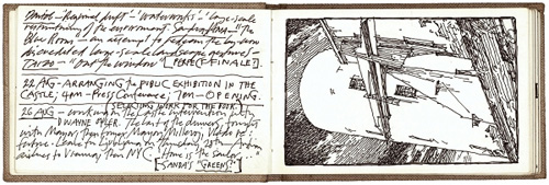
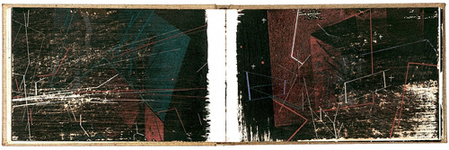
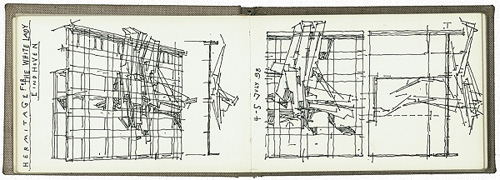
I’ve had these three pages on in tabs for a few days now and I just enjoy reading and looking at them, so I thought I should share the links. They’re three notebooks by Lebbeus Woods, the artist and architect. If you enjoy these (I certainly do), you should also have a look through the rest of his blog, and if you don’t mind all-Flash sites, perhaps look at his official site too.
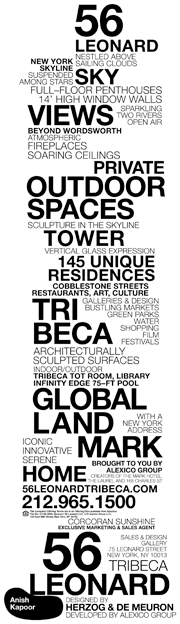
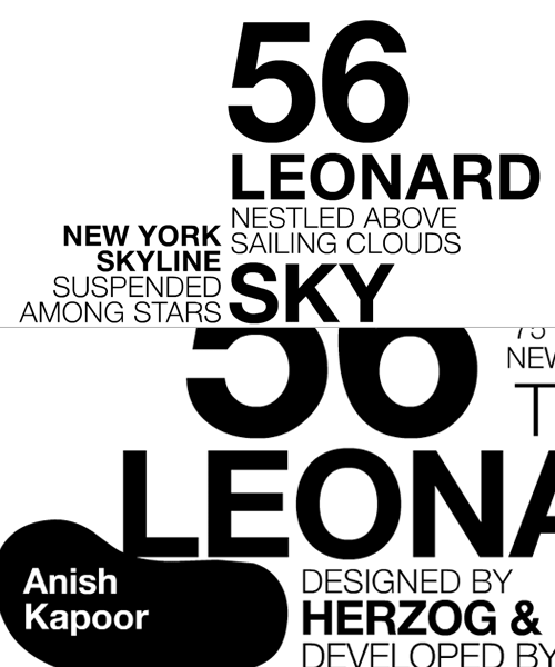
I was clearing up a load of saved links on my desktop and rediscovered this site about 56 Leonard. I saved it last week because of the rather nice typographic representation of the building on the site, which unfortunately flies past pretty fast and doesn’t appear to exist in any of the literature. Still, a few screengrabs and many refreshes later (horribly distorting their stats I’ve no doubt) I put together a decent resolution image of the whole thing. It’s not the prettiest building out there, but it does look like a fun, futuristic place to live, some of the apartments have remarkably large outdoor spaces, and it has an Anish Kapoor sculpture wedged under a corner of the building too. It’s a nice idea, and something that the initial animation does explain very well (the rendered videos on the site explain it too).
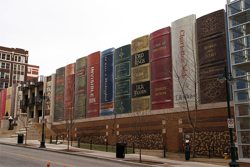
In 1997 the British Library moved to its new building in St Pancras, which I remember reading was designed to roughly resemble a stack of books. Very roughly. It seems that other libraries had a similar idea but decided to be less abstract, much less abstract.
First off, Cardiff Public Library, which has built this (unfortunately) temporary covering for the building until it’s completed. I partly agree with the sentiments here (where I got the images) that the installation should be permanent, but that the books should change. I’m sure book publishers could provide the panels, both advertising the book (should people want to buy it) and the library (if they want to borrow it). It’s interesting how the books are all modern bestsellers, I’ll get to that later.
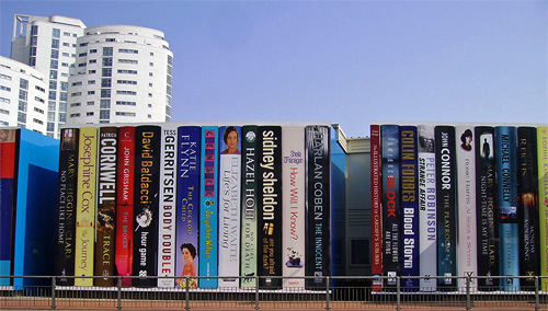
Then there’s the Kansas City Public Library, where the installation is permanent, on a much larger scale, and is designed to conceal the library’s car park. Here the public were asked to nominate books that they felt represented Kansas City. I’m not sure how Lord of the Rings meets that criteria, and I’m sure the last time I read Romeo and Juliet it wasn’t set in the mid-west, but there’s a hell of a lot I don’t know about Kansas City so I’m sure there’s a perfectly valid set of connections there. Mind you, notice here that all the books are great works, classics, high points of Western literature, which is a bit of a contrast with the Cardiff choices.
Now, I have some entirely unsubstantiated wild guesses about why this might be. I could suggest that the Cardiff Library is taking a deliberately populist stance, trying to make itself appear more relevant to “today’s busy Welshman and woman” and not as some ivory-tower isolated repository of dead knowledge. The British Press does tend to have a schizophrenic view of cultural establishments, either they’re lauding some wonderful new Establishment, preserving and restoring Great British Culture, or slagging off yet another white elephant, a waste of money, ignoring the sensible wishes of the Great British Public who Couldn’t Give A Toss.
The Kansas Library on the other hand, like other American city libraries, is likely to be regarded as an educational institution in its own right and an asset, worthy of city pride. Not forgetting that educational institutions in the US are big business, I would hazard a guess that city residents would have some pride invested in their city having a big library, it shows an educated population, and an educated population must have been able to afford college, so Kansas City must be a prosperous place indeed, well worth investing in. So they pick great works, because they represent learning and achievement better than books you could pick up at the checkout line at Wal-Mart.
Oh, and I’d just like to say that philosophical musings aside, I think both of these are bloody marvellous, and we should see more of this kind of thing.
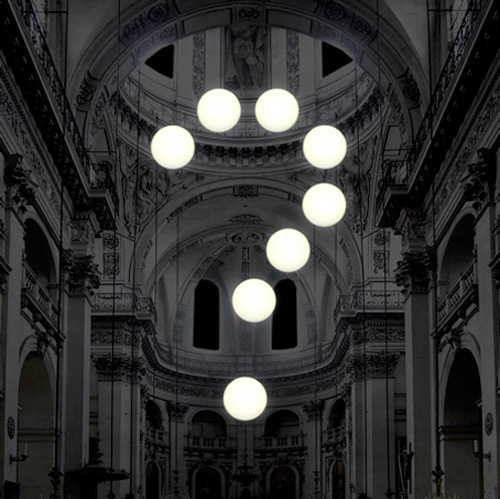
Just found this, Robert Stadler Installation in a Parisian Church, which is wonderful. I am, amongst other things, a great fan of French Rococo architecture, and to add a digital typographic mark into it just works so well for me.
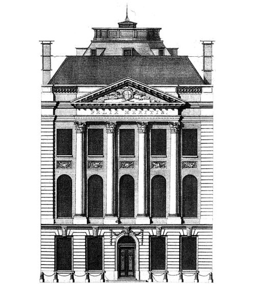
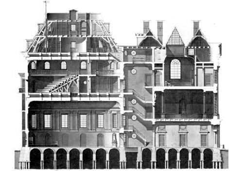
Ah, another great passion of mine: architecture. So I created a new category for it. I came across Andrew Cusack’s site this weekend, and it’s full of wonderful photos, illustrations and articles on the subject. A couple below, though I have to say this has to be one of my most favourite buildings. I’m not fond of the interior, mind.
