One of these days I’ll write about this tracing things compulsion I seem to have. A few people have asked me to elaborate on it, and I will. Thing is, I fear it’ll end up being a mammoth article and I want to give it proper attention, so until then, I procrastinate, by tracing more things. One thing that I’m sure I’ll write about is the temptation to ‘improve’ the original design and lettering. I normally avoid it just so that I can understand the original more clearly, but as I describe below, sometimes I have the impulse to re-imagine the design.
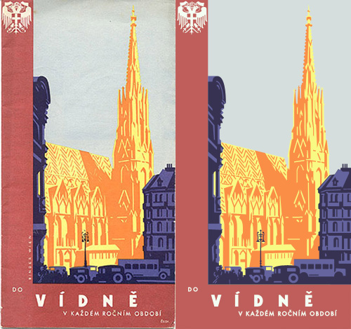
Coudal (I think) linked to this great collection of travel-related designs, which is full of beautiful and inspiring examples of lettering and illustration. I’m still working on a couple more, but I’ve just completed these two. The first is a brochure in Czech advertising Vienna. The text, very loosely interpreted, comes across as, “Vienna, for any season” (you could also say “Visit Vienna, in any season”, perhaps).

“Travel brochure to Vienna (Vídnĕ in Czech), circa 1934. Signed Steyrermühl, Wien. Published by the Foreign Tourism Bureau, City of Vienna”. Description and original courtesy of David Levine, from here, my tracing on the right.

I love the atmosphere of the image; the street shaded and dark, with St Stephen’s Cathedral bathed in warm evening sunlight. It’s just the kind of scene that would enthrall any tourist, and because it’s an illustration it can be happily idealised and stylised to perfection. I love also the way that the heavy traffic is shown too, perhaps as an indication that this is a up-to-date bustling city with all the conveniences the modern tourist of yesterday would require? Tourist brochures today avoid showing traffic at all if they can help it, instead you see ancient buildings connected by gardens, or, say, an open pedestrianised plaza. Funnily enough, this is exactly what is in front of the cathedral today.
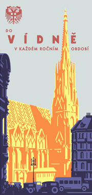
After I traced the brochure, I realised that I would like to modify it a bit to create a poster, or at least something less like a brochure, while keeping the same sense of the era and original intention of the design. I trimmed the red border and rearranged the type, being careful not to ‘over-perfect’ it - there is something special and arresting about the slight wonkiness of the type on these old prints, something I’m trying to keep. The new design is just to the right here. Click it for a larger version.
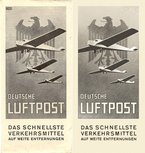
The second one I’ve traced is this odd, but appealing, brochure for the Deutsche Luftpost. It shows three planes in front of the German heraldic eagle against a strangely flat but stormy-looking sky. The planes interest me by having no apparent means of propulsion - normally in illustrations there is a sketchy circle to show where the propellors are, but here, nothing. The eagle is also interesting by having such a prominent tongue. I looked up other examples of the emblem, and unsurprisingly I ended up with a set of images very similar to the ones I saw while researching the coat of arms of Vienna (at the top of this article). None had such a dramatically large tongue though…

“Brochure for ‘Deutsche Luftpost Das Schnellste Verkehrsmittel auf Weite Entfernungen’, circa 1930”. Description and original courtesy of David Levine, from here, my tracing on the right.
