
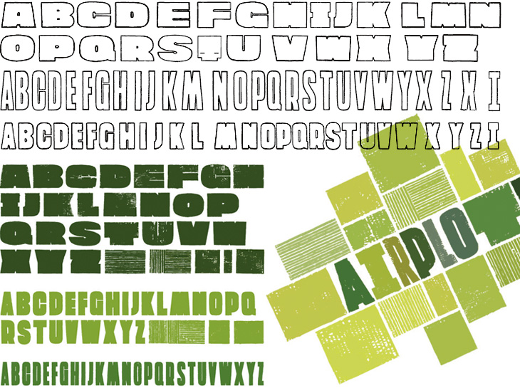
I saw Airside’s great brand/logo system for Greenpeace’s Airplot! campaign (against the new runway at Heathrow Airport) the other day, and today Bauldoff linked to more information on the development of it. I love the development process for the typeface used in the identity, printed in acrylic paint with letters cut out of corrugated cardboard; the corrugations in the cardboard brilliantly emulate the ridged appearance of ploughed fields, and creases and imperfections bring to mind the parch marks brought about by underlying geology (or archaeology!) you can only see from the air. The whole system is very flexible, and as you can see from the examples, allows for a wide range of messages to be created and set while maintaining the strong visual identity of the campaign.
All in all, it’s a great idea, well executed. The campaign itself is interesting and rather amusing, it certainly caught my imagination when I first heard of it. Basically, Greenpeace bought a field in the middle of where the new Heathrow runway is going to be, and is parcelling it off and selling it to potentially hundreds of people worldwide, with the idea that the Government won’t easily be able to track down the owners to force a compulsory purchase. It may not prevent the building of the runway, and may not even slow it down very much (the original purchase could be identified as being legally ‘vexatious’ and nullified) but it brings the protest to light in a positive, clever and interesting way that is likely to appeal to the public. Other recent airport expansion protests have focussed on inconveniencing the travelling public, which, while you might say it’s justified in highlighting the importance of the issue, isn’t going to get much support from said travelling public.