I’m getting fed up of Flickr. Does no-one write about the things they’ve seen anymore? Do they not care about how their images are presented? There are no narratives on Flickr, it’s a bucket full of photos with comments scrawled on them, using tags as a substitute for context and a sovietised interface as a feeble analogue for the blank gallery wall. I read on Kottke of the Tobias Frere-Jones Typographic Tour of Manhattan, with links to photos as ‘set 1’, ‘set 2’ etc. With a groan in my heart I clicked in full anticipation of yet another soulless grid of brutally-cropped thumbnails, and lo! there they were. Browsing this site is like Corbis Images in the early 2000s - the photos are subservient to a forbidding interface built to remind you that this isn’t a site to celebrate photography, but to make it conform to a catalogue. But what’s this? ‘Set 4’ is not Flickr! It’s an actual blog, with words and everything! No vile blue-with-pink vowel-less logos here! OK, it’s plain old Blogger, but it’s a sign of how things are going with presenting photos of things that even Blogger can seem exotic and challenging!
Anyway, if you’re not yet so damn jaded with Flickr, you can have a look at sets 1 through 3, though I recommend set 4, which was posted on Villatype by Joe Shouldice.
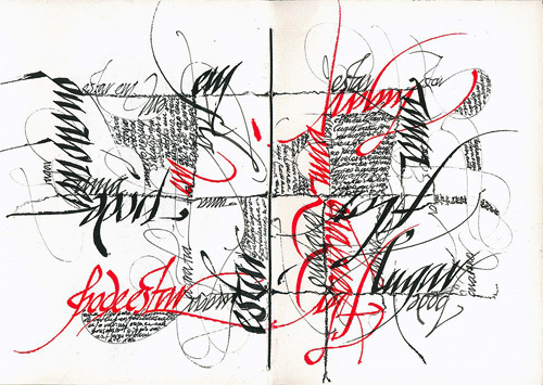
This image is from the Villatype set.

Yes, I know that many people don’t have the time, patience, resources and skills to set up their own photoblog, but there are plenty of blogging services out there, including some designed for photoblogs specifically! Break out from the Flickr mindset, please.