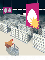
I came across Jörg Block’s site this morning from a link on Drawn! There are some fantastic illustrations and paintings on there; I love his clean, crisp, often isometric drawing style, and especially the page layouts:
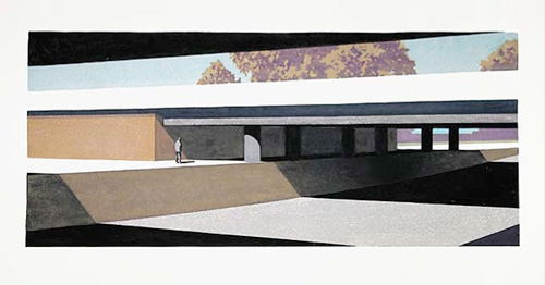
Have a look at the paintings too, they remind me of the paintings of intersections and roadworks you’d see advertising the Glorious New Future in the 50s and 60s, but with a solitude and darkness that suggest the future isn’t all that glorious at all. Of course, he could just like architectural paintings and puts the figure in for scale?
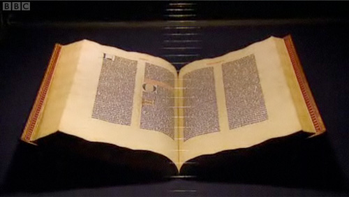
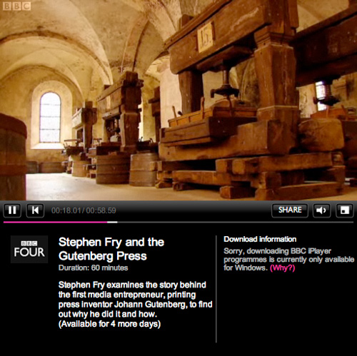
A fair few sites have linked to this recently, but I’ve only just got around to watching it and I can’t recommend it enough. As well as Fry’s flawless presentation of the story of Gutenberg and his invention, there are a few examples of nice lettering to pause the video for too. Mention of the Gutenberg Bible reminds me of this article, from a while back.
It’s the first time I’ve used iPlayer, as it’s the first time my internet connection has worked at a reasonable speed (thank you Virgin Media, it only took you years). I rather like the way its laid out, it’s a bit like my other site, which has looked like that for years, I hasten to add.
Also, for those of you who’ve ever watched the original TV series of Hitchhiker’s Guide to the Galaxy, having Fry present this is just perfect; it’s like a chapter from the Guide itself.
Typographer.org has returned, with a beautiful new design and a single-column format. The infrequent Bald Condensed features will be given their own pages, as in David’s own words:
What happened to Bald Condensed? Nothing, it just appears less frequently, that’s all. New editions of Bald Condensed will be announced in the news feed from now on.
And for the first time (oddly), I notice that the logo is not just truncated Didot - the serif has been removed from the ‘h’. Subtle!
Favourite to draw that is… Two interesting articles I’ve followed links to on the H&FJ site recently are the ones about the Sulzbacher Eszett and the Pilcrow (and Capitulum) (via Kottke and Ace Jet 170). It seems both come up in people’s favourite characters to draw. I like drawing the ‘3’ myself, both in ink and with beziers, but drawing the eszett is like a super big extra special bonus ‘3’ with soft curves, sharp edges, stressed strokes… lovely. Some people I work with have eszetts in their surnames, and it disappoints me that after a few months of blank incomprehension from some of the less linguistically capable* they replace it with a double-s. A real shame.
Office doodles testify to the popularity of the letter R, perhaps because it synopsizes the rest of the alphabet in one convenient package (it’s got a stem, a bowl, serifs both internal and external, and of course that marvelous signature gesture, the tail.)
I think I’ll chime in with Kottke and ask to see some of these office doodles!
* I’m ashamed to say this can be summed up as, “mostly British people”.
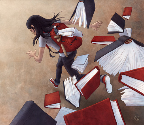
I was looking through my site earlier trying to find an article about Ian Kim’s work, and found that somehow I hadn’t done one. I’ve admired his work for a while, especially the piece below. I was doing some work today that needed illustrations of books flying around (right) and wanted to look at it again for inspiration.
As you can see, my style is rather different (I love working with vectors) but it’s always good to acknowledge your inspirational sources! The similarity in colours is entirely coincidental - the project I’m working on has a scheme of red and blue already!
Make sure to have a look at the ‘personal’ section on the site too, as there are some powerful images, some on some emotive and important subjects.
I’m feeling pretty glad right now that I have the perfect project where I can use this new script face. It’s an astonishingly complete script, with 4280 glyphs in each weight, covering Latin, Greek and Cyrillic. I don’t know of any other script that comes close. I work on projects where the work is localised into many European languages, often including Greek and Russian, so having typefaces and type systems that work for all of them makes life a hell of a lot easier. We make heavy use of Arno Pro nowadays for that very reason, but I was thinking we needed a script face to back it up on this particular project. I think Champion Script Pro fulfils that role perfectly. The “making of” blog post is fascinating, as is the set of examples on the Parachute site itself. I’ve nabbed a few examples for Latin, Greek and Cyrillic as a taster. Beautiful:
Typographica’s annual review of type releases has just been published, and I’m very pleased and honoured to have been asked to contribute to it! There are fantastic reviews of 2007’s notable releases on there, so go and take a look. My review of Meta Serif is available here. Thanks to Stephen Coles for asking me, and for the nice compliment in the link!
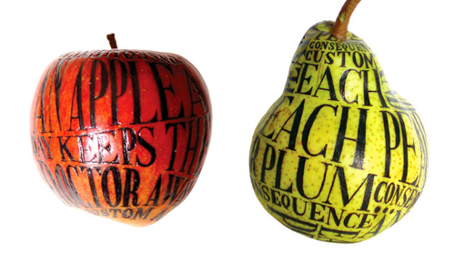
Just a little, hey-look-at-this post. I love these illustrated (or would that be illuminated?) fruit by Sarah King. See them (and a banana) on the Evening Tweed site.
This one’s a bit of a “Fancy that!” post. I came across this interesting post on Kit-Blog about the remarkable typographic consistency of Woody Allen’s film titles. For pretty much all his films, the titles are set in Windsor-EF Elongated, by Elsner+Flake. Not having seen a great deal of his films, I’d not noticed, but looking at these images, they just say “Woody Allen film”. How about that for brand identity?
Go and read the full article for more info and images.
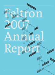
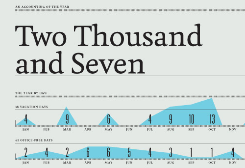
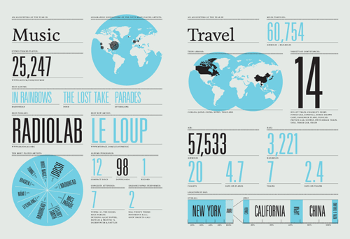
If you fancy ogling some beautifully presented numbers, graphs and maps, Nicholas Felton has published his annual report for 2007 and it’s quite the visual treat. I’m boggling a bit at the idea of keeping track of so much data over such a long period - I remember seeing his 2006 and 2005 reports and being impressed then. I barely keep track of anything. Maybe I should start.