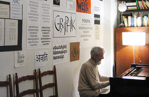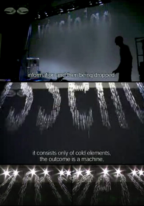
Another great article on pingmag: VEB Typoart: The East German Type Betriebsstätte. Go and read it, it’s got a good history of the organisation and on Karl-Heinz Lange, designer of Minima (both pictured at the end of this article). I’m thinking of ordering the limited edition Freundschaftpacket.
I’m particularly fascinated by these two bits from the article. The second being from the interview with four members of Typoart Freunde:
At Typoart, the principle “frugality and effectiveness” lead us to work with representatives from the printing enterprises to develop a type program that met all the important requirements: a Renaissance roman for literature, like Garamond, a classical, like Bodoni or Didot, then a slab-serif, for example Clarendon. There had to be something from each major style. Naturally also sans-serif, in different styles, like Helvetica and Futura. The “Zentrag” would even request imitations of specific western-made typefaces they couldn’t afford to license.
It’s the history of VEB Typoart, as an example of the fate that many GDR businesses met after the German reunification. Also, to the very end, their working methods were so modern and advanced. Unlike in West Germany, type design in the GDR wasn’t subject to the pressure of business competition. So, typefaces could be created with more care and craftmanship. You could truly call it Schriftkunst [typographic art]: No effort was spared in order to stay on the cutting edge.
So this is fascinating. They had to copy western designs (the article makes mention of Times New Roman) and yet the work they were producing themselves was of a higher quality than those western ones. They were working at the cutting edge, producing the best work, and yet when the business was taken over after reunification, it was run by someone not interested in type, and the place went under and the typefaces were all nearly lost. It reminds me of other businesses producing excellent products, most notably Adobe, which are now run by accountants and managers rather than by the engineers and designers who develop and use the products. Of course a business must have managers and accountants, but why must they be placed at the very pinnacle of the organisation? Their motivations can only be to profit and organisational efficiency, rather than to creativity and excellence. VEB Typoart avoided this for much of its life by operating under a soviet system where profit was not a motivation (and organisational efficiency came about through a scarcity of resources, rather than SMART objectives and the like) and collapsed under a new system with a rush for profits as an advertising agency. I guess it proves to me once again that placing managers, accountants and administrators in control of creative professionals always seems like a good idea to managers, accountants and administrators, and almost never works to improve productivity and creativity.

