Yves Peters wrote recently on the history and origins of the FontShop-released FF Dagny, worth reading in full, especially for the interesting discussion at the end on how to categorise the face. I must admit though to being drawn in by the beautiful illustration by Fredrik Andersson, reproduced below. One of the key features in the development of Dagny was to create a true italic for it, rather than the obliques of its ‘parent’ face, DN Grotesk, so it’s especially pleasing to align italic characters across the illustration like this.
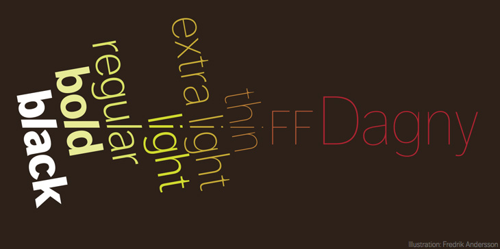
Illustration by Fredrik Andersson for the FF Dagny spec sheet.