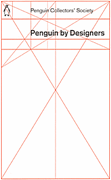
I’ve come across Penguin by Designers* on a few sites now, and the cover intrigues me. I was discussing the grid used on Pelican Originals the other day, after seeing this post. I had thought that both sets of books used a fairly conventional grid, but assuming this cover is accurate, then the real one is more interesting.
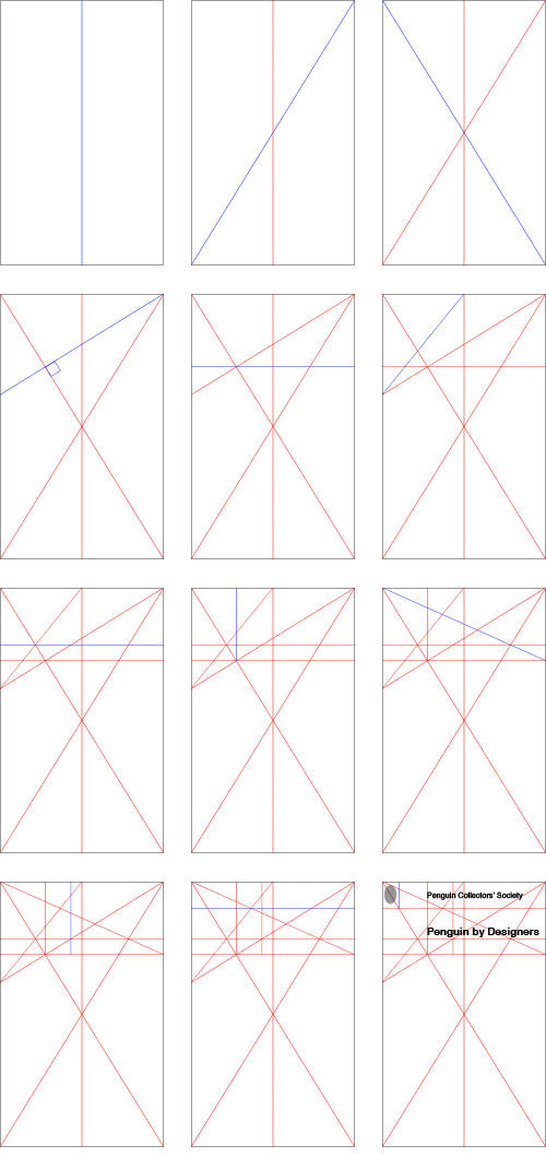
I was looking at it, trying to work out how it’s built. I doubted that any part of it was entirely arbitrary so I’ve redrawn it, but having each line only drawn in an obvious relation to something that already exists. What results is a pretty much perfect copy of the existing grid, so unless I was just lucky, I guess this is how they made their grid. These are the gridlines - each one is illustrated in blue as it is introduced:

- Divide the page in two, vertically
- Draw the ‘right’ diagonal, across the page
- Draw the ‘left’ diagonal across the page
- Draw a line from the top right corner so that it intersects the ‘left’ diagonal at a right angle
- At that intersection, draw a horizontal line across the page
- Draw a line from where the line from step 1 meets the top of the page to where the line from step 4 meets the left edge
- From the intersection of that line with the ‘left’ diagonal from step 3, draw a horizontal across the page
- From the intersection of the lines from steps 3, 4 and 5, draw a vertical to the top of the page
- Now draw a diagonal from the top left of the page to where the line from step 5 meets the right hand side of the page
- Now draw a vertical from the line from step 5 to the top of the page so that it passes throught the intersection of the lines from steps 3 and 7
- Now for a final horizontal across the full page, passing through the intersections of the lines from steps 6 and 9
- Then draw a final vertical from the intersection of this line with the left diagonal from step 3. Then add your titles and publisher logo!
