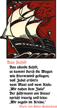
After reading this thread on Typophile about a new beer label I did a quick search for Hartwig Schrift (the original type for the label) and found this site. It’s got a collection of resurrected blackletter types some of which I’ve seen before, others which I’ve never seen, like Jaecker-Schrift. Some of the fonts are genuinely available for free, but others aren't, so check which is which before using any of them, and buy a license for any you need to. There are some real gems in there, amongst the dodgy ones.

This capital Eth from Jaecker-Schrift for example is really quite compelling. The composition of the diacritic brings to (my) mind Suprematism, or Kandinsky - it’s that dot, almost like a full stop hidden in the character and balanced by the verticals - so perfect! As in the sampler on the page, I’d be tempted to use it as an ornamental ‘D’ as after all, it’s so ornamented it goes far beyond a normal Eth that you couldn’t tell the difference anyway. I’m also thinking of creating a set of similarly ornamented caps to use as cadels with the font. I have a thing for cadels too…
