Font-size Glyph Substitution

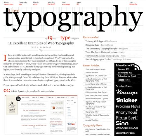
I was just reading “Why Bembo Sucks” over on I Love Typography, and I was led to wondering why Opentype doesn’t allow for alternate glyphs based on size, at least, that’s how I understand this. After all, as Kris Sowersby points out, fonts were cut for a specific size, with variations in the glyph forms created as a result of aesthetics and practicality. Looking at the Opentype font I have with the most optical weights (Arno Pro) and what options Photoshop offers for Opentype, there isn’t anything in the OT menu or the application itself to set the optical weight based on size.

So why not? Of course, if it does and I’m misreading the spec, do let me know. Mind, I’ll then have to ask why no-one is doing it yet.

And, for comparison, Arno Pro Caption (left) and Arno Pro Display (centre) scaled to the same point size and overlaid on each other (right). Wouldn’t it be nice if the software could switch between the weights automatically?

Oded Ezer

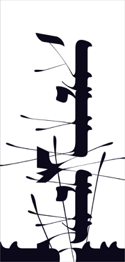
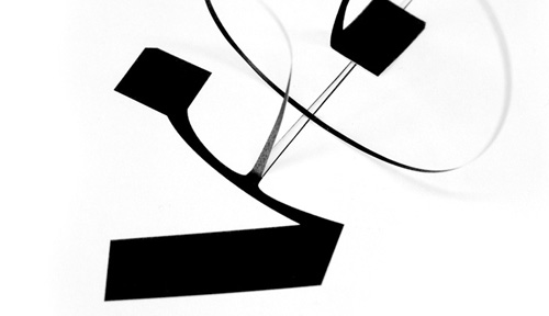
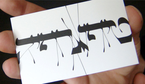
I’ve been meaning to write something about Oded Ezer for ages, ever since seeing his contribution to the Urban Forest Project (at right). Unfortunately I know only a little about Hebrew typography and calligraphy so I can’t write from any qualified angle on it. Ezer’s work is just amazing though, and so I add another entry to my ever-expanding Things To Learn Or Find Out More About list - Hebrew! Recently I saw a link on Notcot about his recent Ketubah project, which looks great, but I’m having a little difficulty working it out. The closeups show what appear to be cut out letterforms folded over to form new shapes, but the photos don’t say whether they’re printed to look like that or they’ve actually been cut out and stuck down again. I’m hoping the former. Below are some images of his work that I’ve saved for inspiration. Take a look at his site for more, and here for some samples of his poster work.

From Ketubah:

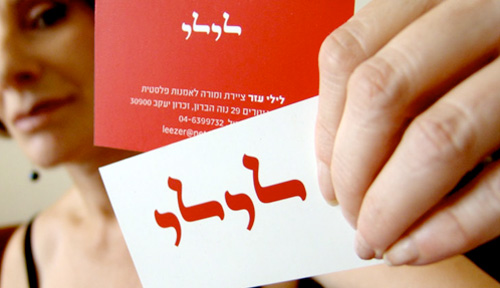
Other inspirational images from Oded Ezer’s site. These really are lovely.

Ambigrams

I came across these ambigrams by Tiffany Harvey during the big Christmas/New Year break. There are some great examples in the gallery (on Flickr, of course), but these two caught my eye especially. I’m fascinated by ambigrams, and always thought words suitable for making them were fairly rare, but Harvey seems to promise any word can be made into an ambigram, even two, three or four words. Fascinating.

Ex Ljbris

This is an interesting strategy. Jos Buivenga is a type designer producing high quality, fully-featured fonts and releasing them for free through his website. Perhaps realising the seemingly universal attitude that it’s perfectly OK to steal fonts, rather than accepting that they are licensed software products, he allows you to download his fonts with no restriction and just providing an option to donate through Paypal. I don’t know what the solution is to software and digital media piracy, but I’m not sure the honour system is the right way to go about it. I hope Jos Buivenga gets lots of donations, because the quality of his work deserves reward.

I’m particularly liking Fertigo. I think I can make use of that at work (and yes, we will donate):

And I just like this image:

Shuttle Type

I always thought that the names of the shuttles was written in Helvetica, at the very least screened on in some regular manner. Looking at this image from airliners.net, I see that it looks hand-painted, and after all these years of patching and repainting, the lettering looks decidedly wonky.