Seen on a trailer on Hallmark for ‘Intelligence’. Love that ‘g’. Using the amazing ‘What The Font’ tool on MyFonts I’ve identified this as Libel Suit.

Seen on a trailer on Hallmark for ‘Intelligence’. Love that ‘g’. Using the amazing ‘What The Font’ tool on MyFonts I’ve identified this as Libel Suit.

Another one I had to do some clever re-Googling for. A while back I was sent a link to Si Scott’s portfolio site. Once you get past the mystery-meat navigation, you’re in for a treat.
You know that floral, bling style that’s been so popular lately that it’s rapidly becoming a cliché? Well, this guy is the master of it - so much so I wouldn’t lump him in with the rest of them. I think his work is too finely executed to be called a cliché. Check these out.


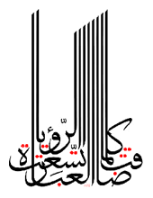
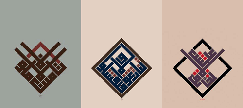
I recently rediscovered Mouneer Al-Shaárani’s work after trawling Google Images for the original of an image I had saved. His portfolio site has had (see Update below) some wonderful examples of quite remarkable calligraphy on it. The three examples of his work below show some of what’s possible with Arabic calligraphy, which may well be unreadable, but is definitely beautiful.

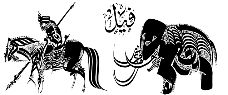
It’s also worth checking this collection of anthropomorphic and zoomorphic calligraphy on this post on BibliOdyssey. I gather from reading around the subject that the idea of doing this may have come from the prohibition on creating images of animals - this isn’t a picture of the animal, it’s just a description of it, written down. Whether that’s true or not is open to interpretation, but it makes a nice story. Would that defence stand up in court, I wonder?


From Penny Arcade. I love the big serial number, and I also love the idea of a ping pong robot. Quoting the site:
So our ping pong games have not been going so well. We’ve taken steps recently to ensure that our future games go better. I don’t want to say too much right now but here’s a picture. This arrived yesterday morning.
Nice.

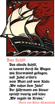
After reading this thread on Typophile about a new beer label I did a quick search for Hartwig Schrift (the original type for the label) and found this site. It’s got a collection of resurrected blackletter types some of which I’ve seen before, others which I’ve never seen, like Jaecker-Schrift. Some of the fonts are genuinely available for free, but others aren't, so check which is which before using any of them, and buy a license for any you need to. There are some real gems in there, amongst the dodgy ones.

This capital Eth from Jaecker-Schrift for example is really quite compelling. The composition of the diacritic brings to (my) mind Suprematism, or Kandinsky - it’s that dot, almost like a full stop hidden in the character and balanced by the verticals - so perfect! As in the sampler on the page, I’d be tempted to use it as an ornamental ‘D’ as after all, it’s so ornamented it goes far beyond a normal Eth that you couldn’t tell the difference anyway. I’m also thinking of creating a set of similarly ornamented caps to use as cadels with the font. I have a thing for cadels too…