Canadian Art

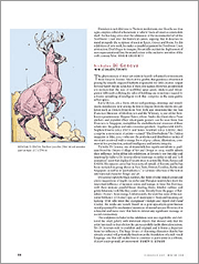
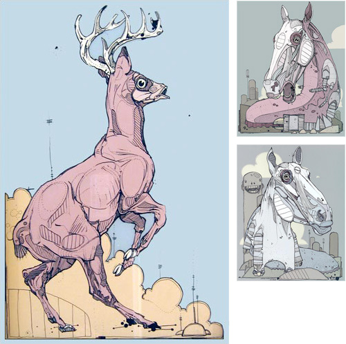
This is another post from the big pile of images I have. Now, I remember finding this, and being disappointed there were no detailed versions of the illustration, which from what I can see should bear closer inspection. Unfortunately yet again I’ve lost the reference to where I found it. No, no I haven’t. I found it through an image search for Japanese Advertising Art while researching this article and I just realised the Google Image Result page is still in my history. W00t.

So here we have it. It’s a page from Canadian Art Magazine about Nicholas Di Genova. Using Google I find lots of pages about him, including a decent quality version of the image used in the article, along with a couple more. Looking at them I realise I’ve seen his work plenty of times in books and magazines. Interestingly I had an entirely different image in my mind when I saw the original page from Canadian Art. I thought it would be a stylised but otherwise accurate drawing of a stag or moose, but it turns out to be some kind of moose-fish hybrid. Ho hum. Still, the inspiration holds. One day I’ll get around to doing my comic book of doom.
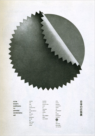
Look what’s happening to Japanese advertising art

I found this image of a poster months ago, and I’ve no idea where it was. I’d really like to get hold of a higher resolution image (or a print) and to find out what was shown in the exhibition.

Sake

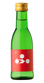
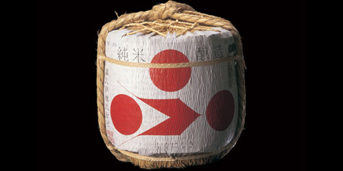
Continuing the Japanese theme, in my collection of inspirational graphics is this little gem, from pingmag’s article on Japanese fonts on sake bottles. If you’re really interested, there’s another feature on their site added recently about sake bottle labels in general. The label was designed by GRAPH, who have an online portfolio of their work online. Go and visit, and drool.

Mon

Digging through my collection of pictures I come across this collection of Mon. I’ve been fascinated by these heraldic devices for a while and wondered what the rules were governing them. Well, Wikipedia to the rescue:

Mon (紋?)(plural mon), also monshō (紋章?), mondokoro (紋所?), and kamon (家紋?), are Japanese heraldic symbols. Mon may refer to any symbol, while kamon and mondokoro refer specifically to family symbols. Mon serve roughly similar functions to badges, crests and family crests in European heraldry.

A mon consists of a roundel encircling a design (such as feathers, flowers, or some man-made object). They are somewhat like coats of arms in that they are either associated with a particular clan or family, or an individual who has achieved some variety of public recognition. The designs are usually stylised versions of traditional Japanese themes, such as bamboo. Artists may choose something symbolising their art; a fan design might be chosen by a geisha.

I love Wikipedia. Interesting that people nowadays use the inkan instead. I’ve always wanted to do my own inkan - as it closely resembles the western form of printer’s mark. I really want to have my own Mon too, though. What kind of Mon would a designer/photographer/typographer have though? And would it be considered unforgivably gauche for a westerner to create their own? Well dammit, I want one. Maybe I could just use the crown image from this site…

How To Make A Pig

That’s how, apparently. I love the image, but I suspect there’s a portion of style over content going on there. I can’t help but think that there are some very important (but less visually appealing) steps missing.

This is one of those images I have that I can’t find the source of.

Tiny Bit of Inspiration

The start of a new, much-needed category: Pictures Found Online. When it comes to browsing, I’m a bit of a magpie. Anything that I want to look at in more detail or inspires me, I grab a copy of it in case it disappears offline or I lose track of it. Unfortunately, over the years the latter concern has proved itself as I’ve lost track of where I found almost all of these things. To add to the confusion, some of them were sent to me by friends and relatives, “You might like this…” so I’ve even less chance of finding where they’re from. I’m going to put up examples of them as I go through my big stack of images, and hope that someone will point me to the original source (and allow me to give correct credit).

So yes, at right. A little label that has inspired a few titles and design treatments of mine over the years.