It’s Helvetica’s birthday this week. What better present to get it than to buy an actual genuine licensed copy of the font?

It’s Helvetica’s birthday this week. What better present to get it than to buy an actual genuine licensed copy of the font?

That’s how, apparently. I love the image, but I suspect there’s a portion of style over content going on there. I can’t help but think that there are some very important (but less visually appealing) steps missing.
This is one of those images I have that I can’t find the source of.

Seen on a trailer on Hallmark for ‘Intelligence’. Love that ‘g’. Using the amazing ‘What The Font’ tool on MyFonts I’ve identified this as Libel Suit.

Another one I had to do some clever re-Googling for. A while back I was sent a link to Si Scott’s portfolio site. Once you get past the mystery-meat navigation, you’re in for a treat.
You know that floral, bling style that’s been so popular lately that it’s rapidly becoming a cliché? Well, this guy is the master of it - so much so I wouldn’t lump him in with the rest of them. I think his work is too finely executed to be called a cliché. Check these out.


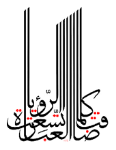
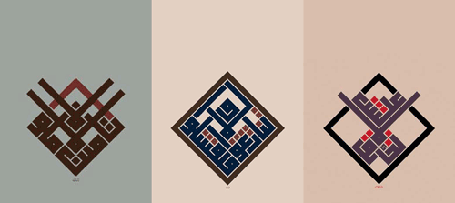
I recently rediscovered Mouneer Al-Shaárani’s work after trawling Google Images for the original of an image I had saved. His portfolio site has had (see Update below) some wonderful examples of quite remarkable calligraphy on it. The three examples of his work below show some of what’s possible with Arabic calligraphy, which may well be unreadable, but is definitely beautiful.
It’s also worth checking this collection of anthropomorphic and zoomorphic calligraphy on this post on BibliOdyssey. I gather from reading around the subject that the idea of doing this may have come from the prohibition on creating images of animals - this isn’t a picture of the animal, it’s just a description of it, written down. Whether that’s true or not is open to interpretation, but it makes a nice story. Would that defence stand up in court, I wonder?
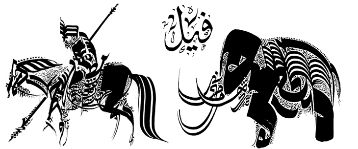

The start of a new, much-needed category: Pictures Found Online. When it comes to browsing, I’m a bit of a magpie. Anything that I want to look at in more detail or inspires me, I grab a copy of it in case it disappears offline or I lose track of it. Unfortunately, over the years the latter concern has proved itself as I’ve lost track of where I found almost all of these things. To add to the confusion, some of them were sent to me by friends and relatives, “You might like this…” so I’ve even less chance of finding where they’re from. I’m going to put up examples of them as I go through my big stack of images, and hope that someone will point me to the original source (and allow me to give correct credit).
So yes, at right. A little label that has inspired a few titles and design treatments of mine over the years.
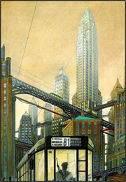
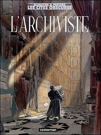
I read this article on BLDGBLOG a while back, and immediately wanted, yes wanted all of them. I’d sort of kept it in mind with thoughts of a few projects I wanted to do, but hadn’t really hunted down the books. Then, last night, a French colleague from work presented me with L’Archiviste! She’d bought it on a trip back to France, and obviously knows me quite well. Today I also bought this from Amazon.fr. Funny how I hadn’t even thought of that when I first came across it.

From Penny Arcade. I love the big serial number, and I also love the idea of a ping pong robot. Quoting the site:
So our ping pong games have not been going so well. We’ve taken steps recently to ensure that our future games go better. I don’t want to say too much right now but here’s a picture. This arrived yesterday morning.
Nice.
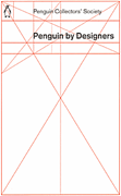
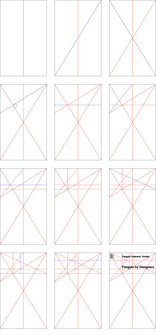
I’ve come across Penguin by Designers* on a few sites now, and the cover intrigues me. I was discussing the grid used on Pelican Originals the other day, after seeing this post. I had thought that both sets of books used a fairly conventional grid, but assuming this cover is accurate, then the real one is more interesting.
I was looking at it, trying to work out how it’s built. I doubted that any part of it was entirely arbitrary so I’ve redrawn it, but having each line only drawn in an obvious relation to something that already exists. What results is a pretty much perfect copy of the existing grid, so unless I was just lucky, I guess this is how they made their grid. These are the gridlines - each one is illustrated in blue as it is introduced:
