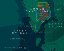
I was reading about Postopolis! on City of Sound, and came across a short writeup of Timescapes, a multimedia exhibition at the Museum of the City of New York (scroll down a bit). I love the design of this map (click for larger version) - looking closely I think that’s Eccentric 1 isn’t it? Until now, I’ve never seen that font used on anything that makes it look good. Here, it looks rather dignified. [Update] I actually think that it’s Democratica. I thought it was the freeware Eccentric because (sigh) that’s what a company I work with was using.
Also, while hunting for more examples of the work online, I realise that it’s usually museums who completely fail to show off their exhibits to any great effect. Looking at the official page on the museum’s site, would you be enticed to go see it? Where’s the gallery? I mean, it’s a multimedia piece, so putting a few screenshots of the thing online wouldn’t hurt them one little bit - you still have to go to the museum to get the full effect of it, and seeing some examples online might actually get you to go.
